My backlog of blog posts I want to write is getting a bit ridiculous at this point. One of them is a follow-up to YarnBuddy’s “App of the Day” feature back in March, complete with screenshots and stats and the whole story of how that feature came to be. I’m not quite ready to put all of that together yet, so today, I just want to note some of the things I’ve been working on lately in YarnBuddy (from a more technical standpoint).
Themes
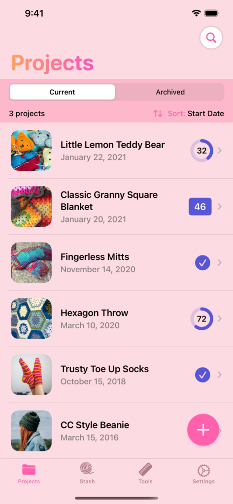
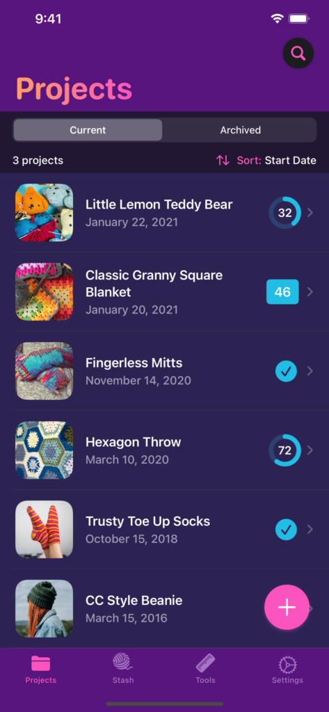
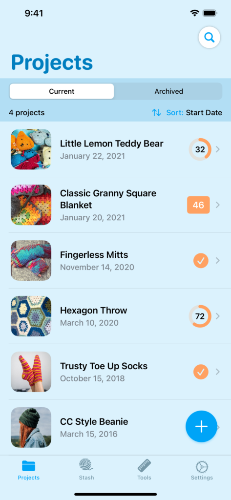
I’ve released 6 updates for YarnBuddy so far this year (with another one waiting for review), kicking the year off with a major design refresh that introduced the ability to change the app’s theme. I did this by creating a Theme struct that has a number of semantic colors such as “primaryAccent,” “secondaryAccent,” “headerText,” “rowBackground” etc. Next, I set up an AppTheme enum, with each case being the name of a theme. The enum has a variable called “colors” that returns a Theme struct for each case. The result is that I can do things like .background(settings.theme.colors.primaryBackground) and it just works!
However, there are some UI elements in SwiftUI that are notoriously difficult to customize, such as the background of the list view that a Picker pushes onto the stack. I realized that some of my themes could be considered “light,” while others would be more at home with dark mode defaults. In other words, a bright white background would be super jarring in my Supernova theme. So, I decided to override the user’s preferred mode based on the selected theme.
In my SettingsStore class, which manages a number of UserDefaults keys, I added the following:
var theme: AppTheme {
                set {
                        defaults.set(newValue.rawValue, forKey: DefaultKeys.appTheme)
                switch(newValue) {
                case AppTheme.system:
                    UIApplication.shared.windows.first?.overrideUserInterfaceStyle = .unspecified
                case AppTheme.dark, .midnight, .supernova:
                    UIApplication.shared.windows.first?.overrideUserInterfaceStyle = .dark
                    UIApplication.shared.statusBarStyle = .lightContent

                case AppTheme.light, .grapefruit, .creamsicle, .seaside:
                    UIApplication.shared.windows.first?.overrideUserInterfaceStyle = .light
                    UIApplication.shared.statusBarStyle = .darkContent
                default:
                    UIApplication.shared.windows.first?.overrideUserInterfaceStyle = .unspecified
                }
    }
    get { AppTheme(rawValue: defaults.string(forKey: DefaultKeys.appTheme) ?? AppTheme.system.rawValue) ?? AppTheme.system }
}
Those status bar text color overrides are deprecated but I can’t figure out how I would call their replacement in SwiftUI. For now, it works!
Data Export
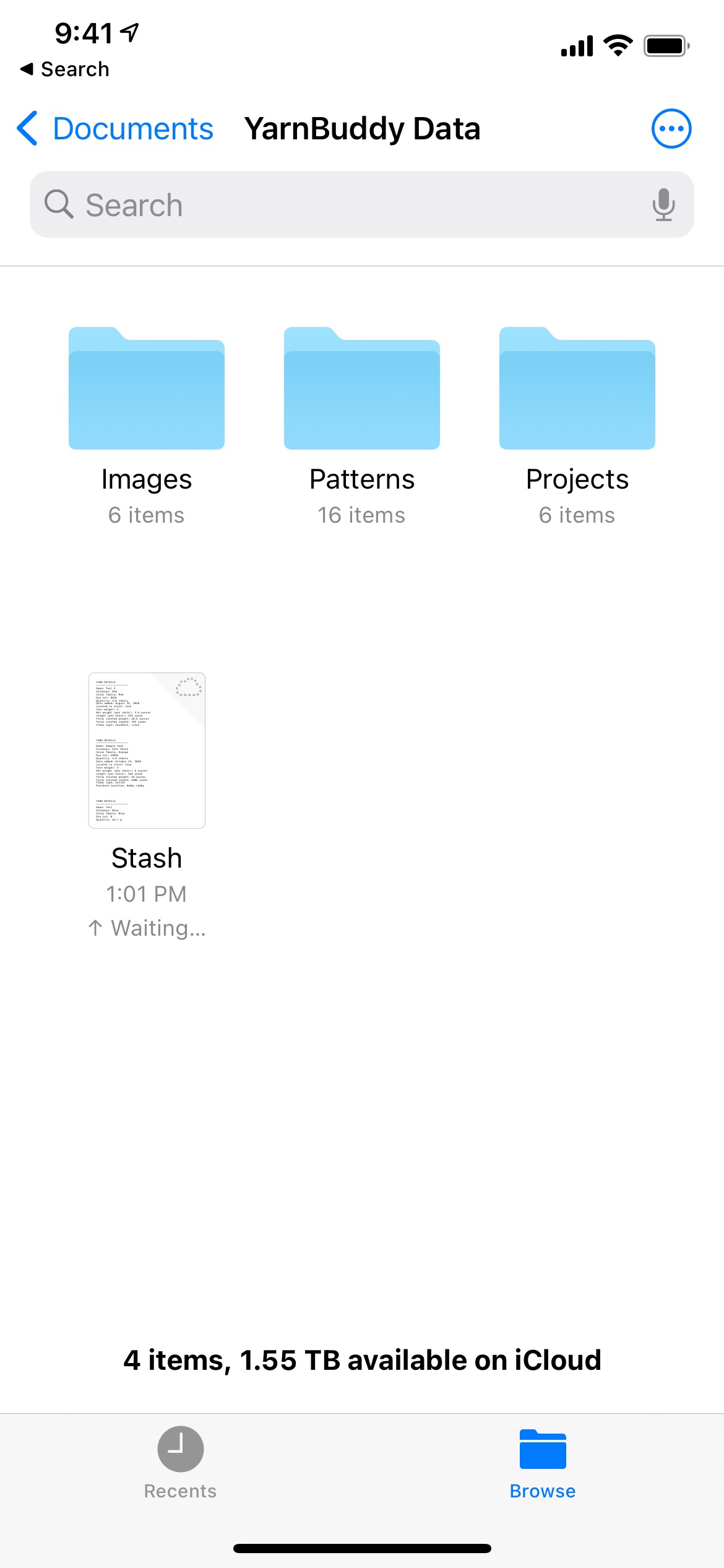
The next major version, 1.5, gave users the ability to export a zip archive containing all of their photos, pattern PDFs with annotations, and metadata (in plain text files). I wanted to give users some method for getting their data out of the app as soon as possible, even if it wouldn’t be importable. Now that I’ve shipped it, I’ve begun slowly working on a true backup solution using Codable.
To export data using SwiftUI, I created a struct conforming to FileDocument and did all of the data gathering in the fileWrapper(configuration: WriteConfiguration) throws -> FileWrapper method. I used SwiftUI’s .fileExporter modifier to trigger the export. YarnBuddy uses CoreData, so to make things a little easier I created an “exportString” variable in each NSManagedObject subclass that prints a nicely-formatted string of all metadata associated with the class. That way, I just needed to loop through all of the user’s projects and yarn, map the exportStrings to their own array and append them to the appropriate plain text files.
Time Tracking
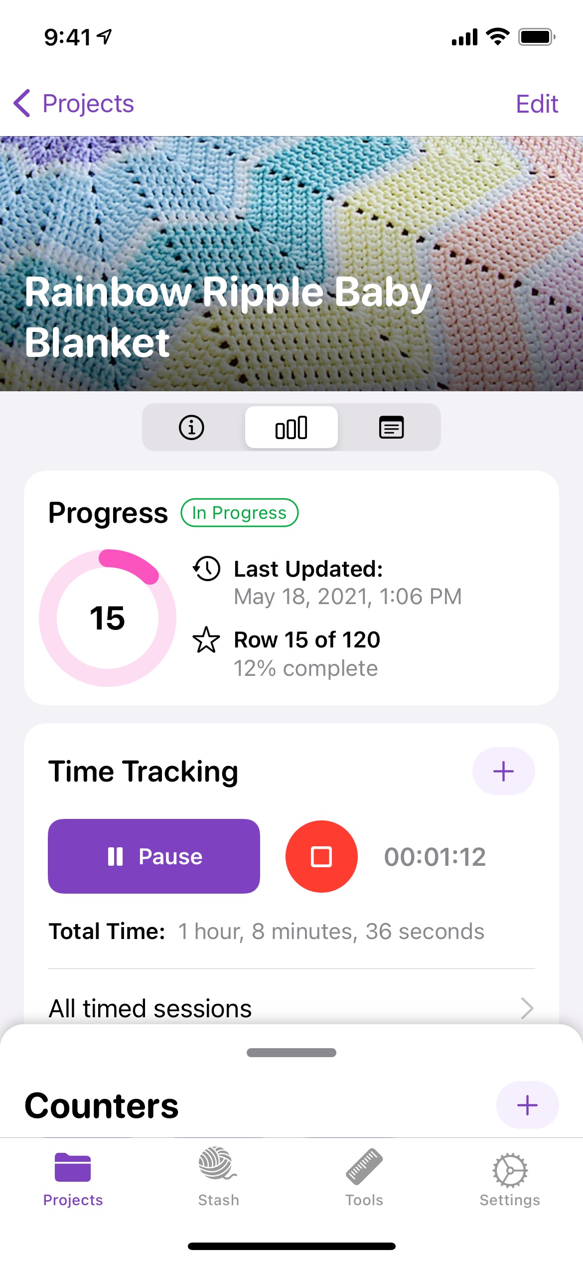
Version 1.6 introduced time tracking for Pro users. Time tracking can be fun and useful on its own, but what I’m hoping to do is lay the groundwork for some fun “end of the year summary”-type features. For avid knitters and crocheters, it would be neat to know how many projects you completed that year, the average and total time spent on them, etc. Someday I’d also like to have a little “share card” creation studio where users could choose stats and photos to share on social media.
Time tracking is also a great feature to integrate with widgets, Shortcuts, and the watch app, so there will be plenty of low-hanging fruit for me to pick throughout the summer!
Yarn Remaining, User Guide, and Stash Export
Version 1.6.1, when approved, will be a big point update: it includes a new user guide, the ability to export your yarn stash as a CSV file, and new estimates of yarn remaining.
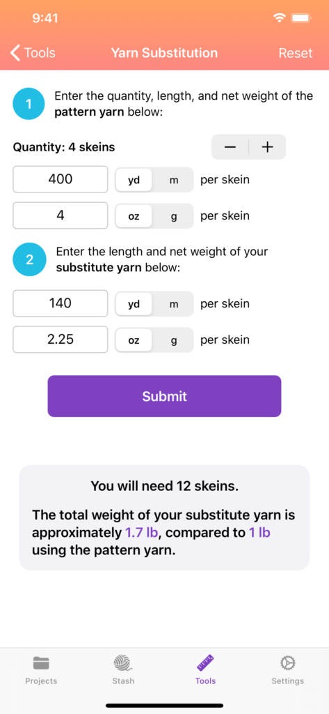
Previously, when a user linked a project to a yarn in their yarn stash, the amount of yarn would not automatically be subtracted from the total stashed amount. The reason for that was logistics: “In progress” projects weren’t guaranteed to be finished, projects could list yarn quantities in terms of the number of skeins (yarn balls), grams, or ounces, and the total amount of yarn in the user’s stash could be shown in terms of skeins, grams, ounces, yards, or meters. In other words, there were potentially a lot of unit conversions required, and in some cases those conversions would only work if the user supplied the length and net weight per yarn ball (which aren’t required fields).
Now, YarnBuddy will attempt to calculate an estimated amount of yarn remaining based on whatever pieces of information is has, using projects marked as finished. If the estimate is clearly wrong, users can override it with a custom value. Hopefully it’s a good compromise, and users will be happy with it.
I don’t get a ton of support email for YarnBuddy, but I wanted to have a place where users could go to get answers to basic questions and even just explore what the app has to offer. So, I wrote a little user guide in plain ol’ HTML using Textastic on my iPad and included it in the app.
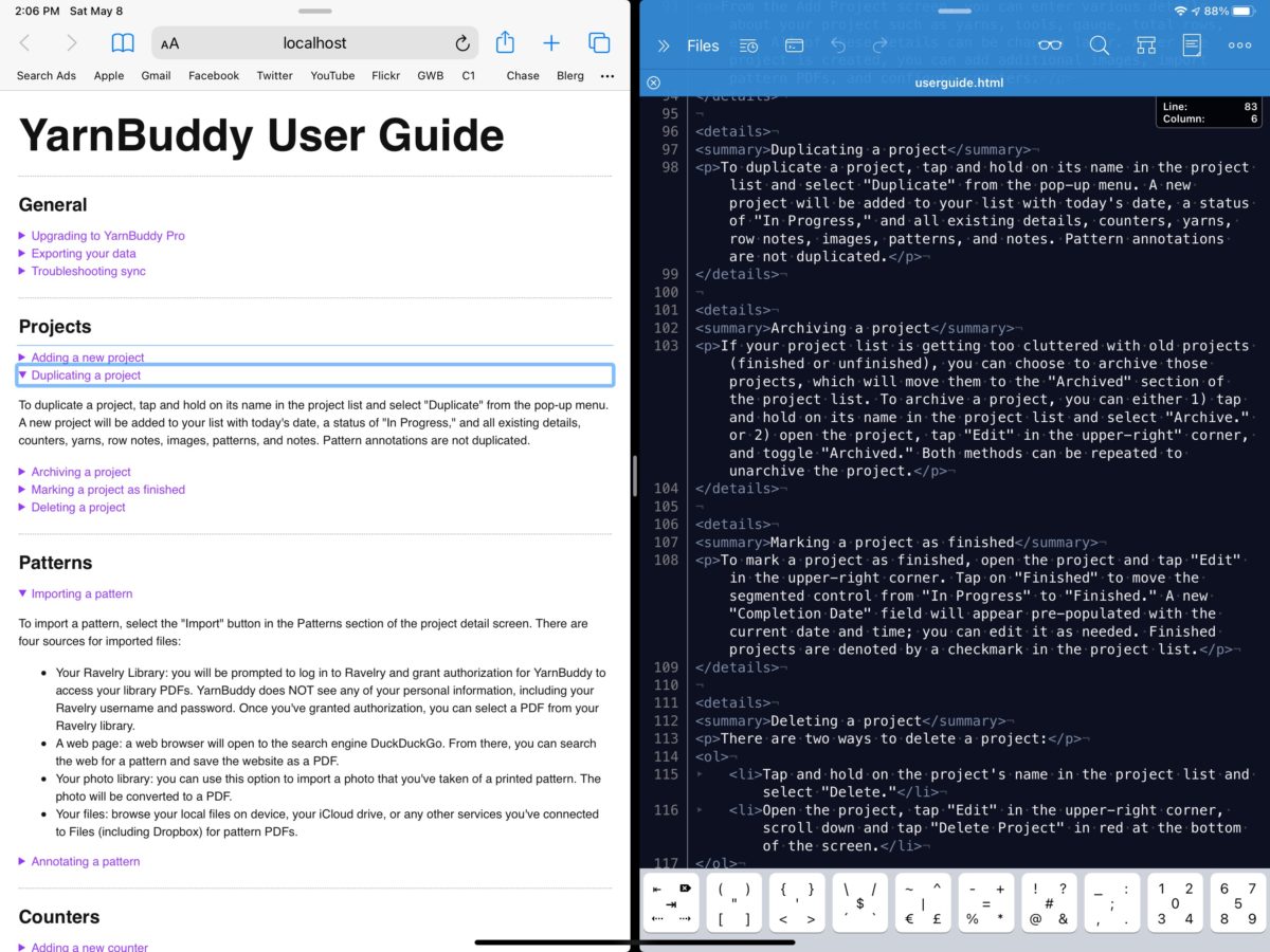
Finally, users can now export their yarn stash as a CSV file. This turned out to be trivially easy, and you can see my entire implementation of it below. If you’re horrified by my lack of error handling, please know that the rest of the app is even worse; it will absolutely give you the heebie-jeebies…just a total wasteland filled with roving packs of feral errors running amok and destroying anything in their path.
struct YBStashCSV: FileDocument {

let managedObjectContext = CoreDataStack.shared.context

static var readableContentTypes: [UTType] { [UTType.commaSeparatedText] }
static var writableContentTypes: [UTType] { [UTType.commaSeparatedText] }

static let yarnWeights = ["Lace (0), Light Fingering, 1-3 ply",
                          "Super Fine (1), Fingering, 4 ply",
                          "Fine (2), Sport, 5 ply",
                          "Light (3), DK, 8 ply",
                          "Medium (4), Worsted/Aran, 10 ply",
                          "Bulky (5), Chunky, 12 ply",
                          "Super Bulky (6), Roving",
                          "Jumbo (7)"]
init() { }

init(configuration: ReadConfiguration) throws {

}

func fileWrapper(configuration: WriteConfiguration) throws -> FileWrapper {

    let csvText = createCSV()
    return FileWrapper(regularFileWithContents: csvText.data(using: .utf8) ?? Data())

}

func createCSV() -> String {
    let fetchRequest = NSFetchRequest<Yarn>(entityName: "Yarn")
    fetchRequest.resultType = .managedObjectResultType

    var stashString = ""
    stashString.append(contentsOf: "Name,Colorway,Color Family,Dye Lot,Quantity,Remaining,Weight,Length,Net Weight,Fiber Type,Purchase Location,Date Added,Notes\n")

    do {
        let allYarn = try managedObjectContext.fetch(fetchRequest)
        let stash = allYarn.filter({ $0.isStashed })

        for yarn in stash {
            var notesString = ""
            for note in yarn.notesArray {
                notesString.append("\(note.wrappedText)\n")
            }
            stashString.append("\"\(yarn.wrappedName)\",\"\(yarn.wrappedColorName)\",\"\(yarn.wrappedColorFamily)\",\"\(yarn.dyeLot)\",\"\(yarn.quantityValue) \(yarn.wrappedQuantityUnit)\",\"\(yarn.customRemainingString.isEmpty ? yarn.estimatedQuantityRemainingString : yarn.customRemainingString)\",\"\(Self.yarnWeights[Int(yarn.weight)])\",\"\(yarn.lengthString)\",\"\(yarn.weightString)\",\"\(yarn.wrappedFiberType)\",\"\(yarn.wrappedPurchaseLocation)\",\"\(yarn.dateAdded ?? Date())\",\"\(notesString)\"\n")
        }
    } catch let error {
        print(error)
    }
    return stashString
    }
}