What I’m Excited About/Hoping for at WWDC 2022

It’s kitten season here at the farm. As I type this, I’m sitting at the bottom of the stairs near the dining room, keeping an eye on a shoebox full of black and white furballs. We had to pry them from their safe spot under our deck so the exterminator could treat around our house for termites (ugh). In a couple hours, we’ll return them to their mom, who will likely find a different spot for them. (Note: I wrote this earlier today.)

The past few months have really flown by. In March, we decided to build a greenhouse against one side of our garage. My husband has a degree in building construction; he poured the concrete for the foundation on March 4 and we had plants in the greenhouse on March 29, which still amazes me tbh. It still needs a few finishing touches, but in the meantime we’re having fun learning how to grow a variety of veggies, fruits, and flowers. We’re hoping we’ll be able to keep it warm enough in the winter to continue our gardening hobby year-round.

Last month, my son finished kindergarten. ? I still can’t quite process how fast his first year of school went. Thankfully he loved it and can’t wait to go back!

All that’s to say: WWDC kinda crept up on me this year. It had always been my plan to shift gears at the beginning of June, pausing work on my SpriteKit game to prepare an update for YarnBuddy and take in all of the new goodies Apple will announce in just two days’ time. Some weird animation bugs have cropped up in YarnBuddy over the past few iOS point releases (thanks SwiftUI!), so I need to deal with those, as well as add the ability to export projects as nicely-formatted PDF files. Eventually, I need to start working on the foundation of a crowd-sourced yarn database.

There have been so many cool rumors swirling around the conference this year—those, combined with the in-person element and lack of developer-relations kerfuffles have contributed to what seems like an unprecedented amount of hype. Here are a few things I’m hoping to see, in no particular order:

  • A redesigned MacBook Air with an M2 chip. I’m hoping for a green or orange one, but Mark Gurman thinks the only new color might be blue, which would also be rad. I’m still hoping they’ll go with white bezels just for that pure iBook nostalgia.
  • More ways to customize the Home Screen or Lock Screen on iOS and iPadOS. I love the idea of an old school Mac-like Dashboard with live, interactive widgets. It’s also way past time to be able to insert blank spaces into our app icon layouts.
  • A first-party professional iPad app. There have been interesting rumors about yet another revamp of iPad multitasking, possibly involving (gasp) floating windows. What better way to demo this new “pro” mode than with a new pro app? Something that involves multiple windows and/or moveable floating tool panels, etc.
  • The announcement of Apple’s new standalone classical music app. I enjoy listening to classical (especially choral music) and I’m looking forward to having an app specifically optimized for that purpose.
  • SwiftUI improvements. I still don’t regret the decision to write YarnBuddy entirely in SwiftUI; however, it would be nice to be able to start phasing out some of the weird hacks and workarounds I’ve had to come up with to make the app look and work the way it does. For example, there’s still no true collection view equivalent. Navigation could use a re-think, or at the very least, some official guidance. Core Data integration is okay-ish, but it’s needlessly difficult to make it possible for users to sort and filter a fetch request. Any and all improvements are welcome, so I’m excited to see what the team has been working on this year (though I, like others, think SwiftUI needs to be decoupled from the annual OS upgrade cycle).
  • New and/or third-party watch faces. When I think of all the amazing designers I follow on Twitter, it makes me sad to imagine the gorgeous, fun watch faces they could come up with that will probably never see the light of day. I’m hoping this is the year Apple gives up its tight control over watch face design and gives designers a simple API for building and sharing (selling?) watch faces. Even if there are a limited number of third parties (Nintendo??), I’d call it a win.
  • Augmented reality stuff! As someone who gets really bad motion sickness, I’ve never been interested in virtual reality. Augmented reality, however, interests me. I can see its potential for good in areas like navigation, accessibility, and collecting Pokémon. I get a kind of uneasy feeling, though, when I consider the possible negative social consequences of wearing a computer on your face. Maybe I’ll have to write more about that someday.
  • Flat design is just…well, over. It’s been on the way out for awhile, but it’s time for us to save the good bits and jettison the rest of it straight into the sun. In other words: here’s hoping Apple puts the final nail in the coffin on that weird chapter of mobile app design. I just want my apps to have personality again, you know? Not in a garish way, but a beautiful, fun way.

What are you hoping for this year? Although I won’t be there in person, I’m looking forward to watching the keynote at home and watching sessions whenever I can find a free moment. I really enjoyed the Digital Lounges last year, so I signed up for more this time around. I’m also hoping I can try at least one of the challenges.

I hope you all have an awesome week, whatever you’re doing! And don’t get stressed about all the new stuff…remember: the summer is long, the videos can be rewatched, you probably have to support older OSes anyway, and Apple won’t have half of their own bugs worked out until maybe next spring. So relax! Happy WWDC!
Wishes for WWDC 2021

‘Tis the season for WWDC rumors, predictions, and wishlists! Spring is off to a shaky start here in Nebraska; we’ve had a series of colder, windy days that seem more at home in March than May, and the forecast for the coming weeks is much more “April showers” than “May flowers.” However, the foliage is definitely greening, the birds are still singing, and, best of all, we have kittens on our farm again (somewhere between 3 and 8…one of the two litters was moved to an undisclosed location by the momma cat).

My husband and I are fully vaccinated, nearby parks, zoos, and orchards are starting to plan fun outdoor activities, and things are generally looking up around here. Of course, I know that’s not true for everyone; I just want to express my gratitude for the circumstances I’m in, and I hope things are looking up for you as well.

There are things to celebrate even in hard times, and WWDC is when we all get to celebrate Apple engineers’ hard work over the past year. I really enjoy reading wishlists and predictions, so this year I’ve compiled a WWDC 2021 Community Wishlist. You’re welcome to contribute, just submit a pull request (or send me a note on Twitter and I’ll add it for you).

Here are a few things I’m hoping to see next month:

SwiftUI

  • Native search bar & pull-to-refresh
  • Ability for views to become/resign first responder, and to identify the current first responder
  • For List and Form to either drop their UIKit backing or be much more customizable (cell selection style and behavior, list background colors, etc. without using appearance APIs)
  • Iron out all of the NavigationView/NavigationLink bugs. It seems like there’s some regression in this area with every single update. Also, native navigation bar customizations that don’t require the appearance API (background color, text color, etc.)
  • A way to change the status bar style (light/dark) at runtime using the SwiftUI app life cycle
  • Some sort of “bottom sheet” view that can be pulled up and expanded
  • Accessory views for TextFields/TextViews
  • Inactive/destructive states in Context Menus
  • Context menu preview-providers (for showing a custom preview on long-press/right-click)
  • SwiftUI version of UIVisualEffectView
  • Native support for the share sheet

iPad

  • A first-party code editor for iPadOS that supports SwiftUI, UIKit, live previews, Swift Package Manager, light debugging tools, and the ability to archive and submit builds to App Store Connect
  • Another Home Screen overhaul for iPad, allowing widgets to be moved anywhere
  • An iPad feature similar to App Library but that is actually more like LaunchPad
  • The ability to back up to an external drive (i.e. Time Machine)

Everything Else

  • The ability to see and configure Smart Mailboxes in Mail for iOS
  • A method for adding third-party wallpapers that won’t clutter up your Photo Library and also supports light/dark mode
  • TestFlight for Mac
  • Some degree of widget interactivity. I would love to be able to easily start/stop timers, check to-do items, increment a counter, etc.
  • Third-party Apple Watch faces (?)
  • For Apple to chill out and allow apps like Riley Testut’s Delta emulator to be installed on iOS devices in some sanctioned way (remember, emulators are not illegal)
  • For Apple to chill out and let developers accept payments via some approved processors (i.e. Stripe)
  • Improved TestFlight beta review times (or, just ditch the whole review process in its current form)
  • Subscription cancellation API for developers.

I’m sure I’ll think of more things in the coming weeks. Don’t forget to check out the WWDC 2021 Community Wishlist!

My WWDC 2020 Wishlist

As of today, Apple’s first-ever online-only version of WWDC is 40(!) days away. As always, I’m incredibly excited to see what Apple has in store for us (although I must say, I’m really disappointed we don’t all get the chance to own a WWDC 2020 jacket and pin set…?). And since YarnBuddy is written entirely in SwiftUI, I’m particularly looking forward to the next iteration of Apple’s new declarative UI framework.

I’ll go ahead and divide my wishlist into “SwiftUI” and “Everything Else.”

SwiftUI: Missing Pieces

Most of my issues with SwiftUI boil down to 1) Missing UI elements and 2) Missing customizations. Here’s a run-down of what I’m looking for in SwiftUI 2.0:

  • A collection view of some kind
  • A multi-line editable text view
  • A search bar
  • The ability to manage which object is first responder and to resign objects as first responder
  • Accessory views for TextFields/TextViews
  • Inactive/destructive states in Context Menus
  • Context menu preview-providers (for showing a custom preview on long-press/right-click)
  • Style parity with UIKit, including the new system colors and materials, the grouped inset table style, and the appearance APIs for styling things like navigation bars,tab bars, etc.
  • Correct state restoration for TabViews and a fix for the frame delay/flash when switching tabs
  • A way to prevent modals from being dismissed by dragging (and/or a full-screen modal style)
  • A way to read the scroll position of a scroll view
  • Smoother interoperability with QLPreviewController and PencilKit

Everything Else

I would really like to see an easier way to support the native Apple Pencil mark-up tools in PDFKit. In addition, I would love to see:

  • A complete re-design of Mail. There is no perfect e-mail client, but like, maybe Apple could try or something?
  • A system-wide color picker in iOS. It’s bananas that I can’t select some text in Apple Notes on my iPad and change its color. From what I can tell, every single Mac app has access to the color picker. As the great 21st-century philosopher Shia Labeouf once said, “JUST DO IT!” ?
  • Apple Watch sleep tracking. There are great apps for this, but I’d like to see Apple’s take on it as well.
  • Some sort of IDE for iPad that would allow me to work on my Xcode projects with some limitations. If I have a project that’s SwiftUI or UIKit with no storyboards and the only third-party dependencies were installed via the Swift Package Manager, I would expect to be able to edit and preview projects in this app. Could I release them straight to the App Store? Maybe not. Could I run the apps on an attached device? Maybe not. I just want to get some work done, yo.
  • More home screen customization. Let us have an empty row at the top if we want. Give us some widgets. Allow for some chaos. Set us freeeeee.
  • De. Fault. Apps. Let me change them.
  • A way to automatically put my Apple Watch in theater mode at night so I don’t accidentally blind myself every time I move.
  • A revamped iPad multitasking system (yep, just do it again until it’s right) that isn’t big ol’ hot mess. Make it so my 4-year-old can figure it out.
  • Third-party Apple Watch faces (ahahahaha).

I think that’s all I have. If I think of anything else, I’ll throw some edits down below this paragraph. Now it’s your turn: what do you wish for this year? I always love reading everyone’s wish lists, so feel free to tweet them at me or mention me on Micro.blog.

My iPad Wishlist

Last month, I wrote about why my current MacBook Pro may be my last Mac. To summarize: even though I love the Mac, I really enjoy using iOS and am betting that in 3-4 years, when I’m ready to upgrade my computer, the new model of iPad Pro will be able to fit all of my computing needs. Yesterday, Ryan Christoffel over at MacStories wrote a post entitled “What I Wish the iPad Would Gain from the Mac.” He had some good ideas; I particularly agreed with his requests for multiple instances of the same app and persistent background privileges for apps. Here are some other things on my iPad wishlist:

Time Machine backups

Cloud backups are great and all, but who wants to put all their eggs in one basket? I sure don’t. That’s why I’d like to be able to backup my iPad by connecting it directly to an external hard drive. Sure, you can connect an iPad to your Mac and back it up that way…but if the point is to go Macless, then the iPad needs its own independent solution for creating physical backups.

Default apps, file handling, etc.

On my Mac, I have Safari set to automatically download files to my Desktop. I’d love an option in Safari for iOS to just download all files, no matter what type they are, to some designated folder in the Files app. These downloads should be displayed in a magical pane called a “download manager,” with fancy progress bars and “time remainings” and the whole kit and caboodle. Then, from Files, I should be able to tap on a file and it will automatically open in a default app of my choosing (unless I choose a different app from a menu of available apps).

Yes, I just described exactly how that works on a Mac.

Editing a file with multiple applications on iOS feels like a game of hot potato: the file gets passed from app to app, but nobody wants to own it and God forbid it “land” anywhere. Coming from the Mac, I like my files to have a home outside any one application. Files.app attempts to achieve this, but the existence of app-specific folders confuses things. It’s as if the transition from “let’s abstract away the file system” to “okay…I guess we can show you some of the files” was never quite completed. I don’t care about accessing hidden system files or anything, I just want Apple to firmly decide what mental model they want users to have when it comes to file management on iOS, and then use the basic principles of design to clearly communicate that.

iPad-only design paradigms/UI controls

Size classes aren’t good enough. There, I said it. The iPad needs more than just UISplitViewController: it needs more UI controls that are tailor-made for it. It needs its own coherent design language that is an extension of the iPhone’s: similar in spirit, but different. All of this needs to take into account the different ways that people use an iPad: on their lap with no hardware peripherals, with a keyboard, with an Apple Pencil or other stylus, etc.

Most importantly, Apple needs to lead the way on this with its own first party pro software. I think they should start with Logic, and charge a hefty price for it. That would be helpful.

And okay, can we talk about the fact that the 12.9″ iPad Pro has a resolution of 2048 x 2732 and still only shows, what, six app icons per home screen page? (an exaggeration, I know…but good grief!)

Multi-tasking improvements

I would love the ability to have some persistent “spaces” on my iPad of some kind. In other words, a set of side-by-side apps that always remained a pair no matter what. For instance, I’m imagining a space labeled “podcasting” that showed a recording app, a chat room app, and a slide-over with notes, or something. An app would be able to be associated with multiple spaces. I think this approach would fit a lot better with the way most people work.

Xcode, but probably not Xcode exactly

The last thing I really need in order to live the iPad Life is a way to develop apps on it. With wireless debugging now a reality, and a rumored API that would bring some cohesiveness to Mac and iOS development (I’m betting that’ll be Swift-only), a full-fledged IDE for iPad seems more possible and more likely than ever. I doubt it’ll support Objective C, and it’ll probably push Storyboards more than ever, and I’ll love it so so much.

Anyway, I’m pretty sure all of these things have been mentioned by other people a zillion times, but they’re also the things that are most important to me, personally. And that’s why you read this, right?

2016 MacBook Pro Wishlist

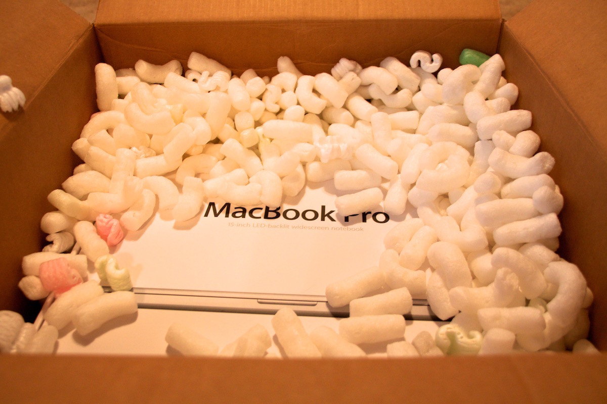
In March, my 15-inch MacBook Pro will be 5 years old. It doesn’t have a Retina display or a Force Touch trackpad, it has an optical drive and a Firewire 800 port, and it weighs about 5.6 pounds. In other words, it’s a clunky, pixelated behemoth, and though it’s served me very well over the years, I can’t wait to say goodbye to it.

Unboxing photo from March 4, 2011

Unboxing photo from March 4, 2011

Here are my hopes and dreams for the new Skylake MacBook Pros that will supposedly be released early next year, in no particular order:

  1. Lighter. According to Apple, the average weight of the current 15″ MacBook Pro is about 4.49 pounds. Given the company’s unwavering commitment to shrinking things, I think I can reasonably expect that number to drop a bit for next year’s models.
  2. Touch ID. Because why not?
  3. Individually backlit keys. I don’t really want to see any changes to the key travel, but those backlit keys on the new MacBook are rad.
  4. Wider color gamut, like the new iMacs. I don’t know if this is technically possible because I have zero knowledge about display technology. However, since MacBook Pros are generally geared toward creative professionals, this would be a change that makes sense.
  5. Different finishes. Gold. Space Gray. Black. White. I don’t really care, as long as it’s not just stupid boring silver. Ugh.
  6. USB-C/Thunderbolt 3 ports. Because if I’m going to be using this laptop for another 5 years, it needs to have the Port of the Future. Or whatever.

Ok, now for some truly weird suggestions. WHAT IF:

  • The trackpad was bigger and had built-in Pencil support. Like a mini built-in Wacom tablet. I know: crazy.
  • You could change the color of the LEDs behind the keyboard. Psychedelic.

Mostly, I just hope the darn things come out soon. I know we’re waiting on Intel’s Skylake H-series chips with Iris Pro graphics, but I mean, early 2016 could mean anything from January to April, and I don’t know if I can wait that long!