Wrapping Algorithms in Empathy

One feature I’d like to add to Snapthread is something akin to the “For You” section of Photos: a small number of auto-generated movies that the user might find useful or meaningful. In Photos, these movies are based on common image properties such as date, location, relationships gleaned from facial recognition and contacts data, and image content classified via machine learning such as dogs, cats, and bodies of water.

I don’t have access to the facial recognition data that Photos collects, and as anyone who’s had the pleasure of syncing their iCloud Photo Library to a new device knows, feeding tens of thousands of photos through an image classification algorithm takes a long time and can burn processing and battery power like nobody’s business. That leaves me with two methods for grouping photos and videos: date and location.

Attempting to smartly group a user’s photos by location without knowing where they consider “home” is pretty much impossible. Are those vacation photos, or just bathroom selfies? I don’t know. I don’t want to know. That leaves me with the safest, least creepy option: capture date.

At the surface level, organizing photos for a user based on their date seems super innocuous—that is, until we stop to recall what a disaster it was for Facebook when they first presented auto-generated “Year in Review” videos to every single user. While some people smiled at memories of a happy year, others were intensely and abruptly reminded of lost loved ones, breakups, illnesses, and other emotional events. In fact, it was re-reading Eric Meyer’s heartbreaking blog post about it that made me pause and think twice about adding this feature.

Some years just aren’t good years. There’s no way for an algorithm to know that. There are, however, steps I can take as a developer to design my “For You” feature with the worst case scenarios in mind:

  1. Make the feature opt-in. This would involve unobtrusively asking the user if they’d like to see some suggested movie projects. The preference would also be available as a toggle in the app’s settings.
  2. Don’t auto-play anything. Even if a user has opted in, they may not want to view a particular suggested movie for whatever reason. I don’t want to force it on them.
  3. Make the whole “For You” section collapsible. Maybe a user just doesn’t like that particular day’s suggestions. Let them hide the thumbnails so they don’t have to look at them.
  4. Make the movies editable. Maybe there’s just one or two videos that ruin an otherwise great movie. Let users delete/replace them.
  5. Don’t add any titles or captions that suggest a particular mood, like “Summer Fun” or “My Great Year” etc. Just stick to dates.

There are two types of auto-generated movies I’d like to offer: ones based on recent photos/videos (such as “last month” or “today”) that are designed to get users up and running quickly, and memories from awhile ago, such as “on this day.” I don’t think the recent ones need safeguards: after all, those are photos you’d see if you opened up your library anyway. It’s the ones from years ago that I need to be sensitive about.

Curating someone’s personal memories is challenging. At best, it can surprise and delight; at worst, it can be painful, invasive, and just downright creepy. We app devs may not have to take any sort of Hippocratic oath, but we probably should. If, like me, you’re considering adding some kind of personalized content to your app, tread carefully, and design with worst case scenarios in mind.
iOS 13 Summer Plans

Yesterday I finally had some time to sit and think about what improvements I want to make to Snapthread this summer. I still want to rewrite the app using SwiftUI; however, after a bit of exploration, I think I may need to wait until it’s a little more capable. Here’s what I’m planning to do instead.

Phase 1

I want to leave the app in a good place for my iOS 11 and 12 users. To do that, I want to add a few more soundtracks to choose from and a tool for adjusting a video clip’s speed.

Phase 2

Based on everything that was revealed at WWDC, here’s what I want to do after I set the minimum OS target to iOS 13:

  • Rewrite my UICollectionView code to use the new compositional layout class and diffable data source
  • Redesign my photo library picker. Apple has deprecated the methods I was using to fetch “Moments,” so I will need to do something else to help users find the photos and videos they’re looking for.
  • Explore some of the new property wrappers, like @UserDefault
  • Replace my icons with SF Symbols and design a few custom ones
  • Replace my colors and font sizes with semantic ones and set the whole app to use dark mode
  • Use the new system provided font picker
  • Possibly rewrite two view controllers in SwiftUI: Settings and Soundtracks
  • If I have time, create some more custom Core Image filters

Doing everything on that list should help rid my code of most of its remaining bugs and set the app up well for the future. I can’t wait to get started!

Snapthread 2.0 is Now Available!

Snapthread 2.0 is live on the App Store as of yesterday, and so far I’m very happy with how it’s been received. I thought I’d write a bit about some of the new features, and my ideas for the app going forward.

I already wrote about Snapthread’s new data recovery feature, which, to be honest, has lifted an emotional burden that’s been weighing on me ever since I got my first negative review. I feel like I can finally relax and just focus on the cool features I want to add instead of obsessing over every little crash, a few of which have been out of my hands.

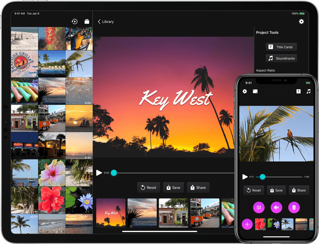
Another one of my design goals for 2.0 was to make the app even more user-friendly. It’s possible that Apple will make iOS 13’s default stock buttons look more like…well, buttons… but I didn’t want to wait until June to find out. So, I brushed up on my very basic graphic design skills and got to work making some buttons in Affinity Designer. They have gradients, and drop shadows, and noise, and I think they look nice. The dark gray buttons you see in the app have an image background that has been sliced so that it can easily expand to fit its contents. On iPad, most buttons have both an icon and a text label.

I also moved several buttons to new locations. It bothered me that the top navigation bar had an unbalanced number of icons on each side, so I decided to take two common actions, share and reset, and move them closer to the bottom of the screen. I also heard from some users who wanted a separate “save” button apart from the one in the share sheet, so I added that as well. To regain some space for the video preview, I moved the aspect ratio button to the navigation bar.

Earlier I wrote about how I wanted to refactor the entire app to use container view controllers. Instead of popping up a new modal view controller every time the user selected an editing tool, I wanted to gracefully transition between view controllers by fading them in and out. Now, the app’s main view controller has three containers: a small one at the top for displaying banners and progress bars, a middle one for displaying video content, and a bottom one for displaying various controls. For the iPad version, a fourth container runs vertically along the right side. I’m still working on making the code cleaner (it’s kind of a tangled mess of delegates right now), but it works, and it feels much snappier to me.

Prior to 2.0, there was no way to tell which clip in your timeline was currently playing. Now when you tap the play button, every thumbnail in the timeline darkens slightly except for the currently playing clip. There was also no way to know what a clip’s duration was while you were trimming it…now, there’s a handy label with that information (there’s still more I need to do to make trimming a better experience, but this should help at least a little!). You can now adjust the crop rectangle of landscape and portrait videos when you’re not using letterboxing; previously, that feature was only available if you selected a square aspect ratio. And speaking of square videos: they can now be letterboxed as well. Before, if you added a square video or photo to your project it would force the aspect ratio to be square.

I use a ridiculous hack to get a dark appearance for this action sheet. I’m hoping iOS 13 will eliminate the need for that!

The iPad version now includes a bunch of keyboard shortcuts. A full list of them can be found over at Snapthread’s spiffy new website. One of my wishes for WWDC is for a way to use the keyboard to navigate a collection view. In other words, you could use the arrow keys to say, zip through your photo library and select/preview images and videos. There’s currently no way to implement that (at least that I can figure out), so you still have to reach up and poke the screen to select your clips.

Last but not least, you can now rotate photos and videos, add text overlays, add a bounce effect (from within the Loop tool), and add filters. There’s a mix of Apple’s built-in filters and a few I created myself, named after towns in Nebraska. I also did my best to recreate Apple’s Silvertone filter, as it’s not available to developers (at least not that I could find!). Creating Core Image filters by chaining a bunch of adjustments together is kind of fun, and I definitely plan to add more filters to the list.

I have a long list of improvements to make and features I’d like to add to Snapthread in the future. Some of them I’d like to keep under wraps (just in case they don’t work out, ha), but others are just more basic things you would expect from a video editor: stickers, speed adjustments, an optional Ken Burns effect, etc. I’d also like to make improvements to some of the existing tools before going wild and adding more. For instance, adding text overlays can be a little janky at times. iCloud downloads can be canceled but not restarted, which is frustrating. Trimming could be more precise. The crop tool could allow zooming.

Now, it might be that none of that seems particularly remarkable, and you might wonder why Snapthread 2.0 is a big deal at all, as most video editing apps already have the same basic tools (and more!). It’s a big deal to me because I’m only one person, because I’m still mostly a beginning programmer, and because I really care about it. It might be a big deal to you because it’s one of only two or three apps on the store that merge Live Photos, and now, it’s better than ever. ?

Data Recovery in Snapthread 2.0

tl;dr: The Codable protocol truly is great for lightweight data storage.

For me, the hardest part about being an app developer has been hearing from users who have lost work (and precious time) due to bugs in my app. Video editing apps in general are notorious for crashing, and I believe it’s partially due to Apple’s poor documentation of AVFoundation and its myriad error codes. There’s also a foggy concept of “media pipelines” that are managed by iOS itself, are used for playing and exporting media, are completely undocumented, and are limited in number based on, from what I can tell, device chip. If you exhaust those pipelines, stuff just doesn’t work. It’s frustrating.

I’ve been largely resistant to the idea of adding project management to Snapthread. It’s an added layer of complexity that feels beyond the scope of Snapthread’s mission to be a light, casual video editor. Perhaps worst of all, it invites a developer’s most dreaded user expectation: syncing. I knew I had to find a way to save users’ work without building a big, heavy data layer.

I decided to explore the Codable protocol, and slowly began conforming all of my model data to it. I quickly ran into some roadblocks, but nothing too serious. First, UIColor and CMTime do not conform to Codable. However, CMTime can be made to comply with a little tweaking, and UIColor just needed a wrapper struct. For title cards, I needed to store a thumbnail image and possibly a custom background image. I tried converting them to a Base64 string and saving them that way, and it worked great!

I decided not to cache any other media files like photos, videos, or music. Instead, I simply save identifiers that will allow Snapthread to refetch them. Since they’ve already been recently downloaded from iCloud (or were already local on device), refetching takes a trivial amount of time. Additionally, nearly all edits a user makes to a video clip are stored as parameters and applied at the time the final video is composited, so no actual permanent changes are made to the original files.

Another problem I ran into was protocols not playing nicely with Codable (because they don’t conform to themselves…whatever that means). I ended up creating some base structs for my protocols as a workaround. I hate adding extra layers of abstraction like that, but it worked, and now all of my model classes like Clip, StillPhoto, and Title, all of which conform to a protocol called Threadable, can easily be encoded from an array of Threadable.

I used a helper class called Storage by Saoud M. Rizwan to easily cache the user’s current project by saving and retrieving a single .json file to/from the Documents folder. Snapthread caches the project every time a change is made and only deletes the cached data when the user saves or shares the video. Therefore, if the app crashes (or is force quit) before the video is exported, it will offer to recover the project when the app is opened again.

I’m really hoping this cuts down on the number of frustrated users. Personally, I don’t mind if an app crashes as long as I can resume what I was doing with little to no effort. This should allow Snapthread users to do that.

Journey to 2.0: Container View Controllers

One of the major structural changes I need to accomplish for Snapthread 2.0 is switching to the use of container view controllers. For those who don’t know, container view controllers allow you to embed one or more view controllers inside a parent view controller, which can then manage transitions between its children. UINavigationController and UITabBarController are examples of container view controllers in UIKit, but you can also create your own.

I’ve never used custom container view controllers before, so of course I hit Google to see what I could find. John Sundell has a great introduction to the topic and I really liked the series by Mike Woelmer as well. (Edit: I also meant to include this fantastic article by Ben Sandofsky) The first thing I learned was that if you want to be able to switch between child view controllers, you should probably set them up in code instead of Interface Builder, which only allows a single embed segue between parent and child. I wasn’t ready for that though, so I decided to take a baby step and find a situation where a single parent-child relationship made sense.

Snapthread’s main view controller is…well, massive. I’m too embarrassed to tell you how many lines of code it is, but after combing through it, I realized at least 400 lines were devoted to setting up the AVPlayer, handling play/pause events, observing the status of the current AVPlayerItem, scrubbing, adding the watermark, etc. Clearly, the video player was a good candidate for having its own view controller.

So, I created a VideoPlayerViewController class and began copy and pasting everything relevant to setting up the AVPlayerLayer, displaying time elapsed/remaining, scrubbing, etc. In Interface Builder, I added a new view controller and copied over the video preview view, which is a custom UIView class that resizes its own AVPlayerLayer, and the player controls.

I deleted the video player and controls from my main view controller and replaced it with a container view from the Object Library. I hooked it up to my new view controller using an embed segue.

Next, I had to figure out how to communicate between my main view controller and the video player. Communicating between the player and its parent was easy; I just set up a delegate with methods for responding to changes in AVPlayerItem status and duration (if it exceeds a certain duration, the UI displays a warning that the user needs to purchase Premium in order to export). I set the delegate using prepare(for segue:), which is called when the child VC is embedded.

There were times when I needed to tell the player to do something from the main view controller, however, such as hide its controls or clear its watermark. I wasn’t quite sure how to handle that. Using notifications was one option, but it just didn’t feel right for some reason. I ended up storing a reference to my VideoPlayerViewController and referencing it directly. That’s probably bad practice, but I’m pretty sure it’ll be okay, as I don’t plan on using that particular video player with any other view controller.

Overall, I feel slightly more comfortable using container views now, and I think I’m ready to tackle the next step: transitioning between child view controllers. I plan to post more about new things I’m learning; each of those posts will be prefaced by “Journey to 2.0” if you’re interested (or want to ignore them, lol).

2.0 Design Goals

Happy New Year! ? I hope 2019 is off to a good start for you. I’ve been slowly getting back into coding since my daughter was born, sneaking in 30 minutes here and there in the evenings after the kids are asleep. I’m hoping to get Snapthread 1.9 submitted soon; it contains bug fixes, rudimentary support for still photos, the ability to loop clips, and makes the app compatible with the new iPad Pro screen sizes.

That said, I’m already thinking about Snapthread’s big 2.0 update. I don’t usually do “major releases” because I prefer to get new features out quickly, but now feels like the right time to slow down and really do a lot of work and polishing. A big update also invites more press coverage, is an opportunity for marketing, and can get Apple’s attention…gotta work toward that Apple Design Award, you know. ?

My design goals for Snapthread 2.0 are simple and twofold:

  1. Improve accessibility. This will involve making my buttons even more button-y and using text labels in addition to icons for added clarity.
  2. Consolidate functions. Currently, every tool for editing a clip opens up its own modal view, with its own video preview. My goal is to make the clip editing interface more modular, swapping out tools below the same preview so that all editing (muting, cropping, trimming, looping, etc.) happens in the same view controller.

There are many more additional improvements that I’m hoping to cram into 2.0…but we’ll see. Some of them include: video transitions, the ability to add text to clips, Ken Burns effect for still photos, non-buggy support for time-lapse and slow motion videos, and auto-saving of recent projects to guard against losing work. I also want to continue improving the title card selections.

In order to finish 2.0, I’m going to need a good task management app. After watching the beta evolve over the past year, I believe Capsicum by Illuminated Bits may be the best app for helping me accomplish my goals this year. My next post will be all about how I plan to use it!

Link

The Sweet Setup Review

The Sweet Setup Reviews Snapthread

I love this review of Snapthread by Josh Ginter, especially this paragraph:

These backdrops and Creative Commons music options are, again, very plain and simple. However, the point of the app is to be a quick and easy way to share Live Photos with non-iPhone users and with a little extra pizazz. Snapthread is not designed to replace iMovie, so feel free to export your video after the Live Photo conversion and do more major edits inside iMovie.

Josh really nails what Snapthread is all about: it’s meant to be simple and fast, with a few little extras for those who really want them. I’d absolutely advise people who want more control over music, titles, and other effects to continue editing in a more fully-featured editor like iMovie. I’ll continue to add more editing functions as time goes on, but my intention has always been to compete with super casual apps like Clips rather than bigger apps like iMovie.

I Forgot to Take Videos

I forgot to take videos for the first few days after my son Charlie was born. I made sure to pack a couple nice cameras in my hospital bag, and recall struggling against the harsh lighting in my recovery room (not to mention the constant stinging of my incision) to snap some semi-decent photos of my new little bundle. It felt like enough at the time, though now I wish I had done a little more.

Maybe I should have shelled out for the professional photographer. I definitely should have insisted my husband take more pictures of me holding Charlie. And I should have taken some videos, too. Over the past two years countless friends have had babies, and many of them took videos of some of their earliest moments. I find myself wishing I had done the same.

In a way though, I did. I was using an iPhone 6s when Charlie was born. I took a few photos of him at the hospital to easily send to family and friends, and of course took many [thousands] once we finally got home. I’ve always had Live Photos enabled, so each one of those snapshots recorded a tiny 3-second clip.

The clips are shaky, low-quality, and mostly lack sound (because the little guy was sleeping), but there’s just something about them. I’m glad they’re there. They add some “concreteness” to a time of my life that seems like a blur, in a way that a photo alone couldn’t quite accomplish.

When I’m considering how to record a moment, I almost always favor photographs over videos. After all, you can’t really hang a video on your wall. Live Photos make that choice even easier, and with an app like Snapthread, I can still salvage a great moment from a sub-par photo.

My hope for the future of Live Photos is that we won’t have to choose between taking the highest quality photo and capturing those precious little videos. Having portrait mode and adjustable depth data is amazing, but hearing my little boy’s laugh years later is perhaps even more so.

If all goes according to plan, I’ll be going in for a scheduled cesarean section two weeks from tomorrow and we’ll finally get to meet our little girl. You can bet I’ll be taking even more Live Photos (and longer videos too) this time around.

If you use Snapthread to share some of your favorite moments publicly, I’d love it if you’d use the hashtag #snapthread or tag @snapthread (either on Twitter or Instagram) in your post so I can find them. And if you’ve written an article or blog post about how Live Photos in general have affected your life, I’d love to read that too!

Moving from Paid Upfront to Freemium: Logistics

If you’re thinking about switching your app’s business model from paid upfront to freemium and, like me, have no experience working with servers, I’m here to tell you that local receipt validation isn’t as horrible as it seems.

If you’re unconcerned about piracy and simply want to check to see which version of your app was originally purchased, I highly recommend following this tutorial by Andrew Bancroft: Local Receipt Validation for iOS in Swift From Start to Finish. What I did was skim through each step of the tutorial first to see what was involved. Then, I grabbed Andrew’s code from GitHub and read more carefully through the tutorial, copying files from his project to mine as needed.

Andrew’s tutorial doesn’t go into detail about how to check for original app version, which is why I’m writing this. Hopefully someone will find it useful!

Every time Snapthread’s main view controller loads, it runs a function called checkIAPStatus(). Here’s what that function does, in pseudocode:

if the “purchasedPremium” UserDefault has been set, don’t do anything because everything is already unlocked

else if a UserDefault that I set in the previous release of Snapthread called “originallyPurchasedPaidVersion” is true, unlock everything and set the “purchasedPremium” default (this covers users who paid upfront and have used Snapthread recently enough to have had the default set)

else retrieve and validate the receipt using the ReceiptValidator class created in the tutorial (it returns a ParsedReceipt struct if successful) and examine it for originally purchased app version

NOTE: One of the most important things to remember is that the receipt doesn’t list the original App Store version number that was purchased (such as 1.0, 1.1, etc.). Instead it lists the original build number. So you’ll have to note the final build number of your paid upfront version and check against that.

When you ask your ReceiptValidator to validate a receipt, it returns an enum that may or may not have an associated value (either .success, with a ParsedReceipt struct, or .error). So you can do a switch statement on the result, and do something like case .success(let receipt): to grab a reference to the associated ParsedReceipt so you can look at it.

The originalAppVersion property of the ParsedReceipt struct is a String, so you’ll want to convert it to an Int in order to do a less-than comparison.

The only real downside, in my opinion, to doing local receipt validation using Andrew’s method is that it uses OpenSSL, which requires you to disable Bitcode in your project because it doesn’t support it. Disabling Bitcode is easy, but can cause you to get a weird e-mail from the App Store after uploading a build telling you you’ve got extra symbol files, or something like that. It’s just a warning and doesn’t prevent your build from going through or anything, but I was confused by it.

So far I haven’t received any complaints from previous purchasers who can’t export long videos or are seeing a watermark, so I’m guessing I must have done something right!

Snapthread is Now Free!

Snapthread 1.8 is now available with a brand new business model and a gorgeous new icon designed by the incredibly talented Michael Flarup. The update includes mostly minor improvements, including the ability to select entire “Moments” of photos in one fell swoop as well as a button for quickly generating a video from your most recent photos.

There’s something about having a truly great icon that’s made me feel more dedicated to Snapthread than ever. There are so many improvements I still want to make as well—enough to keep me busy for a long, long time. In a way it’s become a sort of playground for me to practice and develop my programming skills, and I love the endless challenge of improving it.

Anyway, I hope you’ll consider giving Snapthread a try. You can use all of the app’s features for free with only two limitations: a watermark in the lower left corner and a 30-second limit for video exports.

Here are three things you can do quickly and easily with Snapthread:

  • Stitch together Live Photos of your kids, pets, latest vacation, etc.
  • Combine portrait videos for IGTV
  • Mix Live Photos and regular videos together

Thanks for all of your support, and extra special thanks to my awesome beta testers and translators. I couldn’t do this without you!

Looking Ahead

It’s been quite a summer. This pregnancy has been pretty miserable compared to my first; a combination of loosening ligaments and chronic lower back/hip issues has made walking extremely painful, and it’s been hard for Charlie to understand that I can’t play with him exactly like I used to. On the other hand, baby is healthy and the end is in sight with only 8 weeks to go!

Snapthread’s revenue dropped off considerably about two weeks ago, so I’m particularly eager to transition to a freemium model to see if that helps. In the free version you will be able to export videos up to 30 seconds long, with a watermark. You can create a longer movie and preview it, but if you try to share it, you’ll get a prompt to upgrade (before that there will be a noticeable warning in the UI when the duration limit is exceeded). This approach will give people a good sense of what the app can do, and while I realize I could probably get a higher conversion rate by being a little more limiting, I’d rather attract and retain a large user base. With all of the feature ideas I have, it’s very possible that more things will wind up behind the paywall in the future.

Speaking of features, I thought I’d list some of the things I’d really like to add to Snapthread as time goes on. Some of these I’ve mentioned before and others are new ideas.

  • The ability to add text and stickers to clips
  • The ability to select a specific section of a song
  • The ability to adjust the crop rectangle of clips for any aspect ratio, not just square
  • Support for still photographs (ideally with a Ken Burns effect)
  • Basic video adjustments: contrast, brightness, saturation, color balance, etc.
  • An option for at least one type of transition (fade, dissolve, etc)
  • A simpler way to loop a video multiple times (this is currently possible by just adding the same clip more than once)
  • The app should cache the most recent project so it can be restored in case of a crash
  • A way to “intelligently” auto-generate a video from a recent Moment

Honestly, that’s probably a couple year’s worth of features right there, at the rate that I’m able to work on it. 

I once stated that Snapthread’s mission was “to provide the fastest, most intuitive way for people to merge Live Photos and videos for the purpose of compiling and sharing their memories,” and to that end I want to make sure that any features I add don’t clutter up the interface. It will be a careful balancing act but I already have plans to streamline the clip-editing UI so that it’s easier to perform multiple edits quickly.

Anyway, I feel like I’m just rambling now, so: look for Snapthread 1.8 to arrive around the time iOS 12 is publicly released (with a pretty new icon, too!). After that, it’s anybody’s guess as to when I’ll be able to get another version out (besides bug fixes) because Baby Girl Hansmeyer will be here October 15th! 

Snapthread and the Terrible, Horrible, No Good, Very Bad Data Model

I may not have been a complete novice when I sat down to create Snapthread, but it’s obvious I didn’t put much thought into its data model.

Basically, I created a class called “Video” which had properties like “asset” (for its AVAsset), “orientation,” whether or not it should be muted, its start time, duration, etc.

The flow from selecting videos to seeing a preview of them threaded together goes like this:

  1. User taps on one or more videos and taps the “done” button
  2. The PHAssets for the selected videos are passed to the main view controller by means of a delegate and stored in an array called “videoAssets.”
  3. The videoAssets array is used for two things: 1) generating thumbnails for the video timeline and 2) fetching the actual AVAssets for all of the selected videos and wrapping them in the Video class. The Video objects are stored in a new array called “clips.”

You can already see a big problem here. I have two arrays to maintain: an array of PHAssets and an array of Video (containing the AVAssets). If a user re-orders videos in the timeline, I have to re-order both arrays. It’s mind-numbingly stupid.

It gets even dumber. I decided to add titles to Snapthread, so I added an enum called “VideoType” and just shoe-horned all the title stuff into the Video class. Now my “clips” array could have Video objects that were of type “.video” or “.title.” But wait, what about the array of PHAssets? I can’t create a PHAsset for a title card.

So, I shrugged and decided users could only add a single title at the beginning of the movie so that I could do stuff like “clips.remove[indexPath.item + 1],” taking into account the title card. It’s so, so gross.

Going Forward

My proposal for a new data model is to create a protocol called “Threadable,” which will cover any component of a user’s movie that can be added to the timeline. Whether it’s a video, title card, or still photo (which I may add support for in the future), it needs to give me two pieces of data:

  1. a thumbnail representation of itself
  2. an AVAsset to insert into the composition (for titles, this is a short blank video that’s included in Snapthread’s bundle)

All of the rest of the media-specific details will go in Video, Title, and (maybe) Photo classes. Then, I’ll have a single array of type “Threadable” which will be a million times easier to deal with.

I never really understood the benefit of protocols until this idea hit me the other night. Now I totally get it!

February Whirlwind

I realize February is the shortest month of the year, that it’s not even over yet, and that saying things like this is super cliché, but: holy cow this month went by fast.

Snapthread was featured on the App Store on the 12th and it still doesn’t seem real. It’s definitely been a fun couple of weeks. Every morning my husband waits anxiously for me to wake up so he can report Snapthread’s current ranking on the charts. At its peak, it hit #14 in the Photo & Video category and #51 on Top Paid Apps (it’s now around #104 in Photo & Video).

It’s not like I made tons of money in the last two weeks but I did make some money, which is more than I can really say for the past four years of learning iOS development. According to App Annie, in the last 30 days Snapthread was downloaded 1,424 (!) times. As soon as it’s no longer featured, I expect those numbers to fall right off a cliff; still, I’m super happy with how well it’s doing and am enjoying these feelings of success, however fleeting they may be.

As I type this, Application Loader is churning away on the first archived build of version 1.6, which adds iPad support. It’ll probably be a few days before it gets through beta review, but if you’re interested in testing Snapthread on iPad, please get in touch!

After iPad support, I hope to finish a revamped title card system before taking a break for a little while. Thanks to everyone who has shared Snapthread, left ratings/reviews, helped me out with programming questions, or just sent kind words and encouragement. This is such an awesome community and I’m proud to be a part of it!

Status

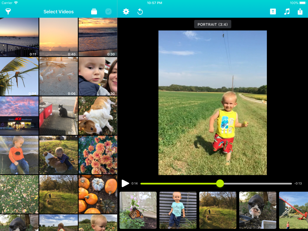
I know, I know. I said I was going to take a break from programming in February. But then Snapthread got featured and I got all jazzed about it and well…here I am. Here’s a peek at my work-in-progress:

Early version of Snapthread for iPad