13-inch MacBook Pro with Touch Bar with real world dust

A Review of the 2016 13″ MacBook Pro with Touch Bar

Intro

This isn’t going to be your typical MacBook review because there are plenty of those out there and most of them are very good. This review is for people who don’t give two craps how this year’s model compares to last year’s model and instead want to know how this year’s model compares to their crusty old ThickBook Pro from five years ago because that’s the one they’re upgrading from. Cool? Cool.

Without further ado, here’s how the 13″ MacBook Pro with Touch Bar fares against the mighty 15″ MacBook Pro (Early 2011).

Size and Ports
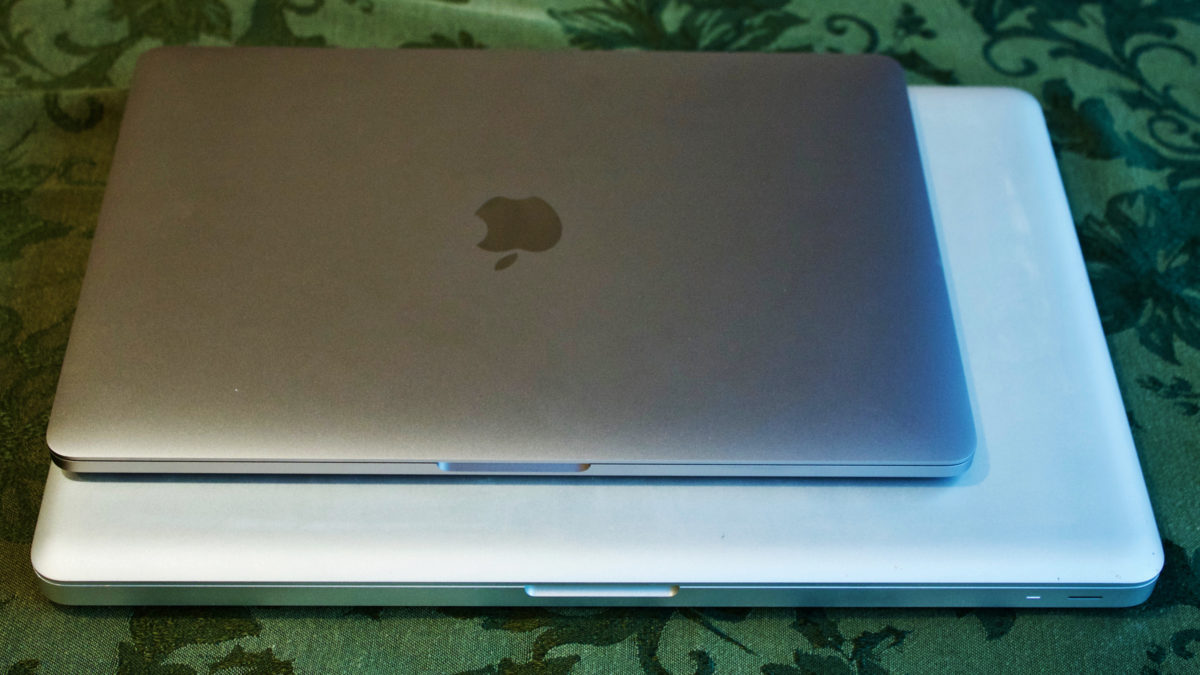
Old and new laptops in a stack on my Christmas tablecloth

I thought my old 15″ MacBook Pro was a laptop. I was wrong. Not only did it frequently burn my lap from running too hot, it was also heavy and annoying to lug anywhere. In contrast, my new MacBook Pro stays cool and feels light as a feather.

The early 2011 15″ MacBook Pro weighed 5.6 pounds. The new 15″ models are only 4 pounds, and the 13″ inch model is actually weightless. Just kidding. But at only 3.02 pounds, it kinda feels like it! I can carry my 9-month-old son Charlie with one hand and my laptop with the other, so it doesn’t get much more portable than that.

My old laptop had a lot of ports, some of which are mysterious to me (a Kensington lock slot? Really?!). My new one has four: Thunderbolt 3, Thunderbolt 3, Thunderbolt 3 and Thunderbolt 3. Oh, and a headphone jack that’s inexplicably on the opposite side of all previous MacBooks.
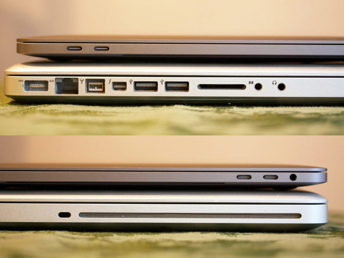
Side view of MacBook ports

So yeah, you’re gonna lose your CD drive, SD card slot, Ethernet port, flimsy old USB 2.0 ports and good ol’ FireWire 800. In exchange, you’re getting four ports that are approximately one zillion times faster at data transfer than what you had. I’d call that a win.

Sure, the loss of MagSafe is a bummer, but being able to plug in the power cable on either side of the computer is really, really convenient.

And honestly, I’m not upset about the adapter situation because the ports on this old MacBook are mostly obsolete, and because I really only need an SD card adapter, and a USB-A adapter for my Time Machine backup.

Display

The 2011 Pro models were the last to have non-Retina displays. If by chance you’ve never seen a Retina display in person yet: it alone is worth upgrading your computer. It’s like taking Claritin, or getting glasses for the first time. Everything is so crisp and clear that you’ll never be able to go back to blurland.

Note, however, that in order to enjoy the full Retina experience on the 2016 MacBooks, you’ll need to change the display’s default scaling.

In addition to being ultra clear, the display is also significantly brighter than the MacBooks of yore and can display many more colors (in technical terms: it has a wider color gamut). It really is beautiful!

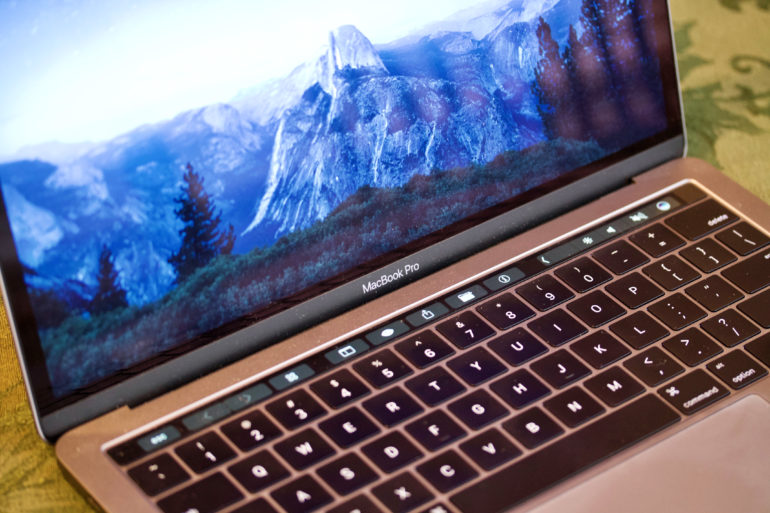
Right below the display you’ll see the familiar “MacBook Pro” label in silver lettering except now it’s in the new system font, San Francisco, which looks much nicer in my opinion.

The Touch Bar

I never learned the keyboard shortcut for comparing an edited photo to its original version in Photos. I still don’t know what it is, and probably never will because there’s a button for that on the Touch Bar now.

I like the Touch Bar. I think it’s fun, and I enjoy customizing it in any app that will let me. Like adding stickers to the outside of a laptop or changing its desktop picture, choosing which functions to add to the Touch Bar makes my MacBook feel more personal to me.

I personally know several people who struggle to use computers but who always buy MacBook Pros because they understand that they’re the nicest in the line-up. These users rarely look through an application’s menus, and if they do, they’re afraid to try stuff. I think the Touch Bar helps surface some useful things for both professionals and people who aren’t particularly “good with computers.”

Keyboard and Trackpad

Once you get used to it, the keyboard on this thing will make your old MacBook Pro’s keyboard feel mushy.

The new keyboard is low and tight and snappy. That’s the only way I know to describe it. It feels really good to me, and I don’t like going back to the old one.

Some reviewers have noted (both positively and negatively) that the new keyboard seems louder. That’s true, but you can also type quietly on it. My baby wakes up if he hears a fly buzzing across the room and I was able to type sitting next to his bed without waking him…so there’s that.

The trackpad is roughly as wide as my iPhone 6s is tall (in its case!) which is to say it’s fairly ginormous. Unlike your old MacBook’s trackpad with a physical button at the bottom, you can press down anywhere on this thing. I opened my 15″ Pro the other day to find a file and was super frustrated that I couldn’t press down anywhere…and I’m normally a tap-to-click person! In other words, this trackpad is rad and I love it.

Speed

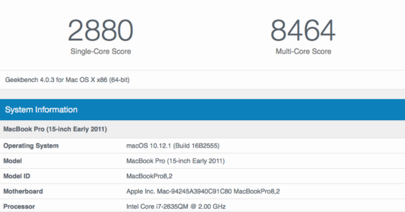
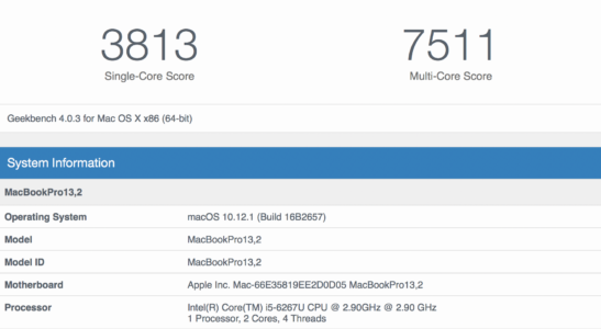
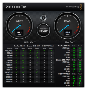
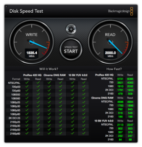
Despite moving from quad-core to dual-core, this computer can run circles around my old one. It used to take 20 minutes to copy Xcode into my Applications folder on the 2011 MacBook Pro with a 500GB spinning platter hard drive. My new 13″ Pro with Touch Bar has a 1TB SSD and I don’t even remember seeing a loading indicator when I moved Xcode. It’s fast. Everything is fast. Launching applications, compiling code, performing Spotlight and Mail searches, saving and moving files…it’s all fast.

I ran Geekbench 4 on both machines and here were the results (click or tap to enlarge):

I also ran Blackmagic Disk Speed Test, which is where you can really see a massive difference:

I had upgraded my 15″ Pro from 4GB to 8GB of RAM which is something you can’t really do on these new machines. They’re locked down tight, with an abysmal 1/10 repairability score on iFixit. Still, my new MacBook has 16GB of RAM. Even with Xcode, Simulator, Photoshop, Affinity Designer, Safari, Photos and iTunes open, I still haven’t come close to running out of memory.

Conclusion

If, like me, you’ve been waiting for a very long time to upgrade your MacBook Pro, the new models with Touch Bar are an incredibly vast improvement. And if you also enjoy being an early adopter like I do, you’re going to love playing around with the Touch Bar. I see no compelling reason to hold out for the next iteration of these machines. It’s unlikely that Apple will bring back any legacy ports, and besides the usual speed bump and the possibility of an e-ink keyboard, I’m not sure what else might change (other than the price, which will hopefully drop a bit). In other words, if you’re holding on to a four- to six-year-old machine, now’s the time to open your wallet and get yourself a great new laptop!
A Clean Slate

Last Thursday my shiny new Space Gray MacBook Pro finally arrived at my doorstep and so far, I absolutely love it. This post isn’t about that, though. It’s about setting up a clean install on my Mac for the second time ever.

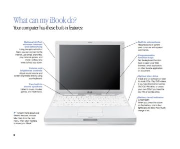
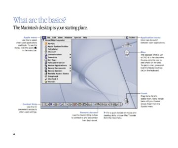
That’s right, I’ve been transferring files from Mac to Mac ever since I got my first iBook in 2002 or 2003 (can’t remember). As proof, here’s a couple pages from one of the welcome guide PDFs that came with that computer:

Where’s Wi-Fi?

Since that’s the way I’ve always rolled, the first thing I did when I opened my new MacBook Pro was connect my Time Machine backup via an Anker USB hub. The restore went surprisingly quickly, and I set about double-checking that everything was in order.

It was, except for one thing: most apps couldn’t establish a network connection. Dropbox wouldn’t connect and Safari Technology Preview wouldn’t load any websites. I spent several moments in despair, thinking I’d received a defective unit and would have to send it back after waiting for so long. Then I tried switching to regular old Safari and…everything worked fine. For some reason, Safari was the only program that was able to access the Internet. I still don’t know what the problem was, but evidently something went awry during the restore. [Update: Rob Poulter suggested that my recent installation of Little Snitch might have something to do with it, and I think he’s probably right.]

So, I wiped my new Mac clean again, re-installed Sierra and set up a new user for the first time in 13-ish years.

That Fresh App Smell

The first thing I did was install my must-have apps and utilities: Dropbox, Homebrew, Xcode, Pages, f.lux, Tweetbot, Textastic, Cyberduck, and Affinity Designer, to name a few. I installed Caffeine only to realize for the first time that it hasn’t been updated in several years and doesn’t even have a Retina-ready menu bar icon. I searched for alternatives and found Amphetamine (Mac App Store link), which is great and gives you a selection of menu bar icons to choose from (I chose the coffee carafe).

Finally it came time to download Photoshop CS6. The download took over an hour on my sad rural internet connection and when I finally ran the installer, it quit with an error every time. So, I got to test out a feature I never thought I’d use: Remote Disc. I found my Photoshop install CD, popped it in my old MacBook, and voila! I was able to install the software. I guess I should have tried that approach first!

Photos Woes

The next thing I wanted to do was move my Photos and Music libraries over. I dug into my last Time Machine backup and transferred the 90GB Photos library file to my new Mac. However, when I opened Photos, things got…weird. Only a few thumbnails appeared, and Photos refused to let me switch on iCloud Photo Library without purchasing more space, because it was planning to re-upload everything. I went ahead and upgraded to the next storage tier hoping that Photos would check with the server, realize it didn’t need to re-upload everything, and calm the heck down. I was wrong.

So, I closed the program, trashed the library, and started over. This time I switched on iCloud Photo Library to begin with. All of my thumbnails appeared, and Photos started downloading all 11,000 photos and 200+ videos from the cloud. Although not ideal, this was the better option for me because my download speed can top out at 10Mbps while my upload speed is only 0.73Mbps. As of right now, 6 days later, there are ~2,500 left to download.

Still, I can’t believe Photos forces users to either re-upload everything or re-download everything if they use iCloud Photo Library. (Wait, yes I can. ?) I’ve read that iCloud is supposed to check for duplicates server-side, but I’m skeptical because it definitely seemed like it was trying to upload files.

The Little Things

I never thought that performing a clean install would make much difference to me. However, here’s a short list of things that are so much better now (note: I could have cleaned all of this up on my old machine; I just hadn’t realized how cluttered everything had gotten):

  • FONTS. Oh my gosh, I had so many freaking fonts installed that I never use and the font menu in all of my apps was so horrible and unmanageable. A clean install fixed that!
  • System Preferences panes. I had icons in System Prefs for devices that I never use anymore, like a 10+ year old Wacom tablet that I’m pretty sure doesn’t even work.
  • Printer drivers and utilities. Back in high school, I’d install whatever drivers and printing/scanning utilities came with my printer. And I went through quite a few printers. Starting fresh helped get rid of whatever unnecessary software remained.

So yeah. If, like me, you’ve never set up a clean user account on a new Mac: I highly recommend it!

The Mac for Me

Last November, I published my wishlist for the 2016 MacBook Pro. Here’s what I wanted:

  1. Lighter. According to Apple, the average weight of the current 15″ MacBook Pro is about 4.49 pounds. Given the company’s unwavering commitment to shrinking things, I think I can reasonably expect that number to drop a bit for next year’s models. Check.
  2. Touch ID. Because why not? Check.
  3. Individually backlit keys. (Check.) I don’t really want to see any changes to the key travel, but those backlit keys on the new MacBook are rad.
  4. Wider color gamut, like the new iMacs. I don’t know if this is technically possible because I have zero knowledge about display technology. However, since MacBook Pros are generally geared toward creative professionals, this would be a change that makes sense. Check.
  5. Different finishes. Gold. Space Gray. Black. White. I don’t really care, as long as it’s not just stupid boring silver. Ugh. Check.
  6. USB-C/Thunderbolt 3 ports. Because if I’m going to be using this laptop for another 5 years, it needs to have the Port of the Future. Or whatever. Super check.

Looks like I’m six for six! (except the key travel did change, but ehhh I’ll get used to it.) Also, one of my “dream big” requests was for a bigger trackpad with Pencil support, so I guess you could even say I got six and a half of my wishes.

I’m really, truly sorry if this MacBook Pro isn’t for you, and I hope Apple will renew its commitment to the rest of the Mac lineup ASAP.

That said, this is absolutely the Macintosh for me.

On iPhone 7/MacBook Pro Compatibility 

I’ve been thinking about how neither the iPhone 7 nor its accompanying headphones can connect to the new MacBook Pro without an adapter. My conclusions are as follows:

  1. Apple wants you to use iCloud and to buy iCloud storage. I’ll come back to this in a moment.

  2. Apple doesn’t really intend for Lightning headphones to be a thing. They included Lightning EarPods in the iPhone 7 box as well as an adapter in order to appease consumers. They assume you either 1) already have some 3.5mm headphones you like or 2) will embrace wireless headphones. So why put a Lightning port in the new MacBooks?

  3. Apple doesn’t want you to charge your devices by connecting them to your computer. I think the 12″ MacBook introduced that idea. Apple wants everyone to charge their stuff via power outlet, probably overnight. I realize the batteries probably don’t last long enough for that to be practical for most people, but there it is.

  4. Apple doesn’t want you to backup your devices using your computer either. They want you to buy iCloud storage, as stated above, and use iCloud backups.

That leaves developers as the only ones who would need to connect their iPhones to their MacBooks, and Apple has no problem selling an extra $25 cord to developers.

So really, putting a Lightning port in the new MacBook Pro makes absolutely no sense, and neither does including a Lightning to Thunderbolt 3 cable.

Viva la (r)evolución

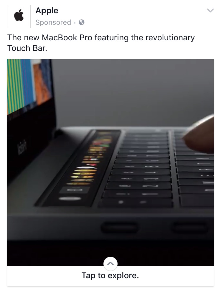
Much to laptop-lovers’ delight, Apple announced three new MacBook Pros yesterday: a 13″ model with a traditional row of function keys and two models, 13″ and 15″, with a “revolutionary Touch Bar.” Now, I don’t have the patience to scrub through the video of the event to see if Phil actually called it revolutionary. And actually, it doesn’t matter because the word is all over their marketing copy.

Apple ad for new MacBook Pro on Facebook

An ad on Facebook for Apple’s new MacBook Pro models.

I agree that the Touch Bar is revolutionary. It’s a dramatic change to what we’re used to. As many have noted, however, the new Touch Bar is also evolutionary: one more change in a long series of tweaks that Apple’s made to the lower half of the clamshell over the past several years. Jony Ive himself told CNET that this was “the beginning of a very interesting direction.”

As I sat mulling over which model and configuration I wanted to buy, I felt slightly uneasy knowing that the Touch Bar was only the first step towards some grand, yet-to-be-realized Jony Ivian vision. How long would I have to wait for him to complete his masterpiece? One year? Two? How about five? The answer, of course, is that it will never be complete. Technology evolves too quickly for anything to remain extremely cool and intensely desirable for more than a year. Design sensibilities fluctuate, new materials are synthesized, and new interaction models are imagined at an incredible rate. In the end, what’s important is that I have a good, functional, reliable tool for doing what I need to do right now.

So, I’ve decided to just embrace the evolution. I will have to buy a hub, as I am a frequent user of the SD card slot and regular USB ports. I’m looking forward to using the new Touch Bar and seeing what developers do with it.

I’ve also decided to move down to a 13″ display. In doing so, I’m going from a computer that weighs 5.6lbs to one that weighs 3lbs, which should feel amazing (and also fit comfortably in my giant diaper bag if necessary!).

“But won’t it suck to have less screen real estate?” my mind asks as I type this entire blog post on my 4.7″ phone display. Sure, Xcode will be a little cramped, but I’ll just have to learn to actually hide various panes when I’m not using them. Full screen will be my friend. And if I decide to get a 5K monitor someday, my little 13″ buddy can handle it.

I saw a lot of snark and negativity on Twitter yesterday, some of which was probably warranted. Regardless, I would encourage Apple lovers to try to separate your desire to see Apple be its best self (and be the perfect, pure source of your futuristic dream devices) from your actual, realistic day-to-day technology needs. If what Apple offers meets your current needs, be glad, and by all means continue to encourage Apple to excel still more. If it doesn’t, then maybe sit back and carefully (prayerfully?) consider switching to something else.

Life is way too short to be grumpy about tech all the time. Embrace the evolution!

The Waiting Game

Patience has never been one of my strong suits. As such, it’s no surprise that as I wait for my son to make his debut into this world, I’m finding it more and more difficult to concentrate on coding. I have a good, solid to-do list set up for Corgi Corral so that I won’t forget where I left off, but basically, I’m just ready to have this baby. (Seriously, any time now would be excellent. Today would be great!)

It's been 84 years

And speaking of waiting: I’ve been waiting to buy a new MacBook Pro for what feels like a very, very long time (how’s that for a segue? lol). I originally assumed that new Skylake MBPs would be announced this month; however, most rumor sites now seem to agree that they won’t be unveiled until WWDC in June. Now I’m even hearing rumors that while the 13″ MBP will be ready for release in June, the 15″ might not be available until September. September? I really, really don’t want to wait until September.

Honestly, it’s made me re-evaluate whether or not a 15″ MacBook Pro is what I even want or need.

The Xcode Problem

One thing we’ve surely learned from the endless “Mac vs. iPad” debate is that everyone uses (and passionately defends) the tool that works best for them. On a recent episode of the Accidental Tech Podcast, the hosts briefly discussed the possibility of Apple releasing a version of Xcode for the iPad (which seems like a real possibility).

For some reason, their discussion prompted me to search Google for the “best laptop for iOS development.” There were a number of question-and-answer threads that went something like this: “Can I use an 11″ MacBook Air for iOS development?” followed by a resounding chorus of “Get a 15″ MacBook Pro. You’re going to want more screen space. Get a Mac mini and a large display. Get a Mac Pro.”

The iPad Pro has a 12.9″ display. It’s certainly possible that Apple could find a clever way to redesign Xcode’s interface for the iPad in order to make screen size less of a pain point. But what about the simulator? And instruments? Would they run side-by-side with Xcode somehow? The logistics are baffling to me. But I digress.

The point I’m trying to make is: it seems like some of the folks who imply that they could switch to the iPad full time if only it had Xcode probably aren’t currently willing to do their work on a 12″ MacBook (and not just because of the keyboard and speed).

On the other hand, I was able to find one person who loves their 12″ MacBook for development: Rob Rhyne. Back in August, Rob wrote a very interesting post about how he sets up his little MacBook to use Xcode and Photoshop. It’s a lot of hoops to jump through (lots of hiding panels and adjusting font sizes), but no more hoops than Federico Viticci has to navigate in order to get work done on his iPad. As I read Rob’s post, I got inspired. Maybe I don’t need the classic developer workhorse after all.

overview_hero_hero

Spring is in the Air

I want something just a tad bigger than the 12″ MacBook. The rumors of new MacBook Airs intrigue me—especially the possibility of a 15″ Air. Presumably, these new Airs (or whatever they’ll be called) will be released before September. Presumably they’ll also have retina displays, a decent speed boost, and good battery life. They’ll probably be fine for photo editing, code compiling, and playing a few games and they’ll be cheaper and lighter than a MacBook Pro to boot.

My philosophy has always been to buy the most powerful laptop I can afford and use it for as long as possible. But times are changing, and maybe I need to refresh my thinking as well. After all, I’m not a professional photographer, designer, videographer, or musician (though I like to dabble in all of those things). I’m not even a professional developer. If I want to run graphics-heavy games, I have a gaming PC for that. I rarely hook up peripherals to my laptop. Really, I honestly can’t think of a single reason that I would need a MacBook Pro over a refreshed MacBook Air.

And that’s…freeing. If, like me, you’ve been waiting ages for new MacBook Pros, I’d encourage you to spend some time thinking about what you really want and need. Maybe, like me, you’ll come to a different conclusion. :)

2016 MacBook Pro Wishlist

In March, my 15-inch MacBook Pro will be 5 years old. It doesn’t have a Retina display or a Force Touch trackpad, it has an optical drive and a Firewire 800 port, and it weighs about 5.6 pounds. In other words, it’s a clunky, pixelated behemoth, and though it’s served me very well over the years, I can’t wait to say goodbye to it.

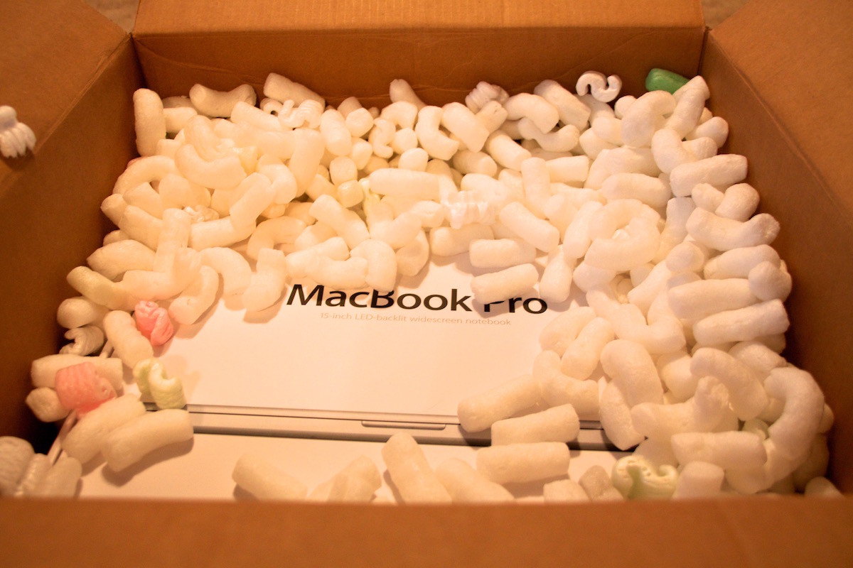
Unboxing photo from March 4, 2011

Unboxing photo from March 4, 2011

Here are my hopes and dreams for the new Skylake MacBook Pros that will supposedly be released early next year, in no particular order:

  1. Lighter. According to Apple, the average weight of the current 15″ MacBook Pro is about 4.49 pounds. Given the company’s unwavering commitment to shrinking things, I think I can reasonably expect that number to drop a bit for next year’s models.
  2. Touch ID. Because why not?
  3. Individually backlit keys. I don’t really want to see any changes to the key travel, but those backlit keys on the new MacBook are rad.
  4. Wider color gamut, like the new iMacs. I don’t know if this is technically possible because I have zero knowledge about display technology. However, since MacBook Pros are generally geared toward creative professionals, this would be a change that makes sense.
  5. Different finishes. Gold. Space Gray. Black. White. I don’t really care, as long as it’s not just stupid boring silver. Ugh.
  6. USB-C/Thunderbolt 3 ports. Because if I’m going to be using this laptop for another 5 years, it needs to have the Port of the Future. Or whatever.

Ok, now for some truly weird suggestions. WHAT IF:

  • The trackpad was bigger and had built-in Pencil support. Like a mini built-in Wacom tablet. I know: crazy.
  • You could change the color of the LEDs behind the keyboard. Psychedelic.

Mostly, I just hope the darn things come out soon. I know we’re waiting on Intel’s Skylake H-series chips with Iris Pro graphics, but I mean, early 2016 could mean anything from January to April, and I don’t know if I can wait that long!