Just released an update to Snapthread (version 2.0.2) that automatically converts panoramas to 15-second videos that slowly pan from left to right. Other changes include a button for easily scrolling to the bottom of your photo library, better support for time lapse videos, and miscellaneous crash fixes.
app update
Snapthread 2.0 is Now Available!
Snapthread 2.0 is live on the App Store as of yesterday, and so far I’m very happy with how it’s been received. I thought I’d write a bit about some of the new features, and my ideas for the app going forward.
I already wrote about Snapthread’s new data recovery feature, which, to be honest, has lifted an emotional burden that’s been weighing on me ever since I got my first negative review. I feel like I can finally relax and just focus on the cool features I want to add instead of obsessing over every little crash, a few of which have been out of my hands.
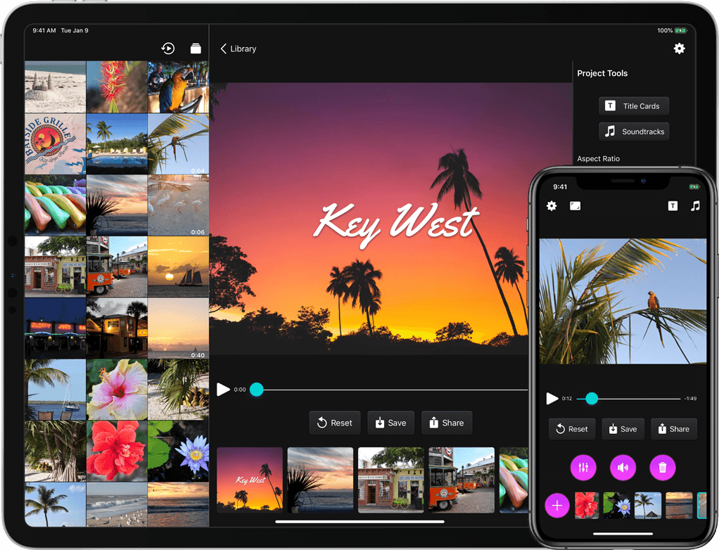
Another one of my design goals for 2.0 was to make the app even more user-friendly. It’s possible that Apple will make iOS 13’s default stock buttons look more like…well, buttons… but I didn’t want to wait until June to find out. So, I brushed up on my very basic graphic design skills and got to work making some buttons in Affinity Designer. They have gradients, and drop shadows, and noise, and I think they look nice. The dark gray buttons you see in the app have an image background that has been sliced so that it can easily expand to fit its contents. On iPad, most buttons have both an icon and a text label.

I also moved several buttons to new locations. It bothered me that the top navigation bar had an unbalanced number of icons on each side, so I decided to take two common actions, share and reset, and move them closer to the bottom of the screen. I also heard from some users who wanted a separate “save” button apart from the one in the share sheet, so I added that as well. To regain some space for the video preview, I moved the aspect ratio button to the navigation bar.
Earlier I wrote about how I wanted to refactor the entire app to use container view controllers. Instead of popping up a new modal view controller every time the user selected an editing tool, I wanted to gracefully transition between view controllers by fading them in and out. Now, the app’s main view controller has three containers: a small one at the top for displaying banners and progress bars, a middle one for displaying video content, and a bottom one for displaying various controls. For the iPad version, a fourth container runs vertically along the right side. I’m still working on making the code cleaner (it’s kind of a tangled mess of delegates right now), but it works, and it feels much snappier to me.
Prior to 2.0, there was no way to tell which clip in your timeline was currently playing. Now when you tap the play button, every thumbnail in the timeline darkens slightly except for the currently playing clip. There was also no way to know what a clip’s duration was while you were trimming it…now, there’s a handy label with that information (there’s still more I need to do to make trimming a better experience, but this should help at least a little!). You can now adjust the crop rectangle of landscape and portrait videos when you’re not using letterboxing; previously, that feature was only available if you selected a square aspect ratio. And speaking of square videos: they can now be letterboxed as well. Before, if you added a square video or photo to your project it would force the aspect ratio to be square.

The iPad version now includes a bunch of keyboard shortcuts. A full list of them can be found over at Snapthread’s spiffy new website. One of my wishes for WWDC is for a way to use the keyboard to navigate a collection view. In other words, you could use the arrow keys to say, zip through your photo library and select/preview images and videos. There’s currently no way to implement that (at least that I can figure out), so you still have to reach up and poke the screen to select your clips.
Last but not least, you can now rotate photos and videos, add text overlays, add a bounce effect (from within the Loop tool), and add filters. There’s a mix of Apple’s built-in filters and a few I created myself, named after towns in Nebraska. I also did my best to recreate Apple’s Silvertone filter, as it’s not available to developers (at least not that I could find!). Creating Core Image filters by chaining a bunch of adjustments together is kind of fun, and I definitely plan to add more filters to the list.

I have a long list of improvements to make and features I’d like to add to Snapthread in the future. Some of them I’d like to keep under wraps (just in case they don’t work out, ha), but others are just more basic things you would expect from a video editor: stickers, speed adjustments, an optional Ken Burns effect, etc. I’d also like to make improvements to some of the existing tools before going wild and adding more. For instance, adding text overlays can be a little janky at times. iCloud downloads can be canceled but not restarted, which is frustrating. Trimming could be more precise. The crop tool could allow zooming.
Now, it might be that none of that seems particularly remarkable, and you might wonder why Snapthread 2.0 is a big deal at all, as most video editing apps already have the same basic tools (and more!). It’s a big deal to me because I’m only one person, because I’m still mostly a beginning programmer, and because I really care about it. It might be a big deal to you because it’s one of only two or three apps on the store that merge Live Photos, and now, it’s better than ever. ?
SnapThread 1.1 with Live Photo Support
I have a confession to make: I released SnapThread too early. I thought it was a good MVP (minimum viable product), but I was wrong. It was a little too buggy, and didn’t have a real “killer” feature.
The good news is, SnapThread 1.1 is now available, and it’s what I should have waited to release in the first place. I’m hoping that with the addition of Live Photo support, SnapThread can now be people’s go-to app for quick, easy portrait video compilations.
New features:
- Live Photo support! SnapThread will strip the 3 second videos from your Live Photos and allows you to stitch them together.
- The app now presents the native iOS share sheet upon successful export.
- New duration limits. Filter your photo library by videos under 10, 15, 30, or 60 seconds.
Improvements/Bug fixes:
- Faster exporting, and fixed a bug where the exporting would fail when trying to merge over 16 videos at once.
- Better progress reporting. Downloading lots of videos from iCloud can take awhile, and now the app more accurately reflects the download’s current progress.
- Smart aspect ratio: since Live Photos are 3:4 and regular videos are 9:16, SnapThread chooses the final video’s aspect ratio based on what you have more of. So if you have 45 Live Photos and 1 video you want to merge, the final video will be 3:4. Likewise, if you have lots of widescreen videos and only a few Live Photos, the final video will be 9:16. (you should see the tangled if-else statements that determine the video clips’ scaling and translation values…it’s terrifying).
Since “the proof of the pudding is in the eating,” here’s a video of Charlie’s day at the pumpkin patch that I stitched together from Live Photos (and one video):
Future plans/ideas for the app:
- Photo library album picker (so you can find clips more easily)
- Scaling improvements and fixes (I’m sure there’s some edge cases I missed!!
- Ability to mute individual clips?
- Ability to add a very simple title to beginning of video?
- New localizations
- Accessibility improvements
- iPad version??