YarnBuddy, my new app for knitters and crocheters, is now available on the App Store! I’ll go ahead and get down to the deets.
Features
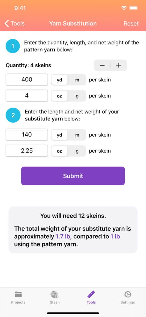
YarnBuddy is a project tracker and a row counter. That means its primary job is to help you keep track of all the knitting or crochet projects you’re working on (or have worked on in the past) as well as where exactly you left off on each one. Its secondary job is to help you keep an inventory of all the yarn you’ve acquired (there’s always so. much. yarn. ?).
Projects can either be “in progress” or “finished,” or you can optionally move them to the “Archived” section if you don’t want to see them in your main list.
You can import patterns from the document picker, your photo library, or a web page. I’m hoping to add the ability to import PDFs from your Ravelry library in a future release; however, I don’t really have any experience working with web APIs and OAuth, so it may take awhile for me to figure it out!
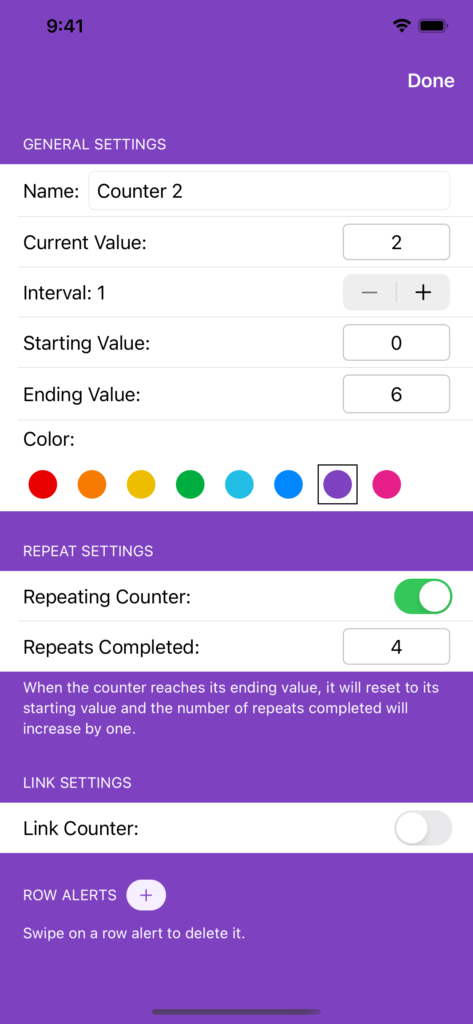
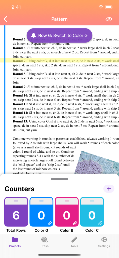
My favorite feature of YarnBuddy is the little drawer/sheet for row counters that appears at the bottom of a project’s detail view as well as its pattern view. You can add as many counters as you want, link them together, set them to repeat a range, change their color, and more. You can also expand a single counter to fill up the entire screen.
YarnBuddy allows you to add up to 10 projects and unlimited yarn for free. YarnBuddy Pro is an optional subscription that adds the ability to create unlimited projects, add tags and due date reminders, create notes with rich links for projects or yarn, add row alerts, and change the app’s icon. There is also a one-time purchase option with no expiration.
Development
YarnBuddy was built using Core Data and is almost purely SwiftUI, with the exception of a few wrapped views: UISearchBar, UITextView, UICollectionView, and UITextField (because I needed to add an accessory view with a “Done” button to dismiss the numberPad keyboard). I also had to wrap the system pickers for documents and images.
Using an app-wide gradient in the navigation bar required fiddling with the UIAppearance APIs which are also foreign to SwiftUI.
Overall, creating a new project using SwiftUI was a blast, and I highly recommend it. However, I can’t imagine completely rewriting a UIKit app in SwiftUI. The two frameworks require such drastically different mental models for data flow that I get a headache just thinking about it!

What’s Next
I’m already working on a big update for iOS 14 that will include a modern iPad UI, a watch app, and a widget (at least, that’s the plan!). I also have an enormous list of feature ideas that may or may not make it into the next release, from data export and time tracking to ways to share your progress on social media. Finally, I’m going to think long and hard about clicking that “Mac” checkbox in Xcode. If everything else is shaping up well for the fall, I would absolutely love to bring YarnBuddy to the Mac.
Well, I think that covers everything for now. If you’re in my target audience and have feature requests/suggestions, I’d love to hear ‘em!


