Music.blogpost

First of all, I’m incredibly excited to announce that Photos.app finally finished syncing my photo library to iCloud, after over two months (March 2 – May 8), leaving me with a “whopping” 7,359 photos and 104 videos. In related news, I’m willing to name my firstborn child after the first person to lay fiber all the way out to my farmhouse.
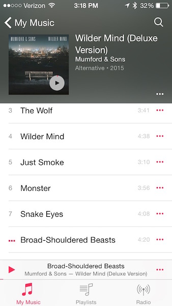
New Music AppAnd speaking of redesigned stock apps, I’ve also spent some time fiddling with the new Music app in the iOS 8.4 beta. I’m using the public beta build because even though I have a developer account, I feel slightly safer using the public betas on my primary devices. Anyway, I mostly like what they’ve done with the app so far, even though a few of the Known Issues are preventing me from using it normally (for instance, it’s not working correctly with the Philips head unit in my car). One thing I don’t like, however, is the size of the new mini player.

I’m generally not one to complain about the size of touch targets, but both the size and location of the mini player make it difficult for me to open it quickly. Whereas the “Now Playing” button in the upper right corner of the old music app was isolated from other tap targets, the new mini player is a skinny bar sandwiched tightly between the tab bar and your scrollable list of songs.

I’m not sure what the solution is here. Moving the mini player to the top would help isolate it, but would ruin the aesthetic that Apple is going for, with the color of the album artwork filling up the entire upper part of the screen. It would also make it harder for folks with the larger iPhones to reach the controls. Perhaps they could just increase the height of the bar to 44 points, the height of a normal table view cell.

I’m a big fan of the Beats Music app. I wish Apple would have borrowed its dark interface and––I can’t believe I’m saying this––its hamburger menu. I’d love it if they ditched the tab bar (but kept the “My Music” view as the default) and put playlists, radio, and anything else in a side menu. Then the mini player could sit at the bottom of the screen where it should be, just like the Beats app.

Finally, I wish they’d call it “Beats” instead of “Music.” All of this Music.app and Photos.app business is…odd. What’s next? FileSystem instead of Finder? Search instead of Spotlight? Let’s try to preserve some personality here, Apple!

Update 5/29/15: I’m used to the mini player now. I think it was just a muscle memory issue from using Beats so much! I still think I’d like it better if it sat at the bottom of the app though. :D
Quick Apple Watch Impressions

  1. I was surprised at how heavy the packaging was for the Sport. The unboxing experience was really fun, and I liked the big plastic case that the watch arrived in.
  2. I immediately turned off most notifications and also muted the sound. When my watch taps me, it’s going to be for a good reason!
  3. Siri on the watch has already been useful. For instance, I was outside grilling and wanted to set a timer. I had somehow managed to get marinade all over my hands and left my phone inside, so it was nice to be able to raise my wrist, say, “Hey Siri, set a timer for 5 minutes” and have it just work.
  4. I like that you can send the animated emoji to people who don’t have the watch, since no one I know has one yet.
  5. I don’t care at all that it’s “slow.” Seriously, it hasn’t bothered me a bit, and I don’t think the average user will mind either.
  6. I wore it in the shower and was surprised to find that I could actually use the screen with wet hands. I like to listen to podcasts in the shower, so it was nice to be able to control the playback using Overcast.

Ok, that’s all for now! I’m sure I’ll have more to say as time goes on.

A Rural Photos.app Experience

Let me start by saying that I live on a farm. The best internet service available to me is beamed from the top of a water tower in a nearby town to a pole on the top of our machine shed. In order for it to work, those two things have to be within each other’s line of sight. I get 6 Mbps download speed and, on a good day, 0.73 Mbps upload speed.

All of the photos on my iPhone have been uploaded to iCloud since iOS 8.1 came out in October. I had 6,482 photos and 84 videos in my Aperture library, which I imported to Photos.app when the OS X 10.10.3 Public Beta came out on March 2. None, I repeat none of my iPhone’s photos have downloaded from iCloud into Photos.app yet. I have no idea why. Perhaps it has to finish uploading before it will download anything? At any rate, I probably have about 1,000 photos on my phone that aren’t on my Mac, but that I can see on iCloud.com. Here’s some stats:

  • By March 24, after 22 days of uploading, I had 2,863 photos on my iPhone and 39 videos. Keep in mind that about 1,000 photos were already on my iPhone, so only about 1,800 had uploaded.
  • By April 2 (a full month), I had 3,336 photos on my iPhone.
  • As of today, April 19, there are 4,991 photos on my iPhone and 57 videos (and that’s after I spent a few hours at a place with blazing fast internet).

Oddly, the constant uploading hasn’t seemed to slow down my Internet connection in any noticeable way. I’ve watched Netflix, played games on Xbox Live, downloaded large files…no problem.

My biggest question about the syncing process is: Why aren’t any of the pictures I take on my iPhone showing up on my Mac? I have iCloud Photo Library enabled everywhere. My iPhone photos are showing up on iCloud.com. Why have they not downloaded into my Photos.app library? I imagine that I’m not the only person in this situation. There are lots of people in rural areas with crappy Internet connections who probably have way more photos than I do.

My suggestion to Apple is: show me what’s really going on. Sure, there are “1,956 Items” uploading, but what about how many items need to download? Why can I only pause the process for a day, and not, say, an hour? Why can’t I choose to prioritize the download of my iPhone photos over the upload of my Mac photos? If this keeps up, it could be another month before I can see my latest iPhone photos in my library, assuming that they will, in fact, show up someday.

Otherwise, though, Photos.app is a great 1.0. I look forward to seeing what features Apple will add as time goes on! I’ll post about this again when my Photos library has fully uploaded everything…probably in a couple months. :\

Autoshrinking Text in a Multiline UILabel using Interface Builder

The problem: I wanted to have a fairly tall, multiline UILabel with auto-layout constraints that would shrink its text to fit within its bounds (instead of using sizeToFit and having the label re-size to accommodate the text).

Things I tried: The first thing I did was head over to Stack Overflow and see if anyone else had the same problem. There were lots of posts from 2011, 12 and 13, but nothing super recent; in fact, most of them used methods that are now deprecated. Still, I examined their answers and tried the following:

  • Creating a helper function that returned the correct font size based on the text length, label size, and the desired minimum and maximum font sizes using suggestions from here
  • From that same thread (towards the bottom), I tried using an extension of UILabel to automatically adjust the font size to fit
  • Finally, I hit the official UILabel Class Reference (which I probably should have started with) and found some useful notes, such as this note under the method “adjustsFontSizeToFitWidth”:

In iOS 6 and earlier, this property is effective only when the <a href="https://developer.apple.com/library/ios/documentation/UIKit/Reference/UILabel_Class/#//apple_ref/occ/instp/UILabel/numberOfLines">numberOfLines</a> property is set to 1.

This led me to wonder what had actually changed post-iOS 6, since everyone on Stack Overflow was still saying that you had to set the numberOfLines property to 1 in order for text shrinking to work, or come up with some convoluted work-around.

The solution: I started tinkering around in Interface Builder, turning various settings on and off to see if anything did the trick.

  • I set “Autoshrink” to “Minimum font size.”
  • I set the font to my largest desirable font size (20) and set Lines to 10, which was as many lines as would fit in the label at that font size.
  • Then, I flipped what turned out to be the magic switch. I changed “Line Breaks” from “Word Wrap” to “Truncate Tail.”

So there you have it, folks. If you want your text to shrink to the size of your multiline label, try setting a specific number of lines (instead of 0, for infinite lines), turn word wrapping off, and make sure Autoshrink is set to either minimum font size or minimum font scale.

Working with UIDatePicker and NSDateFormatter

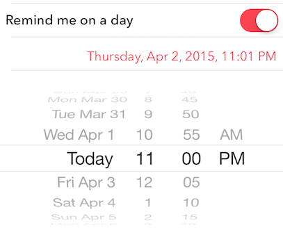
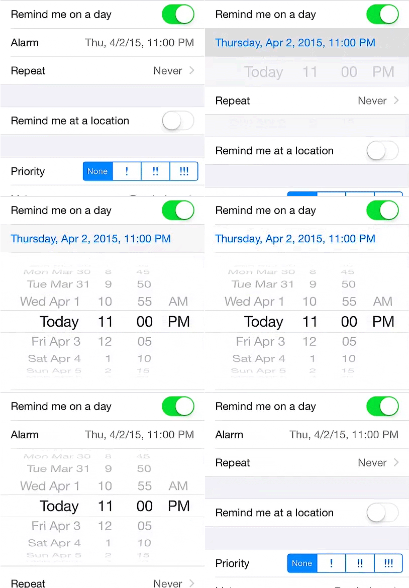
If all goes well, the app that I’m working on will allow users to schedule local notifications for specific days and times. Since I’ve never worked with dates in iOS before (yep, I’m that much of a beginner), I went searching for some resources that could help me get started. I was hoping to create something like the “Info” screen in the official Reminders app, where users can toggle “Remind me on a day” and set an alarm using a scrolling date picker.

One thing I like about that screen in Reminders is that the table row that displays the date and time formats it in two different ways. When the date picker is closed, the date is abbreviated like so: “Wed, 4/1/2015, 3:00 PM.” When the date picker is expanded, the date changes to a longer format: “Wednesday, Apr 1, 2015, 3:00 PM.”

Date Picker

I decided to tackle the date formatting issue first. Fortunately, I stumbled upon a great article that describes exactly how to format dates using NSDateFormatter and Swift. There are four built-in style presets that can apply to both dates and times. Unfortunately, none of presets resembled what I saw in the Reminders app, so I moved on to the “Custom Fixed NSDateFormatter Styles” section. From there, I came up with the following two styles:

let shortDateFormat = NSDateFormatter.dateFormatFromTemplate("EEE, Mddyy, h:mm a", options: 0, locale: NSLocale.currentLocale())
let longDateFormat = NSDateFormatter.dateFormatFromTemplate("EEEE, MMM d, yyyy, h:mm a", options: 0, locale: NSLocale.currentLocale())

The next step was to figure out how to change my dateLabel to display the selected date from the Date Picker. For that, this handy tutorial did the trick. Next, I used a boolean value to determine whether or not the Date Picker was expanded and adjusted the format of the date string accordingly. My result looked almost identical to the Reminders app, which is exactly what I wanted! Why reinvent the wheel?

My Date Picker

Diving into a real project that I care about was the best decision I could have made, and I definitely recommend it. You’ll learn so much more!


UICollectionView & Core Data

Good news! I’ve started on my first real app, which I’m hoping to submit to the App Store prior to my birthday in July. The app makes heavy use of a UICollectionView, which can be really cool and also super frustrating. I discovered very quickly that UICollectionView and NSFetchedResultsController do NOT play nice together. Perhaps Apple didn’t anticipate people wanting using Core Data to populate collection views, or they don’t want to take the time to change the API…either way, it presents an interesting problem––one that has received over 1500 views  (and I think only like 400 of those are me!).

Since I’ve decided to use Swift for my app, I was hoping for a slightly simpler solution than the answer on that Stack Overflow page, which involves keeping track of each and every change as an NSDictionary inside an NSArray. Fortunately, I found a solution at the very bottom of this thread that did the trick. It’s already in Swift, too, which is a major plus (though I am getting pretty good at translating Obj C to Swift).

Now I’ve run into a problem with the method I’m using to delete multiple selected items from the UICollectionView. However, I think I know what I did wrong, so hopefully I can get that fixed tomorrow and be on my way!

Ballz & Linez: Remembering the Golden Age of Petz Hexing

The year was 1995. A company called PF Magic (said to have stood for “pure f–ing magic”) released a virtual dog simulator for Windows PCs called “Dogz.” I was 8 years old, and had just taken a serious interest in computers (beyond just roaming around the AOL portal and playing game demos, that is). My first encounter with Dogz was actually with the Mac version that came out in 1996. My best friend who lived conveniently across the street from me had it on her family’s computer and it blew. my. mind.

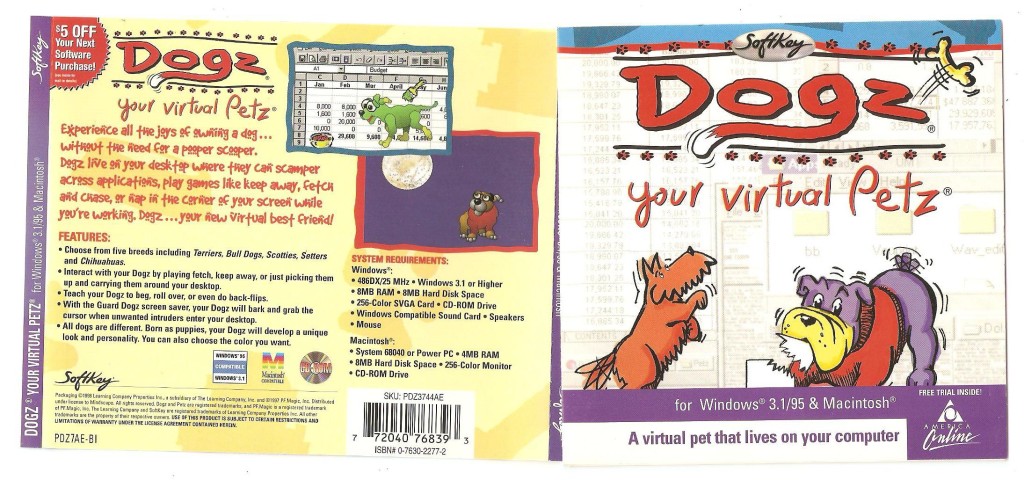
Dogz CD Sleeve

Look at that sexy sleeve art!

The first version was simple: you could choose from 5 breeds: Scottie, Chihuahua, Bulldog, Setter and Terrier––which was different from Scottie even though Scotties are, in fact, terriers. Your virtual dog existed in a “playpen” which you could customize by selecting one of several very Windows 3.1-like background patterns. Alternatively, you could let your dog roam around your entire desktop, which was like, you know, crazy cool. There was a ball you could throw, a paintbrush so you could paint your dog a different color (what?), food and water dishes, and a few other things like maybe a sneaker? I can’t remember. Anyway, it wound up gaining quite a following and it wasn’t long before a network of online kennel clubs (“Petz rings”…remember webrings? much nostalgia. such gifs) and Petz contests sprung up and people realized that it actually wasn’t that hard to mod the game.

Except that Petz modding (I say “Petz” because by now, PF Magic had begun to expand with Oddballz and Catz) was never called “modding.” It was called hexing, because in the beginning, you had to edit a bunch of hexidecimal code in order to do it. As it turned out, Petz breedz were created from “ballz” and “linez” and all one had to do in order to create a new breed was modify their size, position and color. Of course, it wasn’t entirely that simple and thus hexing grew into an odd sort of art form, where those who were truly excellent at it were elevated to god-like status in the fandom. Most of the Petz websites from that era were hosted on Angelfire and Geocities and are now lost to time, however, a few remain as a testament to the weird, awesome culture of Petz hexing.

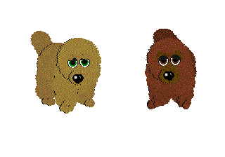
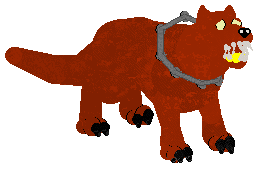
Fortunately, one of those is Carolyn’s Creations, which was like, one of the sites to go to for new Petz breedz. Stop for a moment and click on that link––it’s magnificent. You can even choose between frames and no frames (hashtag frames5ever). Carolyn was one of those fandom superstars, and I remember visiting her site to learn how to hex, though I was never successful at it. Carolyn’s breedz ranged from relatively normal variants such as Chow Chows…

Source: http://boardwalkerz.com/carolyn/d5breedz.htm

Source: http://boardwalkerz.com/carolyn/d5breedz.htm

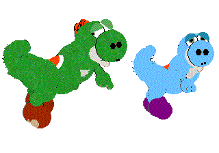
…to this incredibly complex Yoshi recreation:

Source: http://boardwalkerz.com/carolyn/d5breedz.htm

Source: http://boardwalkerz.com/carolyn/d5breedz.htm

Another incredibly-prolific hexing hero was Supernova (real name Jessica). I mean, just check out this list of breedz…it’s insane. Also, check out this tutorial for a little insight into how hexing was done in the early days, before programs like LNZ Pro were developed to make it easier.

I think one of things that makes Petz hexing worth talking about is that the whole community was comprised largely of women. Women talked about the game, women modded the game, and women built websites about the game. It was a fun, friendly, amazing community to engage with and I honestly haven’t seen anything like it since. In the Petz community, women took a game marketed to them with cute puppies and kittens and modded it to create freaking hellhounds. I feel like there’s a message somewhere in there for game developers today, how about you?

Adorable.

Adorable.

Tiny Victories

Well, I finally managed to complete a little test project: an app that lists all of the restaurants in an airport. It’s not something I can submit to the App Store because I don’t actually have a database of airports and their restaurants, (and learning SQLite to create one sounds like a bit too much trouble at this time) but it was a useful exercise in working with table views. Here are some things that I learned about while creating this project:

  • CloudKit (creating record types, adding records from the Dashboard, linking records using CKReferences, and querying for records)
  • Creating dependencies between operations
  • Auto Layout
  • Styling UITableView section headers
  • Using UIActivityIndicatorView
  • Creating custom cells
  • Passing information between view controllers
  • Submitting questions on Stack Overflow :D
  • Lots of Swift syntax

Here’s what the app’s detail view looked like for the one airport that I added:

Airport Restaurants

The problem that I ran into earlier was solved by adding a dependency between my two CloudKit queries: the app needed to finish fetching the restaurants before it finished fetching the names of the sections in order for the table view to populate correctly.

I feel pretty good about moving on to AppCoda’s Intermediate Swift book now. So far, learning Swift and iOS development has been just the right mix of frustrating and fun. Here’s hoping it stays that way!

Doing Things the Hard Way

I honestly don’t understand how so many people teach themselves to program. All I want right now is an expert at my beck and call to answer all of my terrible beginner questions. Apparently, my latest problem is so basic that no one has even asked about it on Stack Overflow. So, I signed up and asked and now I’m sort of dreading the responses I might get.

Stitch in the Rain

On the bright side, I’m getting more and more familiar with Swift. So much so that Objective C now looks super weird and unnatural to me. O.o

Link

Apple Software Issues

Apple Software Quality Questions

Great piece by Jean-Louis Gassée that provides examples of the many frustrations he encounters while trying to use Apple’s software as of late. I’ve read a lot of pieces on whether or not Apple’s software has been declining in quality lately, but this one stuck out to me because of this concluding statement:

One side of the coin is Apple’s numbers are splendid. The quarterly results that will be disclosed next week (January 27th) are likely to show strong iPhone 6 sales and a continuation of Mac progress. And despite my bug list, Apple software still compares favorably to Windows 8 and Android offerings.

The other view is that the quality lapses we observe are the beginning of a slide into satisfied mediocrity, into organizations and projects that “run themselves”, that are allowed to continue for political reasons without regard for the joy of customers.

Simple Animations

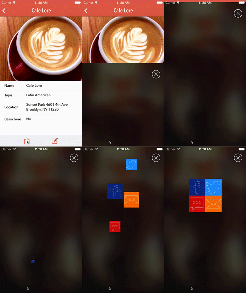
The AppCoda beginning Swift book that I’m going through has a very helpful chapter on creating simple animations using the built-in CGAffineTransform methods. The book is primarily centered around a single project: building a restaurant rating and discovery app called FoodPin. Each chapter either builds new functionality into the app or improves its appearance. The “now you try it!” project at the end of the animation chapter asks you to create a custom share view that has two buttons slide in from the top and two from the bottom. This was my result…hopefully it’s sort of what they were going for!

foodpin1

Quick Progress Update

Well, I did it: I finally finished something. No, it’s not my first iOS app (I wish), but rather a masters degree in Educational Technology Leadership. I started the degree back in the spring of 2012 and it sure feels good to be done. Now that I don’t have to worry about endless readings and an epic quota of mandatory discussion forum posts, I can focus my attention on learning to program iOS apps! Yesterday I began digging into AppCoda’s Beginning iOS 8 Programming with Swift and am on page 111. So far, everything has seemed comfortably familiar, so that’s encouraging. Even though I eventually want to develop games, I also want to have a thorough understanding of UIKit and get plenty of practice using Swift. I feel like this is a good start!

Loving & Making Games

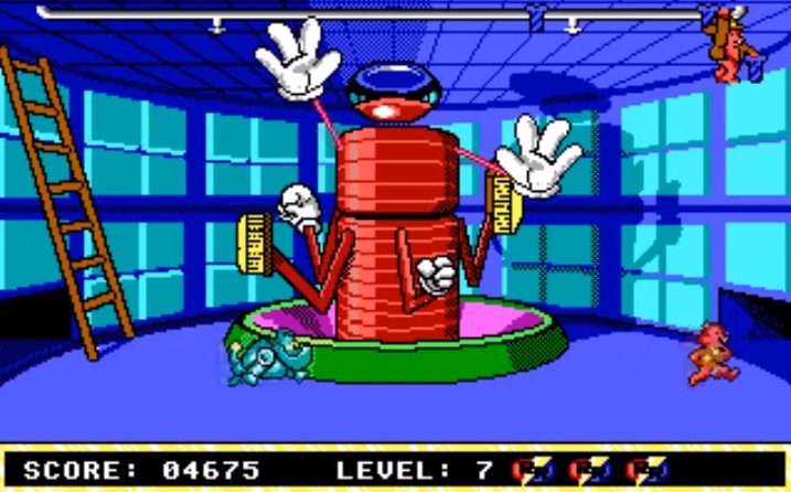
My memories of the first video game I ever played are so fuzzy that I’m not even sure if they’re real. After all, I would have only been 3 years old when Chip n’ Dale Rescue Rangers: The Adventures in Nimnul’s Castle was released. I have a hazy memory of the 5.25″ floppy disk and of this scene from the game:

ChipDale

I’m sure I had no idea what I was doing, but I probably loved the colors and the chiptune music!

The next memories I have are of sitting in my aunt and uncle’s basement, watching my older cousins play Sonic the Hedgehog on their Sega Genesis. I freaking loved Sonic the Hedgehog (though technically, I liked his sidekick Tails better). My parents bought me a Sega Game Gear and I think I only had two games: Sonic the Hedgehog, and World Series Baseball. Those two were enough to keep me entertained for hours on end!

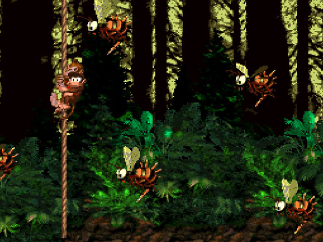
I remember visiting my grandparents in Maine and playing Mortal Kombat at the neighbor kids’ house. I think I was also in Maine the first time I played Super Mario Bros. on an original Game Boy (not sure who it belonged to, but it wasn’t mine!). My real love affair with games, however, started when my family moved from Connecticut to Ohio. I had a Super Nintendo and my parents would take me to Blockbuster to rent games. The day that I picked up Donkey Kong Country was the day that I became really, seriously interested in video games.

dkc1

These bees gave me fits!

Not only were the graphics gorgeous and ahead of their time, but the story was fun and the gameplay was challenging and varied, especially for my 8-year-old self. It wasn’t just that I loved Donkey Kong Country. I was sort of obsessed. I’m not sure if we actually subscribed to Nintendo Power or if my mom just bought me a copy whenever I was interested in the content, but one year they ran an art contest, asking fans to submit ideas for a new Donkey Kong character. Winners would receive a copy of either DKC2 or 3 (I can’t remember which). Anyway, I drew a new character called Kenny Kong, named after my best friend at the time. Kenny Kong wore a baseball uniform and carried a baseball bat and had several special abilities, none of which I remember. Anyway, I placed in the contest and won a copy of the game and was so flipping excited over the whole thing. I decided that when I grew up, I wanted to make video games.

So my mom did what any good mom would do: she took me to the library. I remember checking out a book on video game programming. The problem was, I was only 8 or 9 years old. All of that stuff was way over my head. I remember reading about sprites and thinking wow, I could never do that.

Fast-forward a few years. There were two terrible, erroneous assumptions that I made when I entered middle school. Even though I was a bright, straight-A student, I decided that I somehow wasn’t smart enough to do these two things: 1) play an instrument in band and 2) program computers. And so I didn’t try. I think I was afraid of failure…of being less than the best at something. Basically, I was the Hermione Granger of my class, and I had an image to maintain! …Gosh, I was a prick.

When I went to college, I sought to rectify the mistakes I had made. I majored in music education, learned how to play a bunch of instruments (albeit really terribly), and basically had a blast learning all about music. As it turned out, I wasn’t too dumb to understand it.

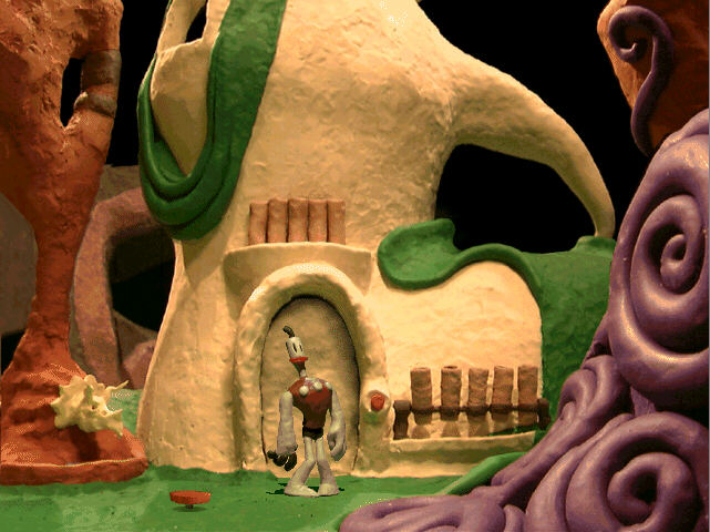
And as it turns out, I’m not too dumb to understand programming either. And I still love video games. All kinds of games. Sim City, Dogz, Pokémon, Mario Kart/Party/Tennis, Donkey Kong 64, Super Smash Brothers, Call of Duty, Guild Wars…the list goes on and on. In fact, I have to draw attention to two more of my favorite games growing up: The Neverhood (PC) and Fin Fin (PC). The Neverhood was an awesome claymation point-and-click adventure released in 1996. Most of the members of the The Neverhood team are currently working on a spiritual successor called Armikrog that I’m SUPER excited about. Seriously. It’s gonna be great.

neverhood

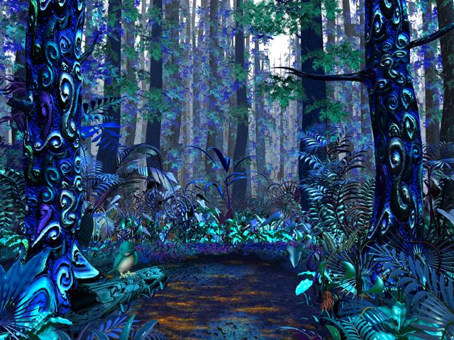
Fin Fin on Teo the Magic Planet, also released in ’96, was a virtual pet game that was way ahead of its time. It had voice recognition and a huge variety of plant and animal species that could be observed as the seasons changed in the game…it was really, really interesting, and I don’t think anyone has made a similar game since then, which is a shame. Also, Fin Fin had really awesome Avatar-like graphics:

finfinAnyway, all of this is to say that I know that a lot of people (women especially) are weary about getting into the video game industry, but I just wanna say this: whether the things that are holding you back are internal (as in my case) or external—don’t give up the dream. I haven’t. Learning to program is the first step for me, and it can be the first step for you too. :-)