Link

Watch Connectivity Framework

How to Communicate Between Devices Using Watch Connectivity

For anyone who doesn’t feel like scrubbing through the “Introduction to Watch Connectivity” WWDC video to find the slides of code that you want to see, this post by Kristina Thai is an excellent introduction to the Watch Connectivity framework. It helped me out enormously today. Honestly, I’m thankful for all the people out there that scramble to put out tutorials and helpful articles right after new APIs are released. #bless

watchOS 2.0 & Core Data

Earlier I wrote about how I was able to give my watch app and my iOS app access to the same Core Data store and methods using a shared app group and a custom framework. Now, with watchOS 2.0, I’m going to have to rethink the whole system. The frustrating thing is, I don’t even know how to begin to go about doing that.

My Core Data store is tiny. The whole thing could sit happily on the Apple Watch itself without making a dent in anyone’s storage. So what…do I put one copy on the watch and one on the iPhone, and sync the changes?

I’m not sure why I’m having trouble wrapping my brain around this, but if you know how I should set up Core Data with my iOS app and a native watch application, feel free to contribute to my Stack Overflow question. I’d appreciate it!

EDIT: The answer is YES, I do need to maintain two separate stores. More on this later, when I get it all figured out.

Refining Fire Now Available

Wow! After only 9 days, Refining Fire is now available for sale in the App Store. I received 3 taps on my wrist during Bible study tonight as iTunes Connect notified me of its changing status, first to “In Review,” then “Processing for App Store,” and finally “Ready for Sale.” According to Twitter, the average review time for many apps has been around 11 days, so I was pleasantly surprised!

I already have several improvements in mind for the app, including visual tweaks (it needs to be prettier), interactive notifications on the watch, landscape and iPad support, and more. If you purchase the app, I welcome feedback at feedback@refiningfireapp.com or you can leave a review in iTunes. I may not reply to every message, but I will read them!

Waiting for Review Day 8: Redesigned Crayon Picker

Apple deemed it important enough to put it on the “here’s the rest of the new features in OS X 10.11 that we didn’t have time to talk about” slide, so one of the first things I did after I installed El Capitan this afternoon was check out the new crayon picker. I’d post a screenshot of it, but I don’t think I’m supposed to under Apple’s NDA (that’s a top secret crayon picker, thankyouverymuch). Instead, I’ll describe it to you.

Imagine the old crayon picker. Flat design, colors, crayons. Now imagine it with—wait for it—colored pencils. Yes, that’s right. The new crayon picker is actually a colored pencil picker. If you need to take a moment to grieve, I understand. I too feel like my childhood has been torn violently away from me. I too question this new direction Apple is taking. What’s next? Pens? Markers? [shudder] I guess we can comfort ourselves with the fact that the picker has been smartly reorganized: the shades of gray are all in a neat horizontal line at the top, followed by rainbow rows of varying brightness. Thank goodness.

Another visual tweak I’ve noticed so far is that the spinning beachball is…well…rainbowier. Like… [RAINBOW INTENSIFIES]. I’ve noticed that because I see it quite often; El Capitan isn’t exactly speedy on my Early 2011 MacBook Pro. I’m hoping that continued optimization throughout the summer will make it a little snappier, but if not, I can live with it until my long-awaited re-designed 15″ Skylake Space Grey Retina MacBook Pro is unveiled in all its thin, Jony Ive-ified glory. <3

The San Francisco font, like Helvetica Neue (and pretty much everything else), looks terrible on my non-retina screen. It makes me a little sad, actually. On the other hand, the desktop picture included with El Capitan is flipping gorgeous. I’m weird in that I love using Apple’s included desktop photos instead of personalizing with my own. Ergo, my desktop will likely be showing off El Capitan for many, many months.

Anyway, I know this post wasn’t about my new app again, but there’s just so much to talk about in light of WWDC. I watched a couple of the live-streamed sessions today about Xcode and Swift and it seems like there’s a lot of really useful new features in both. It’s a great time to be an Apple developer: especially for a beginner like me!

Waiting for Review Day 7: El Capitan & iOS 9

Status update: My app is still Waiting for Review and now I am currently Waiting to Install the iOS 9, Xcode 7, and OS X 10.11 betas. At my network’s lightning fast speed of 260KB/sec, I still have 22 minutes remaining on my iOS 9 download. I even had to cancel a concurrent Xcode 7 download in order for it to reach such blazing speeds. ಠ_ಠ

Anyway, based on the keynote, here are the things that I’m most excited about:

  • SFSafariViewController
  • Search API (CoreSpotlight)
  • iPad Split View – I’m really looking forward to seeing the possible ways that music-making apps could be used with this.
  • iCloud Drive app (finally!)
  • Access to the watch’s taptic engine – The first metronome app to tap you on the wrist and not suffer latency wins!
  • UIStackView – I barely know what this even is but it seems really awesome.
  • All of the intelligent/contextual Spotlight/Siri stuff
  • Swift is open source! Yay!
  • I’m oddly looking forward to trying out the new News app. Also, Notes looks pretty cool as well!

From what I’ve heard thus far, Xcode 7 is weirdly stable. Here’s hoping that everything else is as well! I don’t think I’ll put the iOS 9 developer beta on my iPhone yet (I’ll wait for the public beta build), but I plan to put it on my iPad Air 2 and I’ll also upgrade to the OS X 10.11 beta on my Macbook Pro, since Apple merged the Mac and iOS developer programs (another one of my favorite announcements today). :D

Waiting for Review Day 6: WWDC Wishes

Today I’m going to take a break from talking about my app in order to list some of my wishes for the next versions of iOS and OS X. In no particular order:

  • Fix all the dang network-related issues. mDNSResponder, discoveryd…I don’t care, as long as it works.
  • Lower the prices on iCloud storage. Also, find a way for families to share/access entire libraries with separate Apple IDs.
  • Allow users to change the default apps on iOS (I think this is on everybody’s list every year, lol). And not just browser, email, reminders and calendar…I want to be able to select Tweetbot as my default Twitter app too.
  • Allow me to delete the stock apps so I don’t have to put them all in a stupid folder.
  • API-wise, I would love it if UICollectionView could play nice with NSFetchedResultsController without ridiculous work-arounds.
  • iPad multitasking (sounds like it’s going to happen…hope it’s announced tomorrow)

It’s hard to come up with wishes for WatchKit because I just have no clue what’s even possible. It would be cool to have access to the watch’s speaker and taptic engine, but what are the odds of that?

Anyway, I’m hoping WWDC will provide a fun and interesting distraction as I continue to wait for my app to be approved or rejected. To everyone who is going/already there: have fun!

Waiting for Review Day 5: Adding an Activity Indicator to a UIWebView in Swift

One feature that I really wanted to add to Refining Fire was the ability to read the entire chapter for a randomly chosen Bible verse. So for instance, if the verse was Psalm 23.4, a user could read all of Psalm 23. I decided to use a UIWebView to display the chapter content from a popular Bible-reading website.

Sometimes the website would take a moment to load and at first glance, it seemed like the feature was broken. I knew I needed to add some kind of spinner or loading bar but wasn’t sure how to tie a UIActivityIndicatorView to the loading of a web page. After searching Stack Overflow, I found the simplest solution. Here’s what it looks like in Swift after declaring a UIActivityIndicatorView called “spinner” and a UIWebView called “webView”:

    override func viewDidLoad() {
        super.viewDidLoad()
        
        spinner.hidesWhenStopped = true
        
        webView.delegate = self

        let url = NSURL(string: urlString)
        let urlRequest = NSURLRequest(URL: url!)
        webView.loadRequest(urlRequest)
        
    }
    
    func webView(webView: UIWebView, shouldStartLoadWithRequest request: NSURLRequest, navigationType: UIWebViewNavigationType) -> Bool {
        spinner.startAnimating()
        return true
    }

    func webViewDidFinishLoad(webView: UIWebView) {
        spinner.stopAnimating()
    }
    
    func webView(webView: UIWebView, didFailLoadWithError error: NSError) {
        spinner.stopAnimating()
    }

Don’t forget to add UIWebViewDelegate to the class definition!

Note: This is the fifth entry in a series of posts about writing my first iOS app. The app is currently in review, and until it is rejected or approved, I plan to write something every day about what I’ve learned.

Waiting for Review Day 4: Visual Style

As I mentioned yesterday, my first app is called “Refining Fire.” The name was inspired by my favorite hymn, “How Firm a Foundation.” One of the verses reads: “When through fiery trials thy pathways shall lie, My grace, all sufficient, shall be thy supply; The flame shall not hurt thee; I only design Thy dross to consume, and thy gold to refine.”

Once I named the app, the rest of the app’s appearance quickly fell into place. I would use orange as the main tint color, and the logo would feature a flame. For several weeks, I used a light interface in the iPhone app with white translucent nav/tab bars and the orange tint, but it just didn’t look right. So I switched to a dark gray interface and made the nav bar orange, and suddenly everything “popped.” In hindsight, it makes perfect sense…fire isn’t nearly as fun to watch in the daylight as it is at night!

Hiring someone to make an icon for me was out of the question, so I did the best I could. I think it turned out alright! At the very least, it’s not the worst icon I’ve ever seen…

Flame Logo

Anyway, here’s my tip for other beginners like me: use a template with Photoshop actions to generate your icon at different sizes. Here’s one for Apple Watch icons. Trust me, it’ll save you a lot of time!

I think the biggest thing I learned in choosing colors and fonts for my app is not to get too hung up in making comparisons to other apps. I spent a lot of time looking at my favorite apps like Overcast and Tweetbot and thinking about the decisions the developers made, and as a result I wound up feeling like I had to make those same decisions. But that was stupid because my app is my own and is also designed for a much smaller market. It’s not going to be written about on blogs (other than this one) or nitpicked about on Twitter.

I don’t have a marketing budget, or even a marketing strategy. However, if you are a Christian or know of someone who would like a Bible verse app for their iPhone or Apple Watch, feel free to spread the word. I’d certainly appreciate it. I set up a website for it here: www.refiningfireapp.com.

Note: This is the fourth entry in a series of posts about writing my first iOS app. The app is currently in review, and until it is rejected or approved, I plan to write something every day about what I’ve learned.

Link

Adding Source Control to Xcode

Xcode: adding source control

I admit, I pretty much dove into the app-making process without any clue as to what source control was or why it would be useful to me. And since I didn’t tick the “create git repository” box when I started my Xcode project, I didn’t think I could even add source control to my project. Fortunately, this lovely, easy-to-follow tutorial cleared things up for me!

Waiting for Review Day 3: Apple Watch Glances

Note: This is the third entry in a series of posts about writing my first iOS app. The app is currently in review, and until it is rejected or approved, I plan to write something every day about what I’ve learned.

Today I’m going to talk about Glances. On the Apple Watch, Glances are what you see when you are looking at your chosen watch face and swipe up from the bottom of the screen. According to the official Apple Watch Programming Guide:

A glance is a supplemental way for the user to view important information from your app. Not all apps need a glance. A glance provides immediately relevant information in a timely manner.

Since my app’s primary function is to display a randomly selected Bible verse, I was originally hoping that my Glance could do the same thing. Unfortunately, I hit a snag: Glances must be completely static. That means no buttons, and no scrolling. If the selected verse was too long to be displayed on one screen, it would simply be cut off.

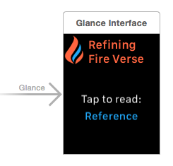
Many of the developers I follow on Twitter have remarked that for them, Glances are almost like the Dock on OS X: they provide a quick way to launch a frequently-used app without having to go to the App Screen (or whatever it’s officially called). Because of this, I decided that my Glance should have two characteristics: 1) be visually attractive and 2) display only the reference for the randomly selected verse. Tapping the Glance would then launch the app and display the full text of that verse.

My favorite Glances on my Watch are those that are colorful. The Dark Sky app uses yellow text to indicate how many hours of sunlight are left, or blue bars to indicate rain. The WWDC Glance uses the app’s purple tint color to show the next upcoming event. The heart rate Glance, as expected, is red. Since my app’s primary colors are orange and blue, and the name of the app is “Refining Fire” (more on that tomorrow), I decided to use those two colors along with a simplified logo to differentiate my Glance from others.

Refining Fire Glance

The next thing I had to figure out was how to pass information from the Glance (in this case, the verse reference) to the app. Turns out, it’s super easy to do. In the willActivate() method of my GlanceController, I called updateUserActivity() and passed in the verse reference as the userInfo. The userInfo needs to be a dictionary, so it looked like this: userInfo: ["verse": verse.reference]. Maybe for your app, that userInfo is some kind of UUID for looking up the object that you need.

Next, you have to implement handleUserActivity(userInfo: [NSObject : AnyObject]?) in your initial view controller for your watch app. For my app, I used this method to fetch the verse object that matched the given reference. From this method, you can push any controller that you want using pushControllerWithName. Note that the “name” parameter should be an identifier for the view controller that you can set under Attributes in Interface Builder and the “context” parameter should be whatever information you need to pass to the next view controller. In my case, it was the verse object that I fetched.

The final step was to go to the view controller that would be displaying the verse and update the awakeWithContext(context:) method. Here, I did a simple test for nil: if “context” had something in it (in other words, if the user arrived at that screen by tapping the Glance), the app would use that as its data source. Otherwise, it would fetch a new random verse as usual and display that. Piece of cake!

As a final note: I have no idea whether it’s okay for me to be talking in so much detail about an app that hasn’t been approved and may never be approved. If it’s rejected, that’s fine… I’ll discuss my reaction to it and whether or not I’ll resubmit. :-)

Waiting for Review Day 2: WatchKit & Core Data

Note: This is the second entry in a series of posts about writing my first iOS app. The app is currently in review, and until it is rejected or approved, I plan to write something every day about what I’ve learned.

In my first post, I talked about how I decided to use Core Data to store the verses in my Bible verse app and how I went about seeding that database. The next thing I had to figure out was how in the world my Watch app and iOS app could access the same Core Data model. I learned from a Make & Build tutorial that I needed to create both an App Group and a custom framework that could be shared between the two apps.

After creating a framework, I added two files to it: my Verse class, and a singleton DataManager class that handles all of the Core Data methods. Singletons are still a little confusing to me, so I pretty much just copied the code from this excellent tutorial video. At first I couldn’t figure out why my apps couldn’t seem to “see” anything in the framework, even after linking to it. Then I realized that I forgot to mark everything in the framework as “public.” /facepalm

My DataManager class has three simple methods: a method to fetch all of the verses in the store and place them in an array, a method to fetch only verses marked as a favorite, and a method to select a random verse from the array. Using one of the methods in my WatchKit app was as easy as saying:

var verse:Verse = DataManager.sharedInstance.getRandomVerse(verses)

Tomorrow, I’ll either talk about my app’s visual style (colors, icon, name, etc.), or about Glances and using Handoff.

Waiting for Review Day 1: Creating a pre-populated Core Data database

Guess what? I finally did it. I submitted my first app to the iOS App Store around 2am this morning. It feels so unbelievably great to have actually finished something (well, as much as any 1.0 can be “finished”). As it’s now waiting to be reviewed by someone from the App Store team, I thought I’d write one post every day during the waiting period, describing the app and what I learned from making it. A quick note before I go any further though: it is a Bible verse app, so if you don’t want to hear about that, this would be a good time to stop reading.

The Idea

My first idea for an app was a sort of non-traditional To-Do list app. It seemed like a neat concept and well-suited for a beginner, but after messing around with it for a few months I realized it wasn’t quite coming out the way I’d hoped. I felt slightly discouraged—that is, until I got my Apple Watch on April 24. Because I am a Christian and my faith is very important to me, one of the first things I did upon receiving my watch was look for an app that would allow me to view Bible verses on my wrist.

As of this writing, there are about a dozen watch apps that show up when you search for “bible verses” in the App Store. They fall into roughly two camps: apps that display daily verses, and apps that allow you to read the entire Bible. I wasn’t really looking for either one of those. What I wanted was an app that would allow me to hit “refresh” and see a new verse whenever I wanted, without having to wait for the next day. At first, I thought I could create the whole thing using just a Glance; however, when I learned that Glances must be static and can’t have any buttons, I set out to build a full-fledged app. According to Xcode, I started the project on April 30.

First Steps: Creating a database

I knew I would need a database of verses to pull from, and that I would need to decide what translation(s) to use. Because I didn’t feel like messing with copyright issues, I decided to build my own database using translations that are in the public domain: the World English Bible and King James Version. I pasted the verses into a Google spreadsheet with columns for the verse text, reference, and translation.

Next I needed to figure out how to get that data into my app. I stumbled upon a Ray Wenderlich tutorial that described how to create a command line utility app for OS X that would basically spit out a pre-filled SQLite database for use with Core Data. I liked the idea of shipping my app with the database already populated, so even though the tutorial was old (iOS 5!), I decided to give it a try. Translating it into Swift was surprisingly easy, but then I hit a problem: the tutorial used a JSON file, and all I had was a spreadsheet.

I feel the need to reiterate that I have no computer science/programming background, and know next to nothing about databases. For all I know, it’s probably ridiculously easy to parse a CSV file. However, my tutorial used JSON, and so I did what any self-respecting woman with over 20 years of Microsoft Office experience would do: I did a mail merge. Yes, I literally mail merged my spreadsheet into a Word document so that it matched proper JSON syntax, and then converted it to plaintext and threw a “.json” at the end. If you’re an experienced programmer and that’s the most ridiculous thing you’ve ever read: you’re welcome. ;-)

Anyway, in case any of you want to use that Ray Wenderlich tutorial with Swift, here is what I did:

  • I pasted the boilerplate Core Data stack into a new Swift class called “DataManager.”
  • After starting a new Xcode project for my iOS app and setting up Core Data, I copied my Core Data class called “Verse” and my .xcdatamodeld file from that project into the command line utility app project.
  • I copied my newly created “Verses.json” file into the utility app project.
  • Note: there are a couple changes you have to make to the Core Data stack code. You can find those changes in the tutorial.

Here is the code for my main.swift:

import Foundation
import CoreData

var dataManager = DataManager()

// Get JSON data
var err:NSError? = nil;
let jsonURL = NSBundle.mainBundle().URLForResource("Verses", withExtension: "json")
let jsonData = NSData(contentsOfURL: jsonURL!)
let verseArray = NSJSONSerialization.JSONObjectWithData(jsonData!, options: NSJSONReadingOptions.AllowFragments, error: &err) as! NSArray

// Seed Core Data
if let managedObjectContext = dataManager.managedObjectContext {
    for item in verseArray {
        let verseText = item.objectForKey("text") as! String
        let verseReference = item.objectForKey("reference") as! String
        let verseTranslation = item.objectForKey("translation") as! String
        
        var verse = NSEntityDescription.insertNewObjectForEntityForName("Verse", inManagedObjectContext: managedObjectContext) as! Verse
        verse.text = verseText
        verse.reference = verseReference
        verse.translation = verseTranslation
        verse.isFavorite = false
        
        var e: NSError?
        if managedObjectContext.save(&e) != true {
            println("insert error: \(e!.localizedDescription)")
        }
    }
}

Tomorrow, I’ll talk about how I set up Core Data so that it could be accessed by my iOS app, Watch extension, and Today View Widget.