Brent Simmons compiled an awesome list of Apple-related blogs written by women. Everyone should check it out!
[Update 11-17-15: Brent was kind enough to add me to his list without me even asking. Thanks!]
Brent Simmons compiled an awesome list of Apple-related blogs written by women. Everyone should check it out!
[Update 11-17-15: Brent was kind enough to add me to his list without me even asking. Thanks!]
Good thoughts from Jared Sinclair on how Apple can elevate the iPad from a position of uncertainty and confusion to a position of strength. Developers have been asking for improvements to the app submission/review process for years in the hope that Apple might take steps to improve the overall economy for pro-style software on iOS. Jared’s suggestion that Apple create a iPad-only fork of iOS is important as well, since the iPad is now the only device in Apple’s line-up without its own specialized version of the operating system.
My mom loves her iPad. I know lots of people that do. They tend to use it for web browsing, reading, and photo viewing. However, if that’s all that Apple wanted the iPad to be, then the iPad Pro would not exist.
Unfortunately, that’s all the iPad ever will be if Apple does not listen to the pleas of what I believe to be the majority of its independent third party developers. If Apple continues to turn a deaf ear to these issues, many talented developers will be forced to throw in the towel, and we will all be worse off because of it.
Like many hobbyist developers, I’m planning to create all of the art and music for my game myself, with the possible exception of some free/public domain sound effects. That being said, I’m not exactly an artist.
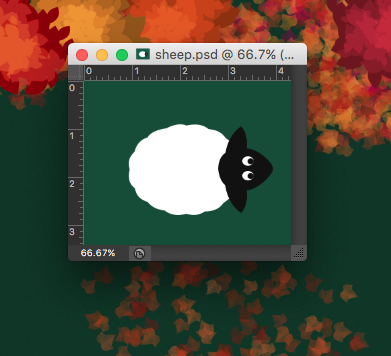
Tonight, as I sat with my husband watching the Huskers eke out a controversial and unlikely win against undefeated Michigan State, I made this sheep:

And it’s a cute sheep. I think I can work with it. Eventually, I’d like for the sheep to have a couple different idle animations…perhaps blinking its eyes and flicking one ear at a time.
I know it’s probably against both convention and good sense to work on the art for my game before I start programming, but without the art, I just can’t seem to get motivated. If I can get all of the assets done for just one level, that’ll be enough for me to want to start working on the code. And right now, I have only one asset left to complete: the hero of my little game! Hopefully my next update will be about digging in to the actual Xcode project, with the goal of having the first level fully functional on iPad by Christmas.
In March, my 15-inch MacBook Pro will be 5 years old. It doesn’t have a Retina display or a Force Touch trackpad, it has an optical drive and a Firewire 800 port, and it weighs about 5.6 pounds. In other words, it’s a clunky, pixelated behemoth, and though it’s served me very well over the years, I can’t wait to say goodbye to it.

Unboxing photo from March 4, 2011
Here are my hopes and dreams for the new Skylake MacBook Pros that will supposedly be released early next year, in no particular order:
Ok, now for some truly weird suggestions. WHAT IF:
Mostly, I just hope the darn things come out soon. I know we’re waiting on Intel’s Skylake H-series chips with Iris Pro graphics, but I mean, early 2016 could mean anything from January to April, and I don’t know if I can wait that long!
If there’s one thing I’ve learned over the past week, it’s that catching a cold while pregnant really, really sucks. All of the good meds are off-limits, so it’s all up to warm washcloths on my head and saline nasal drops and plain ol’ Tylenol to save the day. However, despite all that, I did manage to drag myself to the nearest Best Buy to scoop up a new Apple TV on Friday, and boy: it got me thinking1.
When I first came up with my idea for a game, I thought that I’d make it iPhone-only, just to make it simpler for myself. However, everything Apple has done in the past few years—Storyboards, Auto Layout, Size Classes, asset catalogs—clearly points to a preference for Universal apps2. Also, I enjoy playing games on my iPad, and I know others do too (especially kids, who would be a great audience for my game). But what about the TV? Is that biting off more than I can chew?
Turns Out™, it’s really easy to get a Universal game working on the new Apple TV. My plan is for my game to use the device’s accelerometer for character movement; conveniently, an accelerometer is built in to the new Siri remote, though I’m not sure how easy it is to figure out the remote orientation. (EDIT: I just checked the API doc for GCMotion and found this statement:
Although the remote supports motion data (and the GCMotion profile), the remote cannot determine the attitude or rotation of the remote. The corresponding properties always return constant values.
I’m not exactly sure how to interpret that, so I guess I’ll have to experiment once I get things up and running.)
In addition to the prospect of having my game work on the Apple TV, another thing that really excited me today was the release of a documentary called CODEGIRL. It’s free to watch on YouTube until November 5, so go see it while you can! I watched the entire thing this afternoon and found it really inspiring. I wish such opportunities existed when I was in high school, because even though I got straight As and was tied with my best friend as salutatorian of our class, I still didn’t think I was smart enough for a career in computer science. Part of that was my own stupid fault, and part of it was all that cultural socialization crap that says that programming is for boys (particularly boys who have been tinkering with computers since they were two years old or whatever).
Anyway, it’s a pretty neat film and I hope that a lot of people check it out!

Today I’d like to talk about one of my favorite new toys: the Fujifilm x100T. I bought as a birthday treat for myself back in July, and have had only a few opportunities to really use it since then. However, the times I have used it, I’ve experienced a joy that reminds me of why I ever loved photography in the first place.

The first thing you should know about the x100T is that it has a fixed 23mm f/2 lens, which is equivalent to 35mm. In other words, if you want to zoom in and out, you have to use your feet. The design harkens back to an earlier time (though it does come in an all black version that looks slightly less retro), and the similarities to old film cameras don’t end there. Which brings me to the second thing you should know about the x100T: it has lots of physical controls. Metal knobs, rings, wheels. They feel cool to the touch, are heavy-duty, durable, and make a satisfying “click” when you turn them. That physicality is key to the experience: you feel like you’re finally manipulating hardware instead of just software. Sure, you can use the screen to set stuff too, but why would you want to?
The front of the lens has an aperture adjustment ring, which can be set to “A” for auto. On the top of the camera there are knobs for shutter speed (which can also be set to “A”) and exposure compensation as well. If the aperture is set to auto and the shutter speed is not, you’re in shutter priority mode, and vice versa. I left both the aperture and shutter speed on auto for most of the photos I took and was pleased with the results.

Another one of my absolute favorite things about the x100T is how light it is. According to Fuji’s specifications, it weighs nearly a pound…but it certainly doesn’t feel like it. I have a deep-seated hatred of feeling encumbered, especially when I’m going to be doing a lot of walking around for a long period of time. It’s the reason why I sometimes carry a wallet instead of a purse. So believe me when I say that I was happy to have this thing dangling around my neck for hours on end!

The final feature I’d like to talk about is Fuji’s film simulations. Because I love vibrant colors, all of the photos in this post were set to the “Velvia/Vibrant” simulation, with an additional simulated neutral density filter. All of the photos are also untouched: all I did was process them in-camera using Fuji’s RAW-processing feature, which basically “bakes in” the film simulation to a JPEG along with any other tweaks you want to make (I didn’t make any).


I mostly like to take pictures of animals and flowers and landscapes, so I can’t really speak to how well the x100T handles portraits. However, it’s going to be my primary baby-photo-taking instrument as soon as my son or daughter arrives in March, so I guess I’ll find out! As of this writing, the Fujifilm x100T is $1299 at Amazon.com.
No one’s first game is great (or at least, that’s what I keep telling myself).
Sadly, I’ve spent much more time reading about making games and listening to podcasts about making games than I have actually trying to make a game. It’s that paralyzing fear of starting something…of not being adequately prepared, of not doing things the “right” way (whatever that is), of not being able to see it through. And then of course there’s the ultimate fear: the fear of failure. And since being unable to start something is in itself a type of failure, I have thus found myself in the Creative Anxiety Spiral of Doom for most of my life.
But this week I started making some trees 1 and maybe tomorrow I’ll make a pumpkin or a piece of fence.

And maybe it will start to get easier.
Or maybe it won’t. But either way, I want to keep chugging ahead, and I’m hoping this blog will help hold me accountable.
The guy who made this website is a rockstar.
Let me start by saying that I’m completely new to game development. I would like to make a top-down 2D game in which there is a “chasing” mechanic. As in: you, the player, are able to chase other characters around the game world.
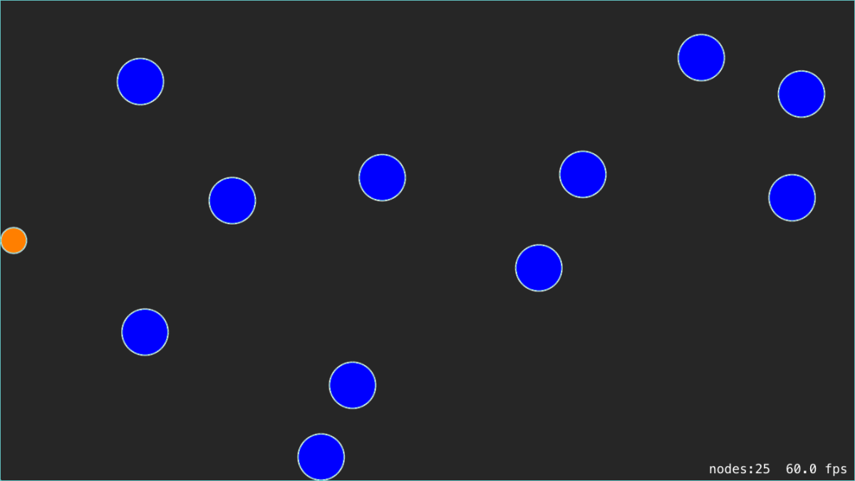
It seems like GameplayKit would be a good fit for this because it features an agent/goal/behavior system and one of the included behaviors is a goal to “flee” from another agent. I spent a long time looking at the AgentsCatalog sample code that Apple provided and attempted to translate the FleeScene into Swift. This resulted in the following:

The little orange dot follows your touch and the big blue dots flee from the orange dot. At first they just fled right off the screen, so I set up a SpriteKit edge loop to contain them.
Herein lies the problem: All of the dots “stick” to the edge loop instead of bouncing off of it, regardless of how fast they’re moving. They also fail to bounce off of each other. They’ll push each other around a bit, but there’s no bouncing. I have a feeling this has to do with the mismatch between SpriteKit’s physics system and GameplayKit’s agent system, but I don’t know how to fix it.
In the delegate method “agentWillUpdate,” I update the agent’s position to match the sprite’s position. In “agentDidUpdate,” I do the opposite. That’s…probably not right? I have no idea. It’s probably worth noting that I’m not using the Entity-Component system…I just have SKSpriteNodes that own GKAgent2Ds.
Anyway, somebody needs to write a tutorial re: GameplayKit and physics. Please and thank you!
This community post over at Gamasutra really resonated with me, as I’ve started and given up on more projects than I can remember. In fact, that’s why I haven’t posted here in so long: I’ve been caught in the endless cycle of “start a project” -> “hate the project” -> “abandon the project” -> “become demoralized & mope” -> “repeat.” The moping part is what takes the longest, honestly.
I would really, really like to make a game. It’s something I’ve wanted to do since I was a kid. I have an idea for a game, but I’ve already hit some bumps while trying to create a prototype and it makes me want to quit. But I won’t. Not this time.
Lost to Time: Gaming’s Forgotten Petz Subculture and the Women Who Shaped It
Could the do-it-for-love era — with the creative freedom that that brings — bring us back to the days when we downloaded apps that weren’t from Facebook and Starbucks and Funded Company X, and we told our friends about our exciting finds?
I hope. I have hope.
Great post. I have hope too, and am looking forward to making my next app (out of love, of course).
Yesterday I decided that I was going to make Refining Fire a universal app. Eager to see how it would look, I quickly changed the relevant build setting, set up my iPad Air 2 as a testing device, and hit “Build & Run.”
As it turns out, if you have a UITableView that mixes custom cell styles with a preset ones such as “Right Detail,” your table is going to look a bit wonky. That’s because cells with preset styles automatically adjust to different layout margins on the iPad, whereas cells with custom styles do not. Basically, if you have a UILabel that has its leading edge aligned to the Superview’s leading margin, it will continue to hug the left edge while all of the standard cells are inset by about 84 pixels.
For my “Settings” screen in the iPad’s size class (Regular Width x Regular Height), it looked like this:
As you can see, my custom “Daily Reminder” cell with the switch control was not aligned with the other cells which were all set to “Right Detail” even though I was using Auto Layout. The “Daily Reminder” label was positioned too far to the left and the switch was positioned too far to the right. Thanks but no thanks, Auto Layout.
I combed Stack Overflow for a solution and found two relevant posts that were fairly recent: this one and this one. However, it seemed as if no one had found a simple fix. So, I did what I usually do when a Stack Overflow search comes up empty: I started flipping switches in Xcode to see if anything helped.
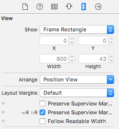
 The solution ended up being super simple (Note: I’m using Xcode 7). I selected the “Content View” of my “Daily Reminders” cell in the Document Outline in Interface Builder. Then I brought up the Size Inspector. Under the “Layout Margins” dropdown, I clicked the little plus next to “Preserves Superview Margins” and selected the “Regular Width x Regular Height” size class. Then I checked the checkbox next to “Preserves Superview Margins.” Immediately, I got two Auto Layout warnings saying that I had misplaced views: the label and the switch. I updated the frames for both warnings and viola! Everything was perfectly aligned.
Apple: Teaching App Development with Swift
Apple has a really nice curriculum on GitHub for teachers interested in having their students learn Swift. The curriculum is divided into 3 levels:
Each level consists of several app projects, each focusing on a particular concept. Every app project is further broken down into a series of lessons (usually between 6 and 15), complete with lesson plans, Xcode project files, and Keynote presentations.
The lesson plans are very well-written and include elements that all teachers will recognize, including lists of learning outcomes, materials, and vocabulary; an introduction, body and conclusion; modifications and extensions; and a list of resources. The only thing missing is an “Assessment” section, which makes sense as teachers will have to find assessment methods that align with their own educational philosophies as well as their school’s grading policies.
Honestly, I’m thinking of teaching the course to myself, just to make sure I understand all of the things that Apple considers important for beginners to learn.
I just submitted my first request for an expedited app review…does that mean I’m a real developer now? :P
I somehow managed to royally screw up the build settings for my project so that my watch extension 1) was not properly linking to my framework and 2) had an incorrect runtime search path. In other words, it was lookin’ for frameworks where there aren’t any. Sometimes I feel like Xcode’s build settings are like playing a game of Lights Out for the first time. With only a beginner’s understanding, it feels like I’m just flipping switches until everything works. Except in this case, everything seemed like it was working and I was able to upload to the store…only to find out that I broke the main functionality of my app: it’s ability to run on the Apple Watch. /facepalm
Of course, this will all be irrelevant when iOS 9 and watchOS 2 are released, because my watch app won’t depend on a shared framework in order to access the data store. It will have its own data store. So far, I’ve really enjoyed messing around with the new features in iOS 9 and watchOS 2, particularly SKSafariViewController and UIStackViews. I’ve also enjoyed attempting to answer people’s questions about WatchKit on Stack Overflow, even though I hardly know what I’m doing myself. All of this has been such a great learning experience and I’m already anxious to move into some new territory, such as learning how to fetch information from websites.