LiveRotate

This post could’ve easily been titled “I made an app with a two month old baby glued to me, AMA.” Of course, if it weren’t for Charlie, I wouldn’t have gotten the idea for the app in the first place! ?

It started with a giraffe.

At the ripe old age of two months, Charlie enjoys things like smiling, staring at ceiling fans, getting his outfit changed (that one seems unusual), and of course, conversing with stuffed animals. By “conversing” I mean “looking intently, grinning, and occasionally yelling at.” One day I snapped a bunch of pics him speaking with his giraffe pal and this happened:

 Pics of Charlie and giraffe pal incorrectly rotated
Whoops. I wasn’t paying attention and was tilting my phone in such a way that it thought I was holding it in portrait rather than landscape. When you attempt to edit a Live Photo beyond simply auto-correcting it, you get this message:
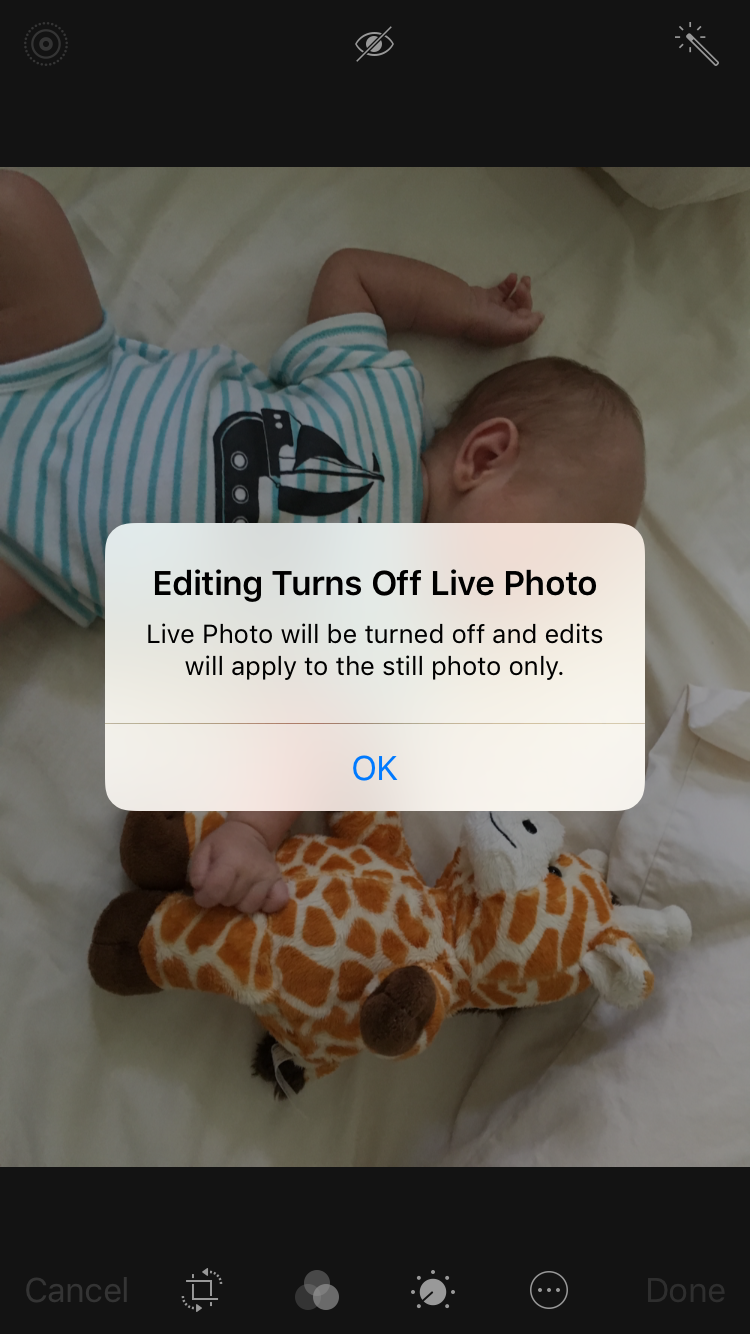
Editing will turn off Live Photo

At this point, I was kinda sad because the Live Photos were cute but weren’t captured as I intended. A few days later, I decided to do something about it.

Programming is fun!

I really enjoy writing code, especially when it requires me to learn a lot of new things. However, while I’m still really excited to finish my game, Corgi Corral, it’s officially on hold for two reasons:

  1. I don’t have the creative energy for it. Taking care of a baby who doesn’t sleep through the night has sapped me of the mental resources I need to make stuff like art and music. Someday!
  2. I’m interested to see what changes to GameplayKit and SpriteKit Apple will show off at WWDC. Maybe I’ll get some new ideas or will be able to improve my code in some way.

Even though I’m taking a break from Corgi Corral, I still have that itch to make something. So, I decided to dive head first into the Photos framework and create an app that rotates Live Photos.

It actually took me several weeks to get something working due to my lack of experience with both Core Image and AVFoundation (not to mention the fussy way that Live Photos are constructed). I’ll write more about the process of building the app in another post, but needless to say there were many headaches involved!

However, I still had a blast doing it. For the first time ever, I truly feel like a real app developer. Sure, my Bible verse app was fun to make, but there are a zillion Bible verse apps on the App Store. I haven’t found an app yet that can rotate Live Photos. Maybe one exists, maybe not, but I finally feel like I was able to identify a unique problem and build my own solution. It’s a powerful feeling!

Shipping things is fun!

Charlie & his giraffe

Confession: I love filling in all the blanks in iTunes Connect. The screenshots, the app preview video, the description…there’s something really satisfying about seeing my app’s profile come together. I even had fun making the screenshots, using David Verwer’s SimulatorStatusMagic to ensure the status bars looked nice and clean.

I don’t really know if there’s a market for this app. I mostly built it for myself, so I could enjoy my pictures of Charlie. Having it on the App Store is just the cherry on top. ? Still, it sure is fun to ship something—to be able to point to something and say “I made that.”

LiveRotate icon

The app is called LiveRotate (I decided to adopt _David Smith’s straightforward approach to naming apps) and it costs $0.99. Any money I happen to make will go towards purchasing the new MacBook Pro I’ve been dreaming of for the past two years!

First Apps Roundup [Updated June 3, 2016]

Last week I challenged iOS developers to share anecdotes and screenshots of their first apps and was delighted when a few people responded. These are exactly the kind of responses I was looking for!

Marius Constantinescu:

My first contact with iOS development was during my BSc. studies. We were a bunch of students and a passionate teaching assistant, and we were learning iOS development on our own, outside of the university curriculum, following Paul Hegarty’s Stanford CS193P course on iTunes U.

I think it’s really cool that Marius and his fellow students taught themselves by following along with the Stanford course. I also love the screenshot from his first (albeit unreleased) iOS game!

Rob Poulter:

Development is easy. We know (or quickly learn) the constraints of the development environment and platform, and the rest is about research and experimentation. Not having done a lot with UIKit before, learning the API was the most challenging part of this. I wish I’d tracked just how much time I spent on StackOverflow vs XCode.

I also wish I’d timed my Stack Overflow visits. I’m sure it’s been at least a couple of days.

Alistair Phillips:

After reading Becky Hansmeyer’s post I decided to dig up some screenshots of the first version of My Opal to see just how far things have come. My Opal was released not long after iOS 7 arrived so I started off with the clean/sparse look but about 8 months later it gained a little more personality.

The screenshots Alistair posted are downright inspiring.

I’ll continue to update this post if more people respond!

Update: April 18th, 4:00 p.m. CST

Curtis Herbert:

One conversation I keenly remember having with my partner on this venture was about the app’s worth. After nights and weekends spread out over a few months we had 1.0 in review for the store. We were talking next steps over lunch and he brought up his idea to approach the big-wigs in the server monitoring space about selling the app to them. For “easily $50,000+” as it existed today, he asserted.

I love that little anecdote! In a nutshell: app pricing is hard, man. As such, Curtis notes how important it is to have a marketing plan and to manage your expectations.

Isis sold 6 copies over its lifetime. I’m pretty sure one of those was my mom, trying to encourage me.

This made me laugh. I’m pretty sure the only people who bought my first app (a Bible verse app for Apple Watch) at $0.99 were my friends and family as well, probably out of pity. ? Once I lowered it to free, the downloads picked up considerably! Anyway, go read Curtis’s post because he included some nice old school iOS screenshots as well as reflections on his code organization and implementation.

Update: April 20th, 5:10 p.m. CDT

Yono Mittlefehldt:

In March 2010, I scrapped everything and rewrote the entire app from scratch. Even I, a novice iPhoneOS programmer, could see how bad it was. And it was really bad. Since it was just a side project and not a business, I had the luxury to do so. And I learned a ton in the process.
Then, in April 2010, I rewrote the entire app. Again. Seriously. It was still terrible.

Another awesome “first app” post! I’m starting to understand more and more than in order to make something great, you have to first be willing to make something terrible. And then figure out why it’s terrible, and try again. Lather, rinse, repeat. This is so hard for picky people like me, who want everything to be perfect the first time! Random, but: Yono’s post also makes me want to learn Hebrew. He’s got a cool language learning app for kids called Gus on the Go, which I plan on introducing to Charlie when he’s old enough!

Update: June 3rd, 9:15 a.m. CDT

Cesare Rocchi:

Beginning of May 2014. I get out of the hospital after a sleepless night. A few hours before my daughter was born. Happiness and concern both having a party somewhere in my body. I stood up and took a walk to think a bit. I made the error of checking my email. As I skim I end up on App.net State of Union. Bottom line: I spent my spare time building on an API that was going to slowly die. The first reaction was cursing. The second was realizing the crazy twist of fate: I was experiencing the joy of birth and the sorrow of death at the same time.

Cesare recounts the story behind what would have been his fourth app—a slick-looking App.net client—if it had ever been released. He encourages new developers to experiment with new APIs but also to be cautious with them and give them time to mature.

We All Have to Start Somewhere

I only know one person in the 3-dimensional world (aka “real life”) that develops iOS apps. We went to college together but were a few class years apart, so we never really got to know each other that well. However, I had the opportunity to talk with him a bit last week and came away from the conversation feeling encouraged, so I thought I’d share the reasons for that here.

I would consider my friend (I’m not sure he’d want me to publish his name, so I won’t) to be a pretty successful programmer. He was the sole developer contracted to build the iOS app Lens Distortions, which has done really, really well in the Photography category. You can read a fairly recent review of it on Fracture’s blog. Although my friend didn’t invent the photo filters featured in the app, I think he did a good job with the UI and the overall user experience.

What encouraged me was when I brought up one of his first projects, a matching game for iOS released in 2009. One of the things I loved about the game was that all of the artwork was literally drawn with colored pencils by his mother, who is one of my dearest friends. The game was adorable and quaint, with unique and challenging mechanics. But when my husband asked how much money the game made, my friend laughed. “Probably about 50 bucks,” he said. “Sometimes I think about going back and making it work again.” (The game is no longer for sale and is broken on most devices.)

I joked that he should rewrite the whole thing in Swift.

Reminiscing about one of my friend’s first apps reminded me that we all have to start somewhere. I’m currently where he began: creating my first game, with far-from-polished graphics and little hope of making more than a few bucks. But it’s all part of the adventure, right? Maybe in 7 years I’ll be where he is now…maybe I won’t. All I know is that these things take time.

Now here’s a challenge for you: If you want to encourage and inspire newbies like me, write a blog post about your first app. Share some screenshots from that good ol’ version 1.0 and talk about what was good and not-so-good about your first effort. Everyone says things like “yeah, the first apps I built when I was learning to program were terrible.” But like…pics or it didn’t happen, amiright? And if you already wrote about it awhile ago: I’d love it if you’d share the link.

(Note: this post was also inspired by Marco Arment’s recent interview with Computerphile, where he reiterates that it took him about a decade to build his audience and create the success he enjoys today.)

Unprepared

I was prepared to have a baby.

I read the Mayo Clinic Guide to a Healthy Pregnancy and What to Expect the First Year. In the last few months of my pregnancy, I’d wager that over 80% of my Google searches began with either “newborn” or “breastfeeding.” And there were a lot of Google searches.

I decorated his room while my husband assembled his crib and changing table. We practiced swaddling stuffed animals and learned all the ways to avoid sudden infant death syndrome. After my baby showers, we organized his clothes, bottles, toys, and various accessories. We were prepared.

I was prepared to go through labor, to have a C-section, to breastfeed an infant, to care for him and bathe him and put him to sleep. I was prepared (mentally) to be up at all odd hours of the night, to live in a state of endless exhaustion, and to be generally overwhelmed with my new responsibilities as a mother.

I was unprepared for how much I would love him.

Charlie at 2 weeks 3 days

He’s my world, to the point where I look forward to spending time with him during those godawful hours of the night. And even though he consumes nearly all of my time and energy, I’m more motivated than ever to finish my little iOS game because I want to make him proud someday.

Like: Yeah, kid. Mommy makes iOS apps. How freaking cool is that?

Meet Charlie!

Last Monday I mentioned how impatient I was to give birth to my son. I published that post around 2 p.m., after having had mild contractions since 4 in the morning. By 5 p.m., I was convinced that something was really happening and by 6, we were on our way to the hospital!

Introducing Charles Maxwell Hansmeyer: 7 pounds, 1 ounce and 21 inches long (though we think that’s inaccurate…probably more like 19 inches)

Charlie Hansmeyer

Naturally, I was hoping for a smooth birth. Unfortunately, Charlie’s grand entrance into this world was anything but easy! As I said, we checked into the hospital around 6 p.m. on March 14. Labor was slow going, and I wasn’t dilated enough to receive an epidural until just after midnight. The epidural worked wonders until about 5 a.m. when suddenly, it didn’t. At that point I was fully dilated and the nurses assured me that my baby boy would be there after about an hour or so of pushing.

Something was wrong though, and the pain was unbearable. The anesthesiologist came back and gave me some extra happy juice (as I called it in my head). This kept me from yelling bloody murder every two minutes but had the unfortunate side effect of making me completely numb from the waist down (usually, you want to be able to feel just enough to push correctly).

Eventually, we determined that Charlie was oddly positioned: he was both posterior and asynclitic. That means that the back of his head was against my back, and that his head was tilted toward one shoulder. My doctor attempted to reposition him several times, but he kept sliding back. Finally, at around noon on Tuesday, March 15, we made the call: it was time for a C-section.

Me & Charlie

By 1:17 p.m., I could hear my little guy crying. I remember tears of relief streaming down my face. Then I remember them holding him near me so I could kiss his little head, after which I promptly fell asleep.

We recovered in the hospital for the rest of the week and I’m happy to say that we’re all doing great! For the past few days my husband and I have pretty much just sat around and stared at him, amazed at how adorable and perfect he is. I’m hoping to get back to work on Corgi Corral soon, but in the meantime I’ve enjoyed reading everyone’s kind responses regarding Charlie. Here’s one last picture of him, all dressed for yesterday’s Apple event:

Charlie in iPood onesie

The Waiting Game

Patience has never been one of my strong suits. As such, it’s no surprise that as I wait for my son to make his debut into this world, I’m finding it more and more difficult to concentrate on coding. I have a good, solid to-do list set up for Corgi Corral so that I won’t forget where I left off, but basically, I’m just ready to have this baby. (Seriously, any time now would be excellent. Today would be great!)

It's been 84 years

And speaking of waiting: I’ve been waiting to buy a new MacBook Pro for what feels like a very, very long time (how’s that for a segue? lol). I originally assumed that new Skylake MBPs would be announced this month; however, most rumor sites now seem to agree that they won’t be unveiled until WWDC in June. Now I’m even hearing rumors that while the 13″ MBP will be ready for release in June, the 15″ might not be available until September. September? I really, really don’t want to wait until September.

Honestly, it’s made me re-evaluate whether or not a 15″ MacBook Pro is what I even want or need.

The Xcode Problem

One thing we’ve surely learned from the endless “Mac vs. iPad” debate is that everyone uses (and passionately defends) the tool that works best for them. On a recent episode of the Accidental Tech Podcast, the hosts briefly discussed the possibility of Apple releasing a version of Xcode for the iPad (which seems like a real possibility).

For some reason, their discussion prompted me to search Google for the “best laptop for iOS development.” There were a number of question-and-answer threads that went something like this: “Can I use an 11″ MacBook Air for iOS development?” followed by a resounding chorus of “Get a 15″ MacBook Pro. You’re going to want more screen space. Get a Mac mini and a large display. Get a Mac Pro.”

The iPad Pro has a 12.9″ display. It’s certainly possible that Apple could find a clever way to redesign Xcode’s interface for the iPad in order to make screen size less of a pain point. But what about the simulator? And instruments? Would they run side-by-side with Xcode somehow? The logistics are baffling to me. But I digress.

The point I’m trying to make is: it seems like some of the folks who imply that they could switch to the iPad full time if only it had Xcode probably aren’t currently willing to do their work on a 12″ MacBook (and not just because of the keyboard and speed).

On the other hand, I was able to find one person who loves their 12″ MacBook for development: Rob Rhyne. Back in August, Rob wrote a very interesting post about how he sets up his little MacBook to use Xcode and Photoshop. It’s a lot of hoops to jump through (lots of hiding panels and adjusting font sizes), but no more hoops than Federico Viticci has to navigate in order to get work done on his iPad. As I read Rob’s post, I got inspired. Maybe I don’t need the classic developer workhorse after all.

overview_hero_hero

Spring is in the Air

I want something just a tad bigger than the 12″ MacBook. The rumors of new MacBook Airs intrigue me—especially the possibility of a 15″ Air. Presumably, these new Airs (or whatever they’ll be called) will be released before September. Presumably they’ll also have retina displays, a decent speed boost, and good battery life. They’ll probably be fine for photo editing, code compiling, and playing a few games and they’ll be cheaper and lighter than a MacBook Pro to boot.

My philosophy has always been to buy the most powerful laptop I can afford and use it for as long as possible. But times are changing, and maybe I need to refresh my thinking as well. After all, I’m not a professional photographer, designer, videographer, or musician (though I like to dabble in all of those things). I’m not even a professional developer. If I want to run graphics-heavy games, I have a gaming PC for that. I rarely hook up peripherals to my laptop. Really, I honestly can’t think of a single reason that I would need a MacBook Pro over a refreshed MacBook Air.

And that’s…freeing. If, like me, you’ve been waiting ages for new MacBook Pros, I’d encourage you to spend some time thinking about what you really want and need. Maybe, like me, you’ll come to a different conclusion. :)

Helpful iOS/Mac Developer Resources

If you’re new to iOS/Mac development (or even if you’re not), you might find these resources useful!

  1. Open Radar – a community bug report site where you can view and submit copies of bug reports that have already been sent to Apple
  2. QuickRadar – I just learned about this one from one of Craig Hockenberry’s tweets. QuickRadar is a free, open source Mac app that lives in your toolbar and allows you to quickly submit bug reports to Apple (and also Open Radar) without using their web interface.
  3. WWDC app for OS X – a really nice Mac app for viewing WWDC videos. You can also view session slides and read the transcripts. On the GitHub page, right below where it says “WWDC app for OS X,” choose “Click here to download the latest release” to download the app.
  4. Dash for OS X and iOS – Dash has a lot of neat features, but probably most useful is the ability to browse API docs offline. You can download the docsets for iOS, Swift, OS X, watchOS, tvOS, and over 150 other languages and APIs.
  5. Bjango App Icon Templates – if you’re going to make your own app icons, using a template can save you a lot of time.

Indies/App Store Responses

There have been some good reactions/responses to Rene Ritchie’s article about independent developers and the App Store. Here are a few that I enjoyed:

Brent Simmons: Indies and the App Store

But my experience since then tells me that writing Mac apps is the best economic bet for indies. (Particularly if you sell the app yourself, so you can have a trial version and upgrade pricing.)

I would love to see more people take up Mac app development, and I would love to write Mac apps myself (except that I’m just starting to get the hang of iOS, and learning whole new frameworks sounds really daunting).

Chuq Von Rospach: Fixing the Apple App Store

It’s not Apple’s job to guarantee your app to be successful. Most apps won’t be, and if you look through the App Stores, most of them don’t deserve to be.

BOOM! And also,

First, I’d remove apps that haven’t been updated in three years. Honestly, if you aren’t doing some kind of even minimal bug fixing when Apple releases each new version of the OS, you aren’t really trying and the app is likely abandoned.

To these I say: amen!

Daniel Jalkut: Make Wooden Toys

Although the market is dominated by cheap plastic, there is real money for thoughtful, careful developers in the market that favors charming, slightly overpriced throwbacks to another era. Make wooden toys.

For Daniel, the glass is indeed half-full, and I appreciate that. :)

Understanding the Navigation Stack

This morning I wrote about a bug in Corgi Corral that I’d been dealing with for a few months. The act of writing about it was apparently just what my brain needed in order to sort it out, and as it happens, it was a real rookie mistake! I’m hoping that by explaining the problem (and solution), I might help other beginners like me.

I started my previous post by explaining Corgi Corral’s navigation stack:

Main Menu –> Scene Selection –> GameViewController –> Score Summary

Basically, the game’s view controllers should always be in that order. From the main menu, you progress to a level selection screen, then to the game itself, and finally to a summary of your score. From there, you should only move backwards through the stack. In other words, the “retry level” button should pop the score summary off the stack and move back down to the game controller. The “choose a different level” button should pop two view controllers off the stack and go all the way back to the Scene Selection screen.

Here’s where I went wrong: in my Storyboard, on the Score Summary screen, I accidentally hooked up the “choose a different level” button to a “Show” segue instead of an “unwind” segue. This caused the following to happen:

Main Menu -> Scene Selection -> GameViewController -> Score Summary -> Scene Selection

In other words, a brand new “Scene Selection” controller was pushed onto the stack. The problem was compounded each time I selected a new level:

Main Menu -> Scene Selection -> GameViewController -> Score Summary -> Scene Selection -> GameViewController -> Score Summary -> Scene Selection -> GameViewController

You can see how after playing a few games, this got way out of hand. There were multiple GameViewControllers in existence that still had references to game scenes. The memory growth, however, was somehow still negligible despite all of these duplicates.

So how did I diagnose the problem? By using simple print debugging. In the viewWillAppear method of each view controller I printed out the entire navigation stack like so: print(navigationController.viewControllers). Then I watched the output as I played a few games. As soon as I saw new controllers being added to the stack, I knew I was in trouble.

The solution was to make sure I was using an unwind segue to move backwards through the stack after the user selected an option from the Score Summary screen.

I know, I know…dumbest mistake ever. But now at least I know that there will only ever be four view controllers in existence at one time in my app. I hope someone can learn from this!

HELP! Squash a Bug, Save a Corgi [Updated]

UPDATED 3-12-16, 2:04PM CST:  I’ve actually been trying to figure out this bug for months, and, of course, as soon as I posted about it I figured it out. :D As it turns out, I made a real rookie mistake and messed up my Storyboard segues. I’m going to write a follow-up post explaining what happened…hopefully it will benefit other beginners like me!

Ok y’all, I’ve finally run into a bug that I can’t figure out, which means: the fate of Corgi Corral is in your hands. I’m posting here first, but if I don’t get a response, I’ll try Stack Overflow.

The Bug

Corgi Corral’s navigation stack is set up in a Storyboard and works like this:
Main Menu –> Scene Selection –> GameViewController –> Score Summary

From the Score Summary, the player can either retry the current scene, pick another scene, or return to the main menu.

The bug, which causes the app to slow to a stutter but not crash, occurs when I play four games in a row and then try to start a fifth. So, like this:

  1. Play Level 1 – all good, game plays at 60fps
  2. Play Level 4 – also good, game plays at 60fps
  3. Play Level 3 – things are still great, 60fps
  4. Play Level 2 – excellent performance here as well, 60fps
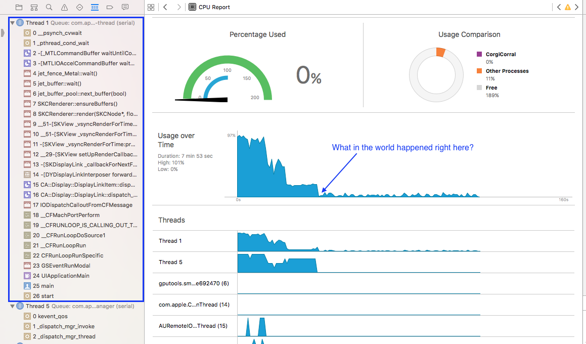
  5. Play Level 1 — when I return to Level 1, the segue between the Scene Selection screen and the GameViewController suddenly slows to a snail’s pace, the game’s framerate drops to 1fps, activity on all threads plummets, and the overall CPU usage drops to just about nothing. The Level1.sks file seems to load properly, everything is just slow.

The bug also occurs if I retry one of the scenes (so like: 2, 3, 1, 1, 2) instead of playing four different ones.

Since a crash never actually occurs, I paused execution right after the slowdown and took this screenshot of the debug navigator (click to enlarge):

debug navigator

However, I can’t make any sense of it. All I know is that I don’t seem to have a memory leak.

The Trace

I opened up the Time Profiler and recorded myself playing four games and then starting a fifth. I saved the trace, which you can download from Dropbox. (Note: it’s a 50MB file, since it took me about 6 minutes to reach the bug). The problem occurs right around the 5:15 timestamp.

Theories

I’m not experienced enough to be able to debug a problem like this. But I’m guess it has something to do with threading? Or texture loading? Or both? All of my scenes are loaded from .sks files. All of my sprite images are in the asset catalog (which, from what I understand, is necessary for app thinning and should behave like a texture atlas as of iOS 9). I’m not doing any on-demand resource loading. I don’t have any code related to Grand Central Dispatch. The game is accelerometer-controlled, so CPU-usage is naturally high during playtime. When I try to start that fifth game though, it’s like the accelerometer just gives up. Am I hitting some kind of system limit?

Comments are open, because I’m desperate. I’ll update this post with any additional information requested, and also if a solution is found. Thanks in advance!

Link

iMore on the Indie App Market

What no indie developer wants to hear about the App Store

Rene Ritchie gives his take on the state of the indie app market. Like him, I hope things will improve, but I’m not necessarily optimistic.

When I was a child, all my favorite toys were wooden, painstakingly carved by artisans who ran the store near my home. I cherished them. Today those kinds of toys are all but gone, and that business model is no longer viable in the mass market.

Indeed, isn’t this the fate of every product market? Everything distills down to a few big players and a lot of little hobbyists/mom-and-pop shops. I can’t think of another profession where one of the expectations of being “indie” is making a sustainable living…let alone striking it rich.

There will always be customers who care deeply about quality, and there will always be a place in this world for wooden toys. However, in order for wooden toymakers to stay afloat they’ve had to either raise the price of their toys, or take on a different job while making and selling their toys on the weekends.

One last thought: in any market (art, music, software, etc.), indies sometimes see themselves as artists more than small business owners. When the market is thriving, that balance of focus probably won’t hurt their chances of success. However, when times get tough, the ability to wear that small business owner hat with competence is absolutely critical. I like Rene’s final words:

Either way, times have changed and we, all of us, have to change with them. We can lament the past and challenge the future all we want, but ultimately the most important thing we all have to do is this:

Figure out what’s next.

Who uses SpriteKit/SceneKit?

Apple introduced SceneKit at WWDC 2012 and SpriteKit in 2013. Both frameworks have received updates over the past 3 years and have had multiple sessions dedicated to their new capabilities. Watching at home, however, I could never tell how many people actually attended those sessions. Is anyone even using SpriteKit? It seems like the majority of iOS games are built using cross-platform game engines like Unity.

If you’re an iOS game developer, I’m hoping you won’t mind answering this quick poll (not sure if it’ll show up in RSS readers):

[poll id=”2″]

Ever since Disco Bees was released, I haven’t heard a peep about any popular games made using SpriteKit or SceneKit. The reason I’m curious about this is because I want Apple to keep working on these frameworks, but I worry that they’ll be left to languish if no one is actually using them!

Comments are open on this one; please behave yourselves.

Resizable Button Backgrounds in Xcode

Every once in awhile I discover a little feature in Xcode that I never noticed before and wonder how in the world I could have missed it. Today’s lightbulb ? moment is brought to you by: “image slicing in the Xcode asset catalog.”

See, I made this button in the shape of a dog treat:

bone_button_slicing1

I’ve been using it as the background for my “Play” button on Corgi Corral’s main menu screen. My concern was that when I localized the word “Play,” there might be a translation that caused the word to be too long for the button at the size I designed it. It would be better if the button background itself could scale its width without looking weird and stretched. That’s when I noticed the “Show slicing” button in the bottom-right corner of the asset catalog.

When you click “Show slicing,” your image appears larger and is overlaid with a button that says “Start slicing.” This is where the fun begins! ?

Slicing a button

You have three options: slice horizontally, vertically, or both. Slicing horizontally automatically preserves the end caps of the button while simultaneously creating a 1-pixel vertical slice that can either be tiled or stretched, depending on your preference.

Sliced button

After slicing the image, you’re done—there’s no “save changes” or “done slicing” button to press. When I switched back over to my Storyboard, however, my bone button was looking a little squished:

Squished bone button

To fix that, I adjusted the content insets on the button like so:

Left and right content insets set to 80

Ah, much better.

And that, my friends, was a quick tutorial on something you probably already knew about. Have a great day! ?

Link

The Fate of iAd

Apple Discontinuing iAd (update)

From 9to5mac:

February update: We have followed up with Apple numerous times since this original post for more clarification and have finally received a firm answer to explain the situation. The whole of the iAd network is going away — developers will not be able to include any ad banners in their apps after June 30. Developers will have to find a new ad company to continue monetizing their apps using ads, as iAd will no longer function.

Well, I guess that’s that!

Follow-up: The Nuances of Online Discussion

A few weeks ago I wrote a post about how some of my favorite people on Twitter seem to be…well, avoiding Twitter…and how that made me kinda sad. This morning I was delightfully surprised to find that Myke Hurley and Casey Liss decided to discuss my post on their podcast Analog(ue).

WarGames

Boy, was it a great discussion (yes, I’m a listener, and yes, you pronounced my name right!). I think Myke may have summed up the issue best when he broke out that oft-quoted line from WarGames: “The only winning move is not to play.” I totally agree, and also find a bit of dark humor in the comparison between Twitter and Global Thermonuclear War. ;) Here exists a problem at the very intersection of technology and humanity for which there exists no decent, workable solution. Like Casey said, it’s lose-lose. As a fellow loser in this situation, let me just say that I am absolutely on their side. If the choice is between my sense of community and someone else’s overall happiness, my vote is unequivocally for the latter.

Ironically, as I listened to their conversation, I got a strange taste of what Myke and Casey’s lives must be like. For instance, I’ve never heard my own name said out loud so many times. It instantly reminded me of how shy I am, and how while in theory I would love to be a part of the “cool kids club,” I’m not even sure I could handle it. Could I even be myself? Myke and Casey said a lot of really nice things about my post (which of course made me feel good), but what if instead they had torn it apart? I would have felt horrible…and yet, that’s the kind of thing they have to deal with all the time.

With all that said, I do believe there is hope for the future of online communities. This brings me to another good post about Online Relationships by Belle Beth Cooper. Belle’s post really resonated with me because it reminded me of something I think about a lot: when an ever-increasing number of blogs and media outlets are disabling comment sections, where do decent, thoughtful people bring their discussions? I only offer readers one way to contact me on this site, and it’s via Twitter. But what if, like Belle, you no longer use Twitter (or never did in the first place)?

Belle wrote about how she enjoys my blog (Thanks!! I just added yours to my RSS reader!) but didn’t have any way to really reply to what I was saying. I loved this bit from her post:

As I wondered about this today I realised I could use my own blog to post a reply in a sense. In the same way lots of developers weigh in on community issues when they blow up, I could link to Becky’s post and write my own short reply in the form of a post on my own blog.

This feels very old-school to me; something that happened more in the early days of blogging when trackbacks were also a big deal. I wasn’t heavily involved in blogging early on, so I don’t know if this is true, it’s simply a vague feeling I have about this approach. Direct, and yet indirect, communication via blogs. Almost like writing letters to someone whose address you don’t have, and being forced to publish them in the newspaper in the hope that they will see them.

The reason I saw Belle’s post was because I keep an eye on the “Referrals” section of my WordPress stats page. Otherwise, I may have never found it. And that’s…well, sad. I actually really like the idea of back-and-forth blog responses, but I also agree that there has to be a better way.

So this is where I find hope: I think that there are a lot of very smart people who are thinking about and working on this. One of them is Christa Mrgan, co-founder of Civil Comments, a crowd-sourced, moderated comment system designed to create safe, pleasant discussion spaces.

Another is Manton Reece, who has so many insightful things to say about the future of blogging. Manton is working on a microblogging service and app and also co-hosts one of my other favorite podcasts, Core Intuition. On episode 219, around the 30-minute mark, he brings up WebMention, which is a sort of modern replacement for pingbacks that looks interesting. There is also apparently a WordPress plugin for WebMention, so I may try that out and see how it works.

There may be no perfect solutions for the myriad problems that arise in online communities, but I’m confident that there exist better solutions than what we have now. Perhaps the more we talk about it, the closer we’ll get to discovering those solutions. Here’s hoping!