Data Persistence Dilemma

Sometimes, in order to solve a problem, I have to think through it out loud (or in this case, in writing).

Here’s the sitch: I’m making an app for knitters and crocheters. They need to be able to manage projects (i.e. “Baby blanket,” “Socks for mom,” etc.). In addition to a bunch of metadata about each project, users should be able to add photos and designate one or more images or PDF files as the project’s pattern. A PDF or image of the pattern isn’t required, but including one will allow users to enter a split view where they can view the pattern and operate a row counter at the same time.

A project shouldn’t necessarily “own” its pattern. In other words, a pattern can have multiple projects associated with it (say you want to make the same baby blanket for multiple babies), so as to avoid the needless duplication of the pattern file. A pattern can exist without a project and a project can exist without a pattern, but when linked, the project becomes the child of the pattern.

My user base includes people who may not always have an internet connection. Therefore, all data needs to be stored locally. However, those who do have an internet connection are going to want iCloud sync between devices.

I like Core Data. If I were to set this up in Core Data, without any consideration of iCloud syncing, I’d create Project and Pattern entities, store images and PDFs in the file system, and call it a day.

iCloud syncing is where things get murky for me. Core Data + iCloud is deprecated, and I don’t want to use it. Not only that, I don’t know what to do with the PDFs and images. Storing them as BLOBs in Core Data seems like a bad idea. I understand how to save them to the file system but don’t understand how to sync them via iCloud and also have a reference to them in Core Data. Do I use iCloud Document Storage for them? Do I zip them up somehow (NSFileWrapper??) and use UIDocument? How do I store a reference to them in Core Data (just the file name of the UIDocument, since the file URL is variable?). If users will be adding photos and PDFs at different times, do I use one UIDocument subclass for photos and one for PDFs or do I use a single document and update it with the added information? You can tell I obviously have no idea how this works, and a multitude of Google searches has yet to clear it up for me.

As for the rest of the information in Core Data, I’m thinking of trying to sync it  with CloudKit using something like the open source version of Ensembles or Seam3.

I guess I’m not sure if I’m on the right track and would welcome any advice/feedback. I’d really like to stay away from non-Apple services (like Realm) for the time being. Comments are open!
Status

Indies: when you decide to run with a new app idea, what sort of prep do you do before you ever fire up Xcode? Prototype? Design sketches?

WWDC 2017: Designing for Everyone

If I had to guess at an unofficial theme for this year’s WWDC, it would be “Designing for Everyone.” In addition to being the name of an actual session (806: Design for Everyone), the phrase captures the main thrust of what many of the other sessions were about as well. More than one presenter mentioned that while accessibility wasn’t a primary focus when re-designing some of Apple’s first party apps for iOS 10, it became a priority for iOS 11. One presenter (I can’t remember who) admitted that her team still had plenty of work to do on the accessibility front.

The session 802: Essential Design Principles reminded me of the best book I read in grad school: Donald Norman’s The Design of Everyday Things. Apple Design Evangelism Manager Mike Stern outlined many of the same principles that Norman discussed in his book—things like natural mapping and affordances.

In Chapter 2 of The Design of Everyday Things, there’s a little box with questions that designers should ask about their design:

How easily can one:

  • determine the function of the device [or in our case, an app or feature]?
  • tell what actions are possible?
  • tell if the system is in desired state?
  • determine mapping from intention to physical movement?
  • determine mapping from system state to interpretation?
  • perform the action?
  • tell what state the system is in?

(Norman, D. A. (2013). The design of everyday things. New York: Basic Books, a member of the Perseus Books Group.)

The questions are based on seven stages that humans go through when taking an action. When people use our apps, they have a goal in mind that they want to accomplish. They should be able to figure out what actions are available, which ones will lead them to their goal, and how to execute said action(s). Ideally, they should be able to do this without any additional walkthroughs, on-boarding, or tooltips.

They should also be able to accurately predict and evaluate the outcome of their actions. This can be achieved using things like error/success messages, animations, button state changes, view transitions, etc.

An app’s design should clearly communicate what you can do with it. Can you toggle a switch? Press a button? Scroll up and down? All of those things are called “affordances”—things the app allows you to do. 3D Touch is tricky because one of the affordances of a flat piece of glass is NOT that you should be able to exert pressure downward “into” it. Rather, glass, as a material, affords swiping and tapping by its very smooth, flat nature.

AirPods are another example of hidden affordances. Can you tell by their design that you can tap on them to execute additional functions? No. That’s traditionally considered bad design.

State changes are also important. What state is your app in? Is it syncing, or loading something? If you are using a tabbed interface, is it clear which tab the user is currently viewing? These questions are integral to making sure your design is accessible for everyone.

I’m planning to spend the next few weeks updating Nebraska93’s design to be compatible with Dynamic Type. A few days ago I tweeted a video of my successfully re-designed table view cells and I’m really surprised by the amount of favorites and retweets it got. A few people remarked that they didn’t know Accessibility Inspector could adjust Dynamic Type settings on the fly.

My advice to fellow devs is twofold. First, open up Accessibility Inspector and see how your app looks to people who have low vision. Off-hand, I can think of three people that I know in real life who use the larger text size settings, and I suspect it might be way more common than you might think. Second, read The Design of Everyday Things. It’ll make you really mad at a lot of doors and household appliances, but it’s worth it!

Status

iOS 11 has already had two major effects on my iPad usage: 1) I feel delighted whenever I interact with it and 2) I want to use it more.

Announcing Nebraska93

Nebraska93 Icon

Two days ago I quietly released Nebraska93, a county license plate game for anyone traveling through Nebraska.

I’m really happy with the way it turned out and thought I’d share some fun things about it:

  • I drew the app icon, which is based on the state’s 1940 license plate design.
  • I also created all of the icons and artwork in the app and gathered all of the interesting facts for each county.
  • Nebraska93 was “in review” for only 12 minutes.
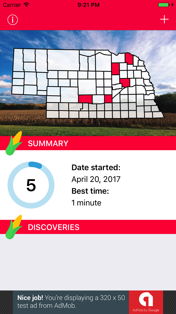
  • The photo behind the Nebraska map on the app’s main screen was taken from my yard.
  • The app uses AdMob to serve ads. If it really takes off (I mean really takes off), I’d definitely entertain the idea of rolling my own ads for local Nebraska businesses.
  • I used third party libraries to create confetti and display in-app notifications. I also modified Marco’s IPInsetLabel for the “Did You Know?” facts on each county page.
  • The basic county data (population, established date, county seat, etc.) is loaded into Core Data on the app’s first launch. The interesting facts about each county are in a separate plist so that I can easily add more as time goes on.
  • The dynamic Nebraska map, circular progress indicator, and corn icon were all made in PaintCode.
  • The “Discoveries” images were drawn with Affinity Designer and involved a lot of tracing with vector tools (except for the Walgren Lake Monster, which I made up myself).
  • If Nebraska schools showed interest in purchasing the app, I’d remove ads, switch to paid-upfront, and then release an ad-supported “lite” version.
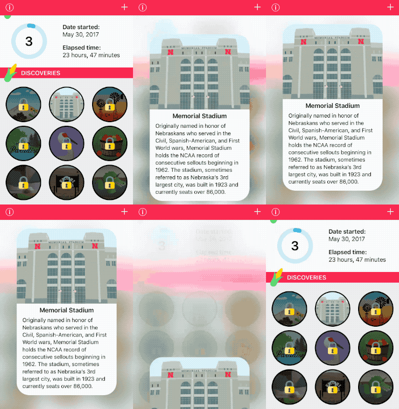
  • One of my favorite things about the app is the little informational view that pops up when you tap an unlocked Discovery.

Discovery modal view

I think it would really be fun to collaborate with local elementary schools. All fourth graders learn about Nebraska history, so students could research the counties and send me their own fun facts which I could feature with their first name and/or school.

The next things on my to-do list are to make it available for iPad, improve accessibility, and re-take the app’s store screenshots without the ad banner (whoops).

Heartfelt thanks to all of you who have downloaded Nebraska93 so far (especially those who don’t live in Nebraska, lol)! If you have any questions about how anything in the app works, let me know. I always like it if my work can help other beginners in some way. And if you’re a beginner, let me just encourage you to explore app ideas that might benefit your local community. It’s a great way to gain experience and give back at the same time!

Status

Currently preparing to submit my Nebraska app for review later tonight. This whole project took about five months longer than it needed to, but I’m proud of the finished product and hope people in my state will have fun with it!

April 21st – Progress Update

A couple months ago I wrote about a little local project I’ve been working on: a license plate game for Nebraska residents/tourists (okay, Nebraska doesn’t really have tourists). Things are slowly coming together with only a few, albeit time-consuming, things left on my to-do list. One of those things involves researching my state’s history and geography, and another involves designing some achievement-related assets and a system for unlocking them.

The UI still needs work, obviously (especially the information density). The “Discoveries” section will be home to special “points of interest” which will be little badges that are automatically unlocked when a person discovers certain counties. Each point of interest will display a little story or historical nugget when tapped. The app is supposed to be educational and fun, and while I don’t think it’ll make much money (if any), I want it to be well-designed and look nice in my app portfolio.

As I mentioned in a previous post, there are 93 counties in Nebraska. I decided to request an App Store rating when a person spots 62 of them. I figure if they stick with it that long, they must like it at least a little! There’s also a link to rate the app in the modal Settings view.

So yeah! That’s where I’m at. I’m hoping it won’t take much more than a month for me to finish and ship this baby. ?

Apple’s Identity and the New Mac Pro

The Mac Pro was dead, or so many of us thought. Or so Apple thought, apparently, because rumor has it the decision to revive it was made fairly recently.

The implications of the Mac Pro’s presumed death were worrisome and left us with many questions. Did Apple care to serve a higher-needs market? If not, why? What machines were Apple’s own engineers using? What did this mean for the future of macOS and Macs in general?

Apple, being Apple, naturally sought to regain control of its narrative and did so with unprecedented transparency and humility. But I can’t help but wonder whether Apple itself fully realizes the implications of its decision to double down on pro hardware. This wasn’t just a product decision, with effects on staffing, component sourcing, and profit margins. It was a decision about the company’s identity. What is our core mission? Who is our audience? Answering those questions (and making sure every employee knows the answer to those questions) is like Running a Company 101. And yet Apple seemed to be confused.

Depending on when the initial decision to sunset the Mac Pro was made, it seems like a lot of this could have been avoided if Apple had utilized its own mission statement. Up until early June 2015, the company still ended every press release with “Apple designs Macs, the best personal computers in the world…” Now filter “Should we kill our high end personal computer?” through that and the answer is an emphatic “Nope.”

Setting all of that aside, I hope Apple realizes that new hardware should only be the beginning. After all, for the most part, pros seem to want a Big Boring Box of Raw Power—a flexible cheese grater of the future. I’m sure Apple will find a way to make it look a little sexier than that, but what remains is that software needs to be the differentiater between the new Mac Pro and a suped up Windows machine. 

In other words, renewing a commitment to professionals involves more than just designing the perfect computer for professionals. It means designing an OS and a software ecosystem for professionals. For example, it’s not enough for Adobe to do cool stuff with the Touch Bar, or for the iPad Pro to act as a Wacom-like tablet input for the Mac. Adobe’s (and other high end software-makers’) products need to integrate with macOS in a way that makes them better and easier to use on a Mac than Windows. It’s Apple’s job to make that possible and to provide incentive for companies to put resources into it. 

So, Apple. Expand your Mac software teams. Fix the Mac App Store. Make sure some of that Workflow love makes it to the Mac. Focus on improving iCloud’s stability and features, because collaboration and remote work are the future and because RAW photographs aren’t getting any smaller (and your storage tiers are not friendly to even amateur photographers). 

Look, you may not be Apple Computer anymore but you have reaffirmed that you are Apple, a company that makes personal computers (among other things), and that your audience is everybody, and that you want to be the best. So do that. 

Link

Larder Blog Interview

Larder Blog Interview

The only interview I’ve ever given was in middle school, to my local newspaper, after winning a spelling bee (ironically, the reporter spelled my last name wrong). So I was super excited when Belle Beth Cooper asked me if she could interview me for Larder’s “Making it” series. In the interview I talk a bit about my background and the advice that I would give beginning iOS developers today.

Give the Girls a Chance: Support the San Diego Girl Scouts

You have 4 days to help a whole bunch of girls in San Diego learn to code.

Actually, that’s not quite true. You really only have 3 days, and it’s not just “learning to code” in that shallow, “everybody should learn to code” boot camp sense. This is a full-fledged curriculum. It teaches math, physics, programming, product management and marketing through the creation of an adorable cookie-themed video game. It will undoubtedly strengthen the girls’ collaboration skills and give them a sense of what it takes to bring a real game to market.

There’s something for all skill levels: beginners can work using Scratch, while more advanced learners can work on porting the game to iOS, Android and the web.

Some of the girls can’t afford to participate. The program needs a meeting space, computers, dev accounts, and teachers. As of the writing of this post, they have a little under $16,000 left to raise. And with Kickstarter, it’s all or nothing. For as little as $5, you can be a part of empowering a group of girls by giving them the opportunity to gain valuable skills and experience.

I was never a Girl Scout. But if this program had been available to me as a kid, I dang well would have been.

So buy 5 boxes of Tagalongs and Samoas to support your local troop and then hop over to the Marshmallow Run Kickstarter. You’ll be helping improve the tech industry by ensuring its next generation of developers and entrepreneurs is as diverse as its customers.

A Little Local Project

When people ask me what I do, I tell them I’m a stay-at-home mom. I say it quickly, hoping the conversation will be whisked along to something else before my husband can interject—as he typically does—with “and she also makes apps.” At that point I blush and explain that I don’t really know what I’m doing and no, I can’t really show them anything I’ve made.

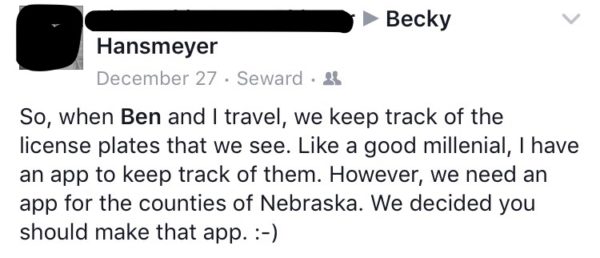
I don’t know why I do that, because most people don’t care whether I know what I’m doing or not. They just want to pitch me their app ideas! Unfortunately most of them either exist already, are too expensive to implement, or are just literally impossible. However, a friend posted this simple little request on my Facebook wall a few weeks ago:

A request for a Nebraska license plate game

In 1922, Nebraska adopted a license plate numbering system that assigned a specific one- or two-digit prefix to each county. Therefore, you can usually tell what county someone is from by their license plate number. The reason I say “usually” is because three counties eventually switched to non-specific alphanumeric codes because their population outgrew the 6-digit system.

Nebraska is a big state and there isn’t a whole lot to look at if you’re traveling between towns aside from crop fields, pasturelands, and sand hills. With 93 counties, it would certainly be a challenge to spot them all!

So, that’s what I’ve been working on lately: a little license plate game.

Some features I want to implement:

  • information about each county, including population, county seat, and some fun facts
  • the ability to mark a county as “found”
  • a state map that highlights the counties you’ve found
  • a progress indicator
  • confetti when you find all 93
  • a few stickers or badges depicting state landmarks that you unlock when you find certain counties

The audience for this app is obviously small. It’s a fun project though, and it continues to help me sharpen my development skills. Before Charlie came along, I think I could knock this out in two weeks. With my little buddy around, it’s going to take months. And that’s okay. ?

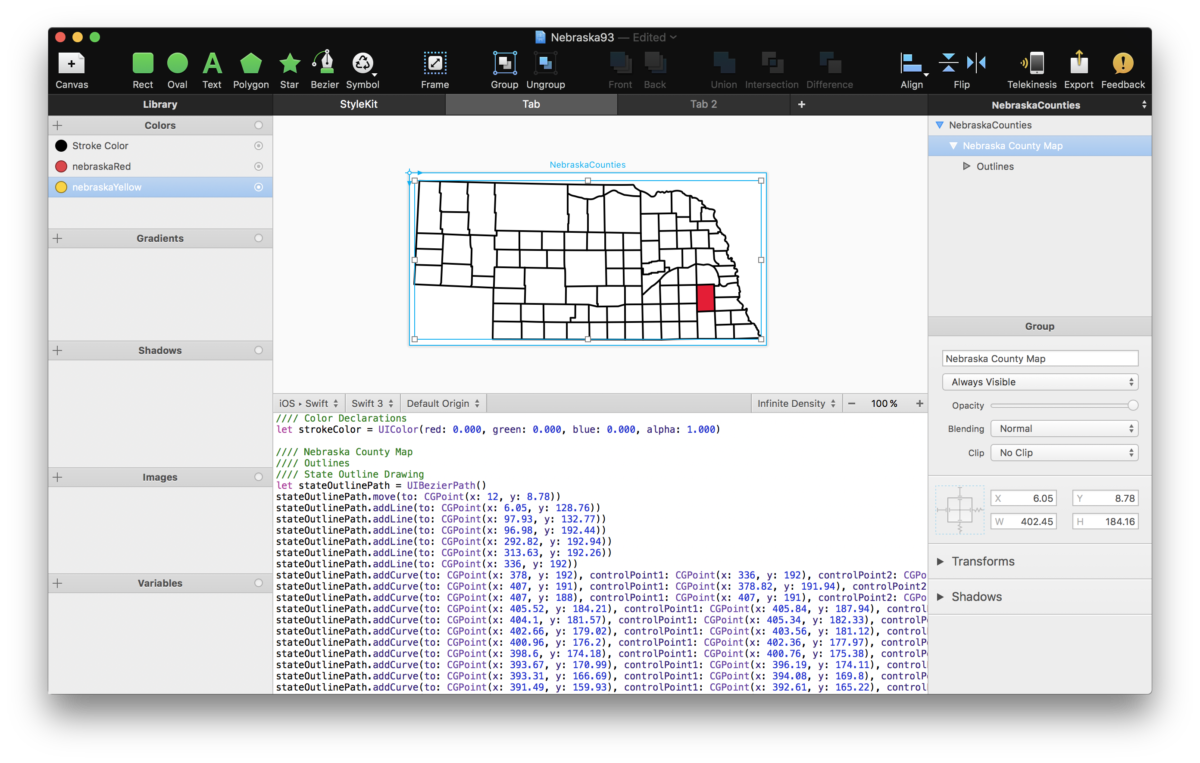
Here’s what I have so far: I traced a map of Nebraska in Affinity Designer, exported it as an SVG, and imported it to PaintCode.

Nebraska map in PaintCode

From what I understand, the only way I can toggle the visibility of each red county shape is by giving it its own unique boolean variable. So that’s 93 booleans, otherwise known as “one heck of a switch statement.” ?

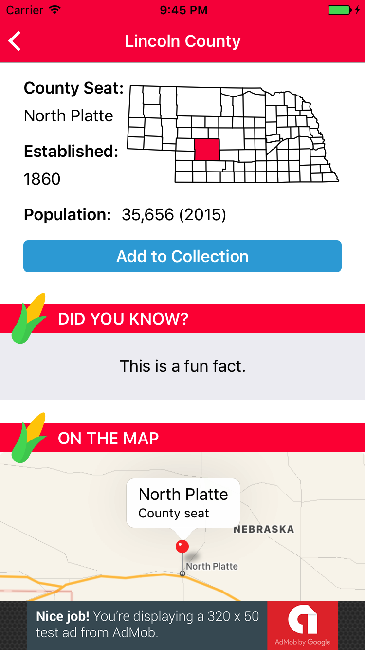
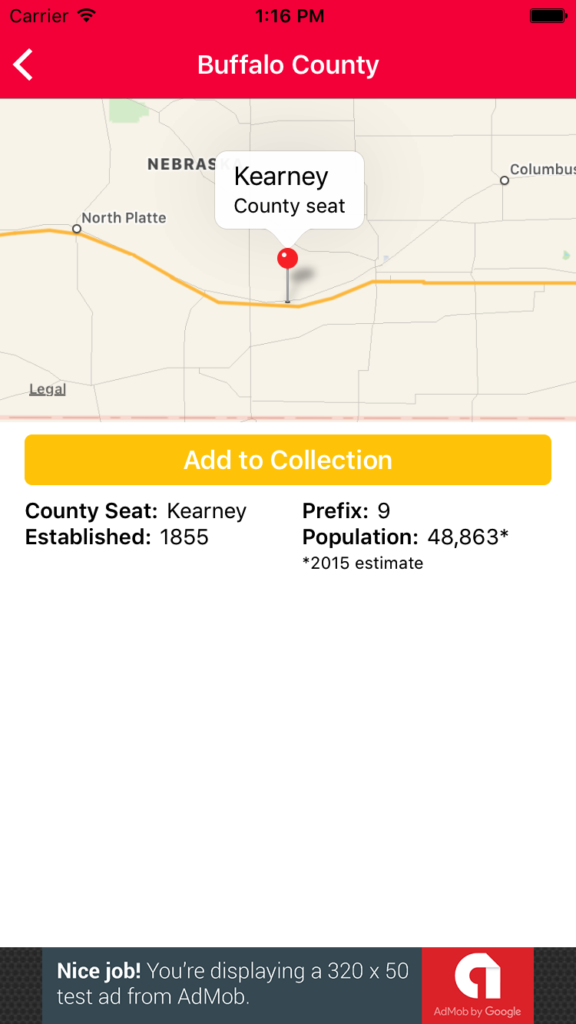
I also have a list of counties in a UITableView and a detail view that shows the location of the county seat, the year the county was established, and its population. Below that will be a fun fact and maybe someday some pictures of county landmarks, if I can find a good source.

In-progress screen shot of detail view

As you can see, the app will be ad-supported as well.

I was going to keep this project under wraps until it was finished, but honestly, I’d much rather share it with you. Some secrets aren’t worth keeping, especially when they might help and inspire other beginning iOS developers to start their own projects!

In Support of (Micro)Blogging

It’s no secret that I’m a big fan of Manton Reece’s vision and passion for the future of blogging and of the open web. I’ve backed his Indie Microblogging book on Kickstarter and am really looking forward to his Micro.blog service, which he has described as “a step forward” in the direction of a more de-centralized, open web.

It’s caused me to reflect on what attracts me to Twitter and what aspects of that could be replaced by Micro.blog if a significant portion of the Apple community began using it.

When I open Twitter, my favorite things to see are:

  1. Links to thoughtful blog posts, articles and podcasts
  2. General commentary on any of the above
  3. Dog pictures and photos from the people I follow
  4. Jokes, memes, banter

I’m old enough to remember when people left the commenting feature turned on for their personal blogs. Then, when everyone became fed up with the toxicity of comment sections and the ridiculous abundance of spam, bloggers started inviting readers to contact them on Twitter (which is, arguably, only slightly less toxic). Manton hopes to successfully combat harassment on his platform, and I have faith in his ability to do so.

I can easily see myself using Micro.blog to read the thoughts, ideas and commentary from my friends and people I admire. For pictures? Most of my favorite people are on Instagram. So where does that leave Twitter?

There are a few things that Twitter really excels at, such as:

  1. Live event commentary
  2. Breaking news (even just local stuff like school closures)
  3. Jokes, memes, banter
  4. Having a huge subset of celebrities, athletes, public figures, TV writers, etc. actively using the service

I find Twitter particularly useful for the first three items (I’m not big on celebrity culture), so I’d probably keep it around.

Microblogging isn’t new. One only need look to the thriving Tumblr community to see that short form blogging is a proven concept. On Tumblr, users don’t just create their own posts; they reblog the creations of others, often providing their own commentary in the tags section (seriously, Tumblr tags are usually stream-of-consciousness sentence fragments). By doing this, users curate a selection of content that speaks to who they are and what they like. This is, in a way, similar to the “link post” format that Daring Fireball uses as well as myself and many other bloggers.

Where am I going with this? I can see kids who have grown up posting anonymously on Tumblr and ephemerally on Snapchat moving on to something like Micro.blog when they’re ready to have a public presence on the web and take serious ownership of their writing. 

I imagine Micro.blog as a vehicle for civilized, thoughtful discussion. Whether it turns out to be so is yet to be seen, but my hopes remain high that Manton will indeed rescue us from the centralized, ever-burning dumpster fires that hold captive our ideas. (Long live RSS!)

macOS’s Sticker Problem

Since iOS 10 launched, many have bemoaned the lack of feature parity between Messages on iOS and macOS. While Messages on the Mac did gain some new features such as rich previews, Tapbacks, and the ability to view stickers, it still lacks the ability to use screen and bubble effects and to send stickers.

I’ve been thinking about how Apple could add stickers to Messages on the Mac and honestly, I’m stumped. It’s a much more complicated problem than I initially imagined.

First, there’s user expectations. I don’t know about you, but I would expect that all of the apps in the Messages app drawer on my phone would also be available on my Mac. For plain vanilla sticker packs that use the sticker template in Xcode, that could potentially be an easy transition, as Xcode could simply compile something that would work on macOS.

But what about sticker packs with custom code? Or full-fledged iMessage apps such as turn-based games? Users can’t tell the difference between a bare bones sticker pack and an iMessage app. They wouldn’t understand why some stickers and apps were available and some weren’t. What then? Does Apple require that developers add a Mac target to their iMessage app projects? (Uh…nope.)

And what about the built-in store? Users would need a way to re-download purchases and to purchase new apps and stickers. But what if a user purchases an app or sticker pack that’s bundled with an iOS app? What if that user doesn’t own an iOS device? They’d be paying for something they could only get partial value from.

Maybe Apple could sync users’ currently installed iMessage apps to the Mac and omit the store entirely, requiring users to manage their stickers and apps on their iOS device. However, requiring that users have an iOS device in order to use stickers in Messages seems insane. This solution also fails to address the issue of iMessage apps even running on the Mac in the first place.

The only thing I can think of in the short term (before the great merging of the iOS and macOS SDKs that will probably happen someday), is that when a user opens the Messages app drawer on a Mac, what pops up is essentially an iOS emulator. Is that even possible? I don’t know. It’d be slow as heck probably.

Maybe I’m missing something obvious, but it certainly seems like a tough problem to solve. Fortunately, it’s Apple’s problem to solve, not mine!

Fireworks

New Year’s Fail-o-lutions (Sent with Fireworks)

I’m a big fan of setting small, achievable goals. I’m also one of those people that adds things to my to-do list that I’ve already done just to make myself feel good. Both of those things sound harmless until I remember that they actually stem directly from my monstrous, soul-crushing fear of failure. ☠️

Failure’s not so bad though, right? It’s like C.S. Lewis said: “One fails forward to success.” I have a few goals for this year, and I also have a little boy who’s on the cusp of learning to walk. So yeah, I might achieve my goals, or I might spend every waking moment pulling my toddler away from the dogs’ water or kissing bruises on his little head. (Honestly, I’m fine with both of those scenarios.)

With that said, here are some things I might fail beautifully at this year:

Blogging More

I love Twitter, but I also love my blog and I feel like I’ve been neglecting it. Also, Manton Reece’s upcoming Micro.blog service has gotten me all excited about self-hosting my thoughts again (check it out on Kickstarter!). Accomplishing this goal will require me to make a significant lifestyle change: I will no longer be able to be a Twitter timeline completionist. It’s just too time consuming! Thinking about declaring Twitter bankruptcy on a regular basis simultaneously pains me and frees me. I’m looking forward to trying it.

There’s a second part to this goal, and it’s this: I want to “be myself” more on the Internet. It’s not that I haven’t been genuine; it’s just that I’ve been a little withdrawn and I feel like my own blog posts have been lacking “voice.” Hopefully that makes sense!

Making Money

I’m becoming a competent iOS developer and that means it’s time to make some money from this gig. My goal is to make $1000 from the App Store this year. This means I’m going to have to work hard and ship some stuff. I’d love for one of those things to be Corgi Corral, however I’m not actually expecting to make any money from that. I just started working on a new project that’s of local interest, and I’m hoping it’ll help me get started toward my goal.

Reading Some Books

Here are some books I’d like to read this year:

  1. Swift Style by Erica Sadun
  2. Making Sense of Color Management by Craig Hockenberry
  3. Aqua and Bondi by Stephen Hackett
  4. A book on either animations in iOS or UI design

There are also a few non-techie books about parenting that I’d like to read (the kind that inspire you and make you feel better, not the kind that make you feel like the world’s worst parent!).

I’m sure I’ll think of some other things throughout the year, but this list is a good start. I also decided that I’m going to try to earn the New Year’s Apple Watch activity achievement. One day down, six to go! ?