How to Flip an App for Profit

Late last year, David Barnard wrote a great post entitled “How to Game the App Store,” outlining some of the numerous hacks that developers can use to send their apps soaring up the App Store charts. This post is written in that same spirit, which is to say: I don’t recommend actually doing any of these things if you have any aspirations of being a decent human being.

Yesterday, after browsing the Top Free Photo/Video apps chart, I posted this tweet in frustration:

It sort of blew up (is there a word for getting fireballed, but on Twitter?), and some of the replies indicated a bit of ignorance or misunderstanding of what exactly the problem is with apps like Background (which, at least as of 3pm CST today, has been removed from the App Store).

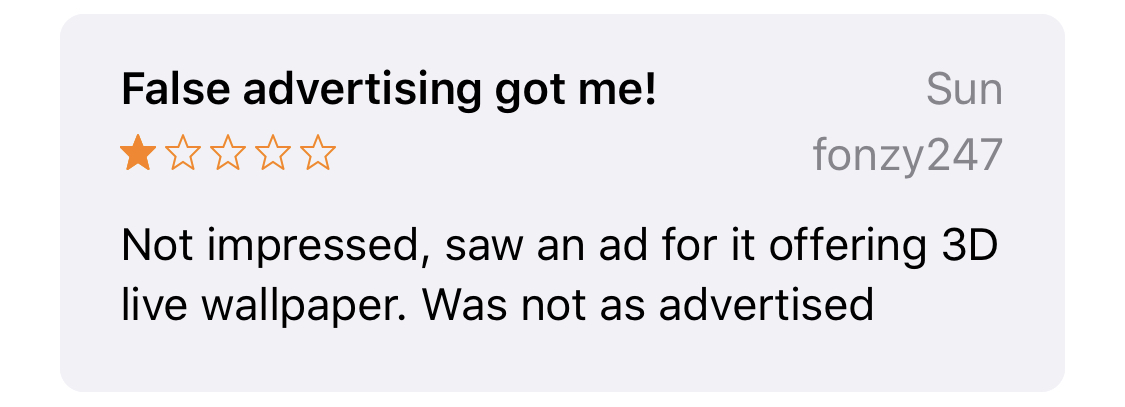
Background used to be a good app. You can tell from its early reviews that its users genuinely enjoyed browsing and making use of its hand-curated selection of iPhone wallpapers. In fact, its reviews are generally positive up until late June, when an update began causing some issues. From that point on it becomes clear that Background is no longer owned or updated by its original developer. It’s been flipped.

So how does an app get flipped? Read on to discover the ultimate secret to making millions on the iOS App Store.

Step 1: Find a good app with a long history of positive reviews and purchase it from the developer

This isn’t too hard if you’ve got the cash. Background is just one example of many apps that, while beloved by a small community of users, struggled to attain a wider reach. It was acquired by Tron Apps, probably sometime this summer. From what I can tell, the worst app-flipping offender in the Photo/Video space is Bending Spoons, LLC. A few of the apps they’ve purchased include Splice, Photo Editorº (purchased under the name Easy Tiger Apps) and Video Maker with Music Editor. In the reviews, you can find the exact moment when everything went to crap.

Step 2: Riddle the app with ridiculously expensive subscription options

The gold standard seems to be a 3-day trial that moves into a $9.99/week subscription, but there’s flexibility here, depending on precisely how evil you want to be. Make sure to hide these new payment options from your pre-acquisition users. After all, you don’t want them updating their glowing past reviews. Oh, and for those new users you’re about to acquire? Make sure it’s darn near impossible for them to find the “x” to close your subscription view (or, for fun, make it completely nonfunctional!).

Step 3: Design the perfect false advertisement

You’re going to need a super polished video that absolutely does not show any actual footage from your app. In fact, feel free to steal images from other apps. For a good example, view Background’s Facebook ad, helpfully listed on SensorTower.
Step 4: Spend a stupid amount of money on user acquisition

That beautiful bundle of lies you just made? Blast it on Facebook, Snapchat, Instagram, in-app ad networks, whatever you can find. Buy search ads. If you’re not spending between $10k and $500,000k (oh, who are we kidding? There’s no upper limit), you’re not doing it right. This should help you get on the Top 200 Free chart, and hopefully into the top 50 or so, which tends to create its own buzz.

Step 5: Buy fake reviews

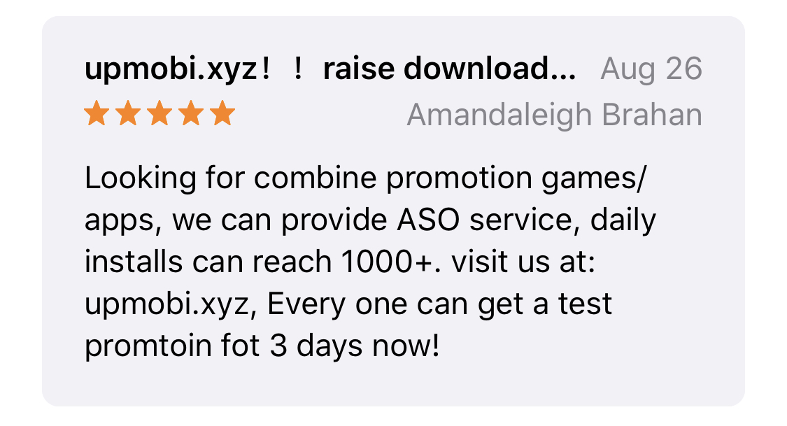
Once the number of one-star reviews written by real humans whose time and money you’ve wasted starts to actually affect the app’s overall star rating, it’s time to buy some fake ones. For some examples of how they’ll look, check out “PicsHub -Art Effects & Get old.” I don’t actually know how you go about buying fake reviews but it’s probably not hard. Just google “how to be the biggest wanker” and that should get you close.
l e g i t i m a t e

Step 6: Profit!!$$!

Congratulations! You’re now rich, and I despise you.

Memory Mischief

A few days ago, as I was attempting to locate and fix Snapthread’s worst shipping bug ever, I encountered a side quest. I haven’t spent much time using Instruments for debugging, mostly because it rarely works for me. either the run terminates, or Instruments itself hangs or crashes. However, I had managed to start an Allocations/Leaks run, and was watching everything hum along nicely; that is, until I decided to tap on a project that Snapthread automatically generated for me. It contained a bunch of large still photos taken with my DSLR and each time one of them was composited for insertion into the final video, memory usage climbed until the app crashed.

I checked the allocations. Hundreds of persistent megabytes were in the VM:IOSurface category. Exploring further, the responsible callers were either “FigPhotoCreateImageSurface” or “CreateCachedSurface” and the stack traces were filled with methods prefaced by “CA”, “CI,” or “CG.” After perusing Stack Overflow, I wrongly assumed that the objects were being retained due to some internal caching that CIContext was doing. After all, I had wrapped my photo/video iteration in an autoreleasepool, and I was only using a single CIContext. The memory should have been dropping back down each time, right?

Here’s what happens when Snapthread creates a video out of a still photo:

  1. If the photo needs to be letterboxed, it is first run through a CIFilter that blurs it, converts it from a CIImage to a CGImage, and sets it as the content of a CALayer. The original photo is then added to its own layer and positioned over the top of the blurred layer.
  2. If the photo doesn’t need to be letterboxed, it’s simply set as the content of a CALayer.
  3. The layer from step 1 or 2 is then composited over a short blank video using AVVideoCompositionCoreAnimationTool.
  4. The AVVideoCompositionCoreAnimationTool is assigned to the AVMutableVideoComposition, which is then assigned to an AVExportSession.

Now allow me to let you in on a little secret: my code is terrible. Can you guess which object calls the code that I just described above? It should be some sort of model controller object, but nope. It’s the “StillPhoto” object itself. Currently, each video and still photo is responsible for providing its own final formatted version to the video compositor. Yeah, I know. I’ll fix it eventually. Continuing on…

After a few hours of trying to figure out how to purge that internal cache, I started to entertain the idea that maybe it was me retaining the objects somehow. I ran the allocations instrument a few more times and discovered a curious stack trace. It highlighted AVAssetExportSession’s “exportAsynchronously(completionHandler handler: @escaping () -> Void)” as retaining over 500MBs. Huh?

Then it hit me. I was storing a reference to the export session, in case it needed to be cancelled. Y’all. Let me say it again. I WAS STORING A REFERENCE TO THE GOSH DARN EXPORT SESSION WHICH STORED A REFERENCE TO THE FLIBBERTY FLANGIN’ ANIMATION TOOL WHICH STORED A REFERENCE TO A ZILLION MEGABYTES WORTH OF IMAGE DATA. And I never set it to nil after the session ended.

fjdisoajefiajfdsjafdslafdadshfuewahfsoik

Can I fire myself?

Status

Finally wrapping up development on Snapthread 2.1 (apologies to anyone I haven’t responded to in the past few weeks!). It’s a great little update that actually has me opening the app every day just to watch the videos it auto-generates for me.

There are still a few little bugs here and there that have been really hard for me to reproduce, but overall I think this release will mark a huge reduction in crash reports. ?

As soon as 2.1 is submitted it’ll be time to get to work on an iOS 13 update, which should be pretty light and fun. Mostly just adding SF Symbols and color/font-related stuff. Might throw in some other goodies if I have time. ?

Wrapping Algorithms in Empathy

One feature I’d like to add to Snapthread is something akin to the “For You” section of Photos: a small number of auto-generated movies that the user might find useful or meaningful. In Photos, these movies are based on common image properties such as date, location, relationships gleaned from facial recognition and contacts data, and image content classified via machine learning such as dogs, cats, and bodies of water.

I don’t have access to the facial recognition data that Photos collects, and as anyone who’s had the pleasure of syncing their iCloud Photo Library to a new device knows, feeding tens of thousands of photos through an image classification algorithm takes a long time and can burn processing and battery power like nobody’s business. That leaves me with two methods for grouping photos and videos: date and location.

Attempting to smartly group a user’s photos by location without knowing where they consider “home” is pretty much impossible. Are those vacation photos, or just bathroom selfies? I don’t know. I don’t want to know. That leaves me with the safest, least creepy option: capture date.

At the surface level, organizing photos for a user based on their date seems super innocuous—that is, until we stop to recall what a disaster it was for Facebook when they first presented auto-generated “Year in Review” videos to every single user. While some people smiled at memories of a happy year, others were intensely and abruptly reminded of lost loved ones, breakups, illnesses, and other emotional events. In fact, it was re-reading Eric Meyer’s heartbreaking blog post about it that made me pause and think twice about adding this feature.

Some years just aren’t good years. There’s no way for an algorithm to know that. There are, however, steps I can take as a developer to design my “For You” feature with the worst case scenarios in mind:

  1. Make the feature opt-in. This would involve unobtrusively asking the user if they’d like to see some suggested movie projects. The preference would also be available as a toggle in the app’s settings.
  2. Don’t auto-play anything. Even if a user has opted in, they may not want to view a particular suggested movie for whatever reason. I don’t want to force it on them.
  3. Make the whole “For You” section collapsible. Maybe a user just doesn’t like that particular day’s suggestions. Let them hide the thumbnails so they don’t have to look at them.
  4. Make the movies editable. Maybe there’s just one or two videos that ruin an otherwise great movie. Let users delete/replace them.
  5. Don’t add any titles or captions that suggest a particular mood, like “Summer Fun” or “My Great Year” etc. Just stick to dates.

There are two types of auto-generated movies I’d like to offer: ones based on recent photos/videos (such as “last month” or “today”) that are designed to get users up and running quickly, and memories from awhile ago, such as “on this day.” I don’t think the recent ones need safeguards: after all, those are photos you’d see if you opened up your library anyway. It’s the ones from years ago that I need to be sensitive about.

Curating someone’s personal memories is challenging. At best, it can surprise and delight; at worst, it can be painful, invasive, and just downright creepy. We app devs may not have to take any sort of Hippocratic oath, but we probably should. If, like me, you’re considering adding some kind of personalized content to your app, tread carefully, and design with worst case scenarios in mind.

iOS 13 Summer Plans

Yesterday I finally had some time to sit and think about what improvements I want to make to Snapthread this summer. I still want to rewrite the app using SwiftUI; however, after a bit of exploration, I think I may need to wait until it’s a little more capable. Here’s what I’m planning to do instead.

Phase 1

I want to leave the app in a good place for my iOS 11 and 12 users. To do that, I want to add a few more soundtracks to choose from and a tool for adjusting a video clip’s speed.

Phase 2

Based on everything that was revealed at WWDC, here’s what I want to do after I set the minimum OS target to iOS 13:

  • Rewrite my UICollectionView code to use the new compositional layout class and diffable data source
  • Redesign my photo library picker. Apple has deprecated the methods I was using to fetch “Moments,” so I will need to do something else to help users find the photos and videos they’re looking for.
  • Explore some of the new property wrappers, like @UserDefault
  • Replace my icons with SF Symbols and design a few custom ones
  • Replace my colors and font sizes with semantic ones and set the whole app to use dark mode
  • Use the new system provided font picker
  • Possibly rewrite two view controllers in SwiftUI: Settings and Soundtracks
  • If I have time, create some more custom Core Image filters

Doing everything on that list should help rid my code of most of its remaining bugs and set the app up well for the future. I can’t wait to get started!

Personal Takeaways from WWDC 2019

Wow, what a conference, eh? Like most, I’m still processing the many new frameworks and APIs that Apple presented to us last week. So far I’ve watched 12 session videos, taken copious amounts of notes, and spent lots of time thinking about what all of this could mean for my app. As such, this post will be an attempt to organize those thoughts.

SF Symbols

When I wished for more standard system icons that could be used anywhere, I definitely did not expect Apple to deliver over 1500 of them. I feel particularly validated by Apple’s instructions for creating custom icons: find a symbol in SF Symbols that resembles what you’re looking for and edit the SVG. I feel validated because that’s exactly what I’ve been doing to create all my icons in Snapthread, except that my custom icons are based on a $25 set of 200 icons from Glyphish. Browsing through SF Symbols, I think I can replace nearly all of my icons with them, with maybe two exceptions.

The Big Functionality Giveaway

One huge point that nearly every presenter hammered on was that if you follow the Human Interface Guidelines and use Apple’s frameworks as-is, you get a TON of functionality for free. In fact, one major goal of SwiftUI is to handle all of the basic features of your app for you, so you can focus on perfecting your app’s cool, custom features. For example, if you use SwiftUI correctly, the system will automatically handle animating view changes beautifully. If you use semantic colors, Dark Mode just works. Localization behaviors for right-to-left languages, Dynamic Type—these are all things you get for free if you use Apple’s semantic font sizes and SF Symbols.

I think it was Mike Stern who said something like, “if you spent time recreating what UIKit gives you for free, with custom controls, you may want to…I don’t know how else to say this…stop doing that.” Launch Storyboards, resizable interfaces, and support for split view multitasking will all be requirements starting in April of 2020. I don’t think the message has ever been clearer: follow the HIG, use the tools we’ve given you, be a good platform citizen. Just do it.

The New Peek & Pop

If you haven’t watched “What’s New in iOS Design,” you should. Peek and pop have become “contextual menus” that are now available and accessible on all devices. “Use them everywhere!” Mike says in the session. Apple wants these contextual menus to be so pervasive that their users expect to find them all over the place. An important thing to note is that any functionality placed into a contextual menu should also be accessible from elsewhere in the app. There are convenience methods for adding contextual menus to table view and collection view items, which I plan to use so that users can perform common actions on video clips in their timeline. Overall, I think this is a great change.

Dark Mode

I wasn’t particularly excited about dark mode prior to the conference because my app, like most other video and photo editors, already has a dark appearance. However, now that I’ve learned more about it, I really like the way Apple’s colors, fonts, and new “materials” adjust to trait changes. For instance, if you use semantic background colors, there are slight variations for “base” and “elevated” states. Apps are elevated when in split view multitasking so that the black separator between apps can be seen more clearly, and controllers and views are considered elevated when they are presented modally. The whole system seems well thought-out, and I plan to adjust my code to use semantic background and font colors, as well as the new “materials” options, and then simply force the whole app to use dark mode (which, incidentally, is as easy as changing an Info.plist value).

Combine

I…don’t understand Combine yet. I mean, I sort of do. I don’t feel like I need to understand it yet, though, because there are only a few places in Snapthread where I could make use of it. I observe values on my AVPlayerItems, there’s a few UserDefaults I keep track of, and maybe a handful of Notifications. Anyway, I’m sure it’s really awesome; I just need to re-watch the videos and read a few more articles before I can grok it.

Collection View Improvements

Collection views got a major API upgrade this year with completely new ways to lay them out and configure their data sources. Like SwiftUI, the new layout API is both compositional, and declarative. The most common crash in Snapthread has to do with the collection view inside my custom photo/video picker, and I still haven’t managed to figure out what’s causing it. This probably sounds terrible, but: I’m hoping that by using these new APIs, the problem might just go away!

In fact, I’m hoping a whole pile of layout-related bugs will be eliminated, which brings me to…

SwiftUI

My code sucks. It just does. I’m inexperienced, I’ve had no mentors or code reviews (by choice—I’ve had offers from many great people!), and there are fundamental concepts of programming that I only have a tenuous grasp of, at best. Despite my best efforts, I’ve utterly failed at using the MVC model. My views are all up in my model’s business, I probably have delegates where I don’t need them, or, on the flip side, other weird hacky ways of communicating between view controllers (like via viewWillDisappear and unwind segues, and all sorts of odd places) where I should have just used a delegate.

With SwiftUI, I feel like I can finally just burn it all to the ground. SwiftUI makes sense to me because it is declarative, and I love it because it forces its views to rely on a single source of truth. One of the items on my wishlist was for “every visual customization that is possible for a UI component [to] be editable in Interface Builder.” As a modern replacement for Interface Builder, SwiftUI delivers on this request with gusto. There’s a TON of advanced drawing stuff you can do with SwiftUI and all of it is immediately preview-able without building and running the app. That blows my mind!

SwiftUI has some missing pieces. There’s no control that provides the functionality of a collection view. You could probably hack together some HStacks and VStacks, but you wouldn’t get caching or cell reuse. For now, UICollectionViews can be wrapped in a UIViewRepresentable-conforming object to be integrated into SwiftUI. If you’re working with videos, you still have to work with AVPlayerLayers. Live Photos are still previewed in a PHLivePhotoView. I’m sure there are many other frameworks that make use of UIKit classes as well.

Still, my urge to re-write Snapthread is strong. By re-writing most of the app to use SwiftUI, I’m confident that I’ll be able to edit it on the go next year, when a first party, Xcode-like code editor will likely arrive on iPad. I’m also confident that it’ll be way less buggy, and way easier for future me to understand, since all dependencies will be so clearly defined. I’ll try to share some of my new SwiftUI knowledge as I go!

I’ll have to drop support for iOS 11 and 12. Before I do that, I want to add one more feature and maybe some more music to the soundtracks list. It’s going to be a busy summer!

Status

I’ve been watching Tuesday’s WWDC session videos on my iPad Pro via the WWDC app, with Notes open in split view so I can scribble thoughts and information with the Apple Pencil. It’s been a really enjoyable experience!

Status

They really love their time-synced lyrics! ? I love sharing suggestions in the share sheet; that looks really helpful. #WWDC19