Link

Finishing a Game

You Won’t Finish Your Game

This community post over at Gamasutra really resonated with me, as I’ve started and given up on more projects than I can remember. In fact, that’s why I haven’t posted here in so long: I’ve been caught in the endless cycle of “start a project” -> “hate the project” -> “abandon the project” -> “become demoralized & mope” -> “repeat.” The moping part is what takes the longest, honestly.

I would really, really like to make a game. It’s something I’ve wanted to do since I was a kid. I have an idea for a game, but I’ve already hit some bumps while trying to create a prototype and it makes me want to quit. But I won’t. Not this time.

Link

Petz Hexing

Lost to Time: Gaming’s Forgotten Petz Subculture and the Women Who Shaped It

I wrote about Petz hexing back in March and about how it gave birth to a unique modding community comprised primarily of women. However, Jessica Famularo over at The Mary Sue was able to put much more time and effort into creating a truly excellent article about it. As an 11-12 year old, Petz really ignited my interest in HTML and furthered my already growing fascination with computer software and virtual pets in general. It’s great to see someone else drawing attention to the impact it had on women and young girls in the 90s and early 2000s.
Link

Apps for Love

Love (by Brent Simmons)

Could the do-it-for-love era — with the creative freedom that that brings — bring us back to the days when we downloaded apps that weren’t from Facebook and Starbucks and Funded Company X, and we told our friends about our exciting finds?

I hope. I have hope.

Great post. I have hope too, and am looking forward to making my next app (out of love, of course).

Aligning UITableViewCell Content in Universal Apps

Yesterday I decided that I was going to make Refining Fire a universal app. Eager to see how it would look, I quickly changed the relevant build setting, set up my iPad Air 2 as a testing device, and hit “Build & Run.”

The Problem

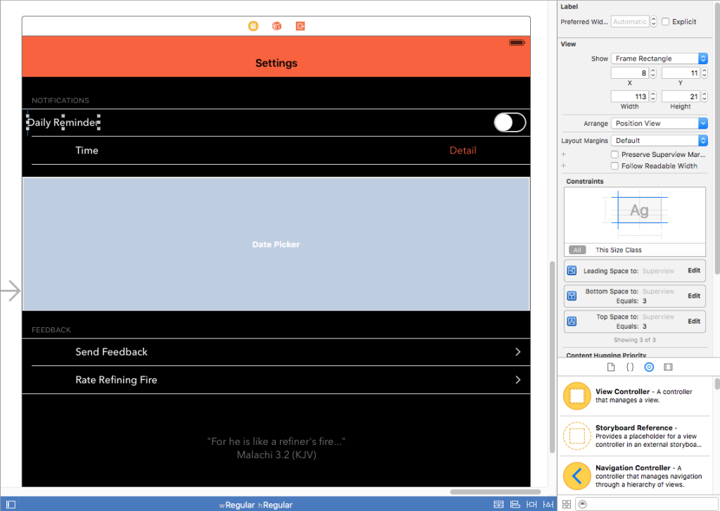
As it turns out, if you have a UITableView that mixes custom cell styles with a preset ones such as “Right Detail,” your table is going to look a bit wonky. That’s because cells with preset styles automatically adjust to different layout margins on the iPad, whereas cells with custom styles do not. Basically, if you have a UILabel that has its leading edge aligned to the Superview’s leading margin, it will continue to hug the left edge while all of the standard cells are inset by about 84 pixels.

For my “Settings” screen in the iPad’s size class (Regular Width x Regular Height), it looked like this:

Refining Fire Settings

As you can see, my custom “Daily Reminder” cell with the switch control was not aligned with the other cells which were all set to “Right Detail” even though I was using Auto Layout. The “Daily Reminder” label was positioned too far to the left and the switch was positioned too far to the right. Thanks but no thanks, Auto Layout.

I combed Stack Overflow for a solution and found two relevant posts that were fairly recent: this one and this one. However, it seemed as if no one had found a simple fix. So, I did what I usually do when a Stack Overflow search comes up empty: I started flipping switches in Xcode to see if anything helped.

The Solution

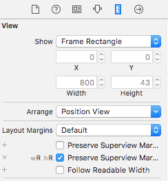
Xcode Table View Cell Layout MarginsThe solution ended up being super simple (Note: I’m using Xcode 7). I selected the “Content View” of my “Daily Reminders” cell in the Document Outline in Interface Builder. Then I brought up the Size Inspector. Under the “Layout Margins” dropdown, I clicked the little plus next to “Preserves Superview Margins” and selected the “Regular Width x Regular Height” size class. Then I checked the checkbox next to “Preserves Superview Margins.” Immediately, I got two Auto Layout warnings saying that I had misplaced views: the label and the switch. I updated the frames for both warnings and viola! Everything was perfectly aligned.

Link

Teaching App Development with Swift

Apple: Teaching App Development with Swift

Apple has a really nice curriculum on GitHub for teachers interested in having their students learn Swift. The curriculum is divided into 3 levels:

  • Level 1: Xcode Fundamentals and Swift
  • Level 2: Single View Applications and MVC
  • Level 3: Frameworks and APIs

Each level consists of several app projects, each focusing on a particular concept. Every app project is further broken down into a series of lessons (usually between 6 and 15), complete with lesson plans, Xcode project files, and Keynote presentations.

The lesson plans are very well-written and include elements that all teachers will recognize, including lists of learning outcomes, materials, and vocabulary; an introduction, body and conclusion; modifications and extensions; and a list of resources. The only thing missing is an “Assessment” section, which makes sense as teachers will have to find assessment methods that align with their own educational philosophies as well as their school’s grading policies.

Honestly, I’m thinking of teaching the course to myself, just to make sure I understand all of the things that Apple considers important for beginners to learn.

My First Critical Bug

I just submitted my first request for an expedited app review…does that mean I’m a real developer now? :P

I somehow managed to royally screw up the build settings for my project so that my watch extension 1) was not properly linking to my framework and 2) had an incorrect runtime search path. In other words, it was lookin’ for frameworks where there aren’t any. Sometimes I feel like Xcode’s build settings are like playing a game of Lights Out for the first time. With only a beginner’s understanding, it feels like I’m just flipping switches until everything works. Except in this case, everything seemed like it was working and I was able to upload to the store…only to find out that I broke the main functionality of my app: it’s ability to run on the Apple Watch. /facepalm

Of course, this will all be irrelevant when iOS 9 and watchOS 2 are released, because my watch app won’t depend on a shared framework in order to access the data store. It will have its own data store. So far, I’ve really enjoyed messing around with the new features in iOS 9 and watchOS 2, particularly SKSafariViewController and UIStackViews. I’ve also enjoyed attempting to answer people’s questions about WatchKit on Stack Overflow, even though I hardly know what I’m doing myself. All of this has been such a great learning experience and I’m already anxious to move into some new territory, such as learning how to fetch information from websites.

Link

Watch Connectivity Framework

How to Communicate Between Devices Using Watch Connectivity

For anyone who doesn’t feel like scrubbing through the “Introduction to Watch Connectivity” WWDC video to find the slides of code that you want to see, this post by Kristina Thai is an excellent introduction to the Watch Connectivity framework. It helped me out enormously today. Honestly, I’m thankful for all the people out there that scramble to put out tutorials and helpful articles right after new APIs are released. #bless

watchOS 2.0 & Core Data

Earlier I wrote about how I was able to give my watch app and my iOS app access to the same Core Data store and methods using a shared app group and a custom framework. Now, with watchOS 2.0, I’m going to have to rethink the whole system. The frustrating thing is, I don’t even know how to begin to go about doing that.

My Core Data store is tiny. The whole thing could sit happily on the Apple Watch itself without making a dent in anyone’s storage. So what…do I put one copy on the watch and one on the iPhone, and sync the changes?

I’m not sure why I’m having trouble wrapping my brain around this, but if you know how I should set up Core Data with my iOS app and a native watch application, feel free to contribute to my Stack Overflow question. I’d appreciate it!

EDIT: The answer is YES, I do need to maintain two separate stores. More on this later, when I get it all figured out.

Refining Fire Now Available

Wow! After only 9 days, Refining Fire is now available for sale in the App Store. I received 3 taps on my wrist during Bible study tonight as iTunes Connect notified me of its changing status, first to “In Review,” then “Processing for App Store,” and finally “Ready for Sale.” According to Twitter, the average review time for many apps has been around 11 days, so I was pleasantly surprised!

I already have several improvements in mind for the app, including visual tweaks (it needs to be prettier), interactive notifications on the watch, landscape and iPad support, and more. If you purchase the app, I welcome feedback at feedback@refiningfireapp.com or you can leave a review in iTunes. I may not reply to every message, but I will read them!

Waiting for Review Day 8: Redesigned Crayon Picker

Apple deemed it important enough to put it on the “here’s the rest of the new features in OS X 10.11 that we didn’t have time to talk about” slide, so one of the first things I did after I installed El Capitan this afternoon was check out the new crayon picker. I’d post a screenshot of it, but I don’t think I’m supposed to under Apple’s NDA (that’s a top secret crayon picker, thankyouverymuch). Instead, I’ll describe it to you.

Imagine the old crayon picker. Flat design, colors, crayons. Now imagine it with—wait for it—colored pencils. Yes, that’s right. The new crayon picker is actually a colored pencil picker. If you need to take a moment to grieve, I understand. I too feel like my childhood has been torn violently away from me. I too question this new direction Apple is taking. What’s next? Pens? Markers? [shudder] I guess we can comfort ourselves with the fact that the picker has been smartly reorganized: the shades of gray are all in a neat horizontal line at the top, followed by rainbow rows of varying brightness. Thank goodness.

Another visual tweak I’ve noticed so far is that the spinning beachball is…well…rainbowier. Like… [RAINBOW INTENSIFIES]. I’ve noticed that because I see it quite often; El Capitan isn’t exactly speedy on my Early 2011 MacBook Pro. I’m hoping that continued optimization throughout the summer will make it a little snappier, but if not, I can live with it until my long-awaited re-designed 15″ Skylake Space Grey Retina MacBook Pro is unveiled in all its thin, Jony Ive-ified glory. <3

The San Francisco font, like Helvetica Neue (and pretty much everything else), looks terrible on my non-retina screen. It makes me a little sad, actually. On the other hand, the desktop picture included with El Capitan is flipping gorgeous. I’m weird in that I love using Apple’s included desktop photos instead of personalizing with my own. Ergo, my desktop will likely be showing off El Capitan for many, many months.

Anyway, I know this post wasn’t about my new app again, but there’s just so much to talk about in light of WWDC. I watched a couple of the live-streamed sessions today about Xcode and Swift and it seems like there’s a lot of really useful new features in both. It’s a great time to be an Apple developer: especially for a beginner like me!

Waiting for Review Day 7: El Capitan & iOS 9

Status update: My app is still Waiting for Review and now I am currently Waiting to Install the iOS 9, Xcode 7, and OS X 10.11 betas. At my network’s lightning fast speed of 260KB/sec, I still have 22 minutes remaining on my iOS 9 download. I even had to cancel a concurrent Xcode 7 download in order for it to reach such blazing speeds. ಠ_ಠ

Anyway, based on the keynote, here are the things that I’m most excited about:

  • SFSafariViewController
  • Search API (CoreSpotlight)
  • iPad Split View – I’m really looking forward to seeing the possible ways that music-making apps could be used with this.
  • iCloud Drive app (finally!)
  • Access to the watch’s taptic engine – The first metronome app to tap you on the wrist and not suffer latency wins!
  • UIStackView – I barely know what this even is but it seems really awesome.
  • All of the intelligent/contextual Spotlight/Siri stuff
  • Swift is open source! Yay!
  • I’m oddly looking forward to trying out the new News app. Also, Notes looks pretty cool as well!

From what I’ve heard thus far, Xcode 7 is weirdly stable. Here’s hoping that everything else is as well! I don’t think I’ll put the iOS 9 developer beta on my iPhone yet (I’ll wait for the public beta build), but I plan to put it on my iPad Air 2 and I’ll also upgrade to the OS X 10.11 beta on my Macbook Pro, since Apple merged the Mac and iOS developer programs (another one of my favorite announcements today). :D

Waiting for Review Day 6: WWDC Wishes

Today I’m going to take a break from talking about my app in order to list some of my wishes for the next versions of iOS and OS X. In no particular order:

  • Fix all the dang network-related issues. mDNSResponder, discoveryd…I don’t care, as long as it works.
  • Lower the prices on iCloud storage. Also, find a way for families to share/access entire libraries with separate Apple IDs.
  • Allow users to change the default apps on iOS (I think this is on everybody’s list every year, lol). And not just browser, email, reminders and calendar…I want to be able to select Tweetbot as my default Twitter app too.
  • Allow me to delete the stock apps so I don’t have to put them all in a stupid folder.
  • API-wise, I would love it if UICollectionView could play nice with NSFetchedResultsController without ridiculous work-arounds.
  • iPad multitasking (sounds like it’s going to happen…hope it’s announced tomorrow)

It’s hard to come up with wishes for WatchKit because I just have no clue what’s even possible. It would be cool to have access to the watch’s speaker and taptic engine, but what are the odds of that?

Anyway, I’m hoping WWDC will provide a fun and interesting distraction as I continue to wait for my app to be approved or rejected. To everyone who is going/already there: have fun!

Waiting for Review Day 5: Adding an Activity Indicator to a UIWebView in Swift

One feature that I really wanted to add to Refining Fire was the ability to read the entire chapter for a randomly chosen Bible verse. So for instance, if the verse was Psalm 23.4, a user could read all of Psalm 23. I decided to use a UIWebView to display the chapter content from a popular Bible-reading website.

Sometimes the website would take a moment to load and at first glance, it seemed like the feature was broken. I knew I needed to add some kind of spinner or loading bar but wasn’t sure how to tie a UIActivityIndicatorView to the loading of a web page. After searching Stack Overflow, I found the simplest solution. Here’s what it looks like in Swift after declaring a UIActivityIndicatorView called “spinner” and a UIWebView called “webView”:

    override func viewDidLoad() {
        super.viewDidLoad()
        
        spinner.hidesWhenStopped = true
        
        webView.delegate = self

        let url = NSURL(string: urlString)
        let urlRequest = NSURLRequest(URL: url!)
        webView.loadRequest(urlRequest)
        
    }
    
    func webView(webView: UIWebView, shouldStartLoadWithRequest request: NSURLRequest, navigationType: UIWebViewNavigationType) -> Bool {
        spinner.startAnimating()
        return true
    }

    func webViewDidFinishLoad(webView: UIWebView) {
        spinner.stopAnimating()
    }
    
    func webView(webView: UIWebView, didFailLoadWithError error: NSError) {
        spinner.stopAnimating()
    }

Don’t forget to add UIWebViewDelegate to the class definition!

Note: This is the fifth entry in a series of posts about writing my first iOS app. The app is currently in review, and until it is rejected or approved, I plan to write something every day about what I’ve learned.

Waiting for Review Day 4: Visual Style

As I mentioned yesterday, my first app is called “Refining Fire.” The name was inspired by my favorite hymn, “How Firm a Foundation.” One of the verses reads: “When through fiery trials thy pathways shall lie, My grace, all sufficient, shall be thy supply; The flame shall not hurt thee; I only design Thy dross to consume, and thy gold to refine.”

Once I named the app, the rest of the app’s appearance quickly fell into place. I would use orange as the main tint color, and the logo would feature a flame. For several weeks, I used a light interface in the iPhone app with white translucent nav/tab bars and the orange tint, but it just didn’t look right. So I switched to a dark gray interface and made the nav bar orange, and suddenly everything “popped.” In hindsight, it makes perfect sense…fire isn’t nearly as fun to watch in the daylight as it is at night!

Hiring someone to make an icon for me was out of the question, so I did the best I could. I think it turned out alright! At the very least, it’s not the worst icon I’ve ever seen…

Flame Logo

Anyway, here’s my tip for other beginners like me: use a template with Photoshop actions to generate your icon at different sizes. Here’s one for Apple Watch icons. Trust me, it’ll save you a lot of time!

I think the biggest thing I learned in choosing colors and fonts for my app is not to get too hung up in making comparisons to other apps. I spent a lot of time looking at my favorite apps like Overcast and Tweetbot and thinking about the decisions the developers made, and as a result I wound up feeling like I had to make those same decisions. But that was stupid because my app is my own and is also designed for a much smaller market. It’s not going to be written about on blogs (other than this one) or nitpicked about on Twitter.

I don’t have a marketing budget, or even a marketing strategy. However, if you are a Christian or know of someone who would like a Bible verse app for their iPhone or Apple Watch, feel free to spread the word. I’d certainly appreciate it. I set up a website for it here: www.refiningfireapp.com.

Note: This is the fourth entry in a series of posts about writing my first iOS app. The app is currently in review, and until it is rejected or approved, I plan to write something every day about what I’ve learned.