Yesterday I decided that I was going to make Refining Fire a universal app. Eager to see how it would look, I quickly changed the relevant build setting, set up my iPad Air 2 as a testing device, and hit “Build & Run.”
The Problem
As it turns out, if you have a UITableView that mixes custom cell styles with a preset ones such as “Right Detail,” your table is going to look a bit wonky. That’s because cells with preset styles automatically adjust to different layout margins on the iPad, whereas cells with custom styles do not. Basically, if you have a UILabel that has its leading edge aligned to the Superview’s leading margin, it will continue to hug the left edge while all of the standard cells are inset by about 84 pixels.
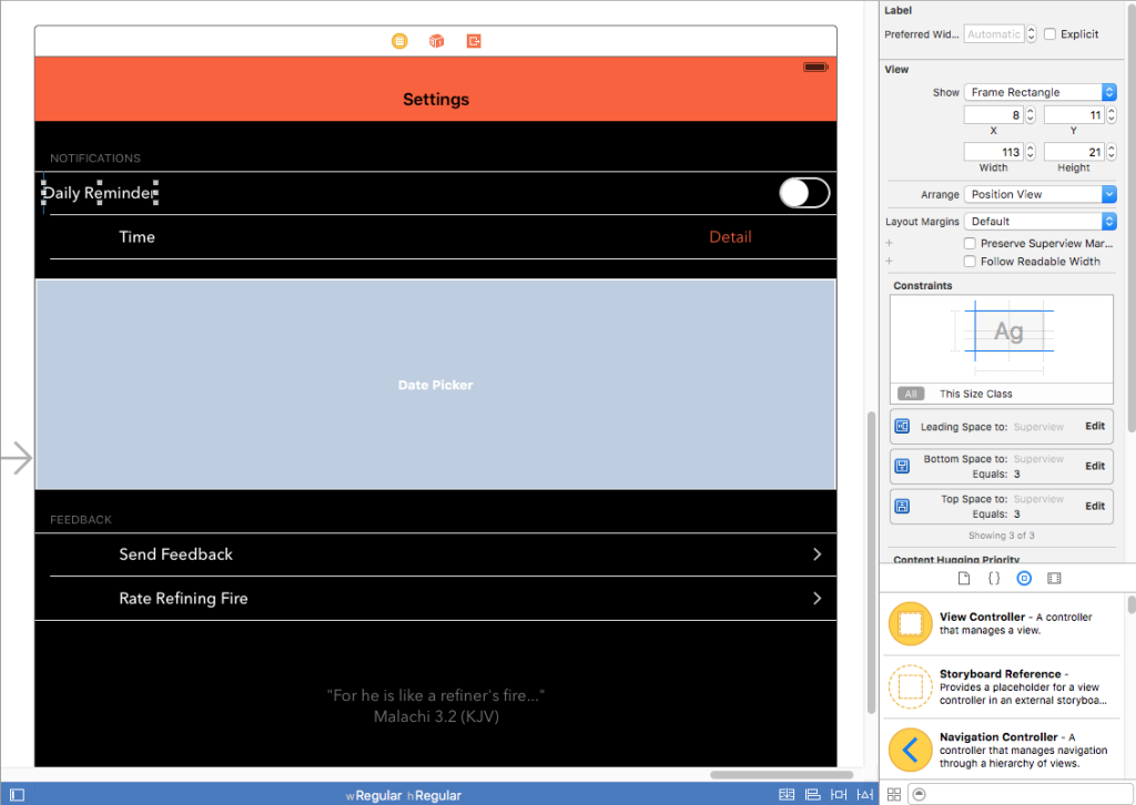
For my “Settings” screen in the iPad’s size class (Regular Width x Regular Height), it looked like this:
As you can see, my custom “Daily Reminder” cell with the switch control was not aligned with the other cells which were all set to “Right Detail” even though I was using Auto Layout. The “Daily Reminder” label was positioned too far to the left and the switch was positioned too far to the right. Thanks but no thanks, Auto Layout.
I combed Stack Overflow for a solution and found two relevant posts that were fairly recent: this one and this one. However, it seemed as if no one had found a simple fix. So, I did what I usually do when a Stack Overflow search comes up empty: I started flipping switches in Xcode to see if anything helped.
The Solution
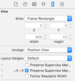
 The solution ended up being super simple (Note: I’m using Xcode 7). I selected the “Content View” of my “Daily Reminders” cell in the Document Outline in Interface Builder. Then I brought up the Size Inspector. Under the “Layout Margins” dropdown, I clicked the little plus next to “Preserves Superview Margins” and selected the “Regular Width x Regular Height” size class. Then I checked the checkbox next to “Preserves Superview Margins.” Immediately, I got two Auto Layout warnings saying that I had misplaced views: the label and the switch. I updated the frames for both warnings and viola! Everything was perfectly aligned.
