When I first released YarnBuddy, it had an orange-to-pink gradient as the navigation bar background color. The colors reminded me of a sunset, which I liked, but the overall effect was a little too heavy and could easily clash with the user’s own project photos. I wondered if I could do something a little more subtle and put the gradient inside the navigation bar title text itself.
The good news is that SwiftUI makes it trivially easy to create gradients and mask them in a variety of ways. The bad news is that SwiftUI can’t do much of anything when it comes to customizing the navigation bar. Maybe that will change in the next version of SwiftUI, to be announced at WWDC in a little over two weeks…maybe it won’t. For now, we can use the good ol’ UIKit Appearance APIs to accomplish our goal.
What we’re going to do is create a UIColor from a pattern image. The image will be generated using our gradient colors, and sized based on the height of the navigation bar and the width of the longest title we expect to display. All of this will happen in an extension to UINavigationController, in which we’ll override viewDidLoad().
The first thing we’ll need is a function to create an image from our gradient.
func getImageFrom(gradientLayer:CAGradientLayer) -> UIImage? {
    var gradientImage:UIImage?
    UIGraphicsBeginImageContext(gradientLayer.frame.size)
    if let context = UIGraphicsGetCurrentContext() {
        gradientLayer.render(in: context)
        gradientImage = UIGraphicsGetImageFromCurrentImageContext()?.resizableImage(withCapInsets: UIEdgeInsets.zero, resizingMode: .stretch)
    }
    UIGraphicsEndImageContext()
    return gradientImage
}
Since the function isn’t guaranteed to return an image, we’ll assign a default color for large title text. I chose UIColor.label, since I knew it would automatically adjust between dark mode and light mode. I also really like the “rounded” font design so I added it to my large title font descriptor; you can go with the default or serif options or a completely different font if it suits your app. Here is an example of what you can do in your UINavigationController extension:
extension UINavigationController {
override open func viewDidLoad() {
super.viewDidLoad()
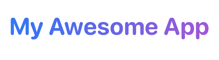
var gradientColor = UIColor.label
let blue = UIColor.systemBlue
let purple = UIColor.systemPurple
let largeTitleFont = UIFont.systemFont(ofSize: 40.0, weight: .bold)
let longestTitle = "My Awesome App"
let size = longestTitle.size(withAttributes: [.font : largeTitleFont])
let gradient = CAGradientLayer()
let bounds = CGRect(origin: navigationBar.bounds.origin, size: CGSize(width: size.width, height: navigationBar.bounds.height))
gradient.frame = bounds
gradient.colors = [blue.cgColor, purple.cgColor]
gradient.startPoint = CGPoint(x: 0, y: 0)
gradient.endPoint = CGPoint(x: 1, y: 0)
if let image = getImageFrom(gradientLayer: gradient) {
gradientColor = UIColor(patternImage: image)
}
let scrollEdgeAppearance = UINavigationBarAppearance()
scrollEdgeAppearance.configureWithTransparentBackground()
if let largeTitleDescriptor = largeTitleFont.fontDescriptor.withDesign(.rounded) {
scrollEdgeAppearance.largeTitleTextAttributes = [.font : UIFont(descriptor: largeTitleDescriptor, size: 0), .foregroundColor : gradientColor]
}
navigationBar.scrollEdgeAppearance = scrollEdgeAppearance
}
}Setting the the x-value of the gradient’s start point to 0 and the end point to 1 creates a horizontal gradient. You can create a vertical gradient by changing the y-value instead. You’ll see that if our getImageFrom(gradientLayer:) function returns an image, we’ll use that to create a UIColor that we can use when assigning text attributes to our instance of UINavigationBarAppearance.
You’ll see I’m only setting the navigation bar’s scroll edge appearance—that’s because it covers the only navigation bar state where large title text appears. However, in YarnBuddy, I also set the “standard appearance” and “compact appearance” to use colors that match the user’s selected theme. If you’re wondering why I’m not using a gradient in all cases, it’s because it doesn’t look very good with small font sizes and makes the text way less readable.
I made a playground using the above code and SwiftUI so that you can fiddle around with colors and font: