Every once in awhile I discover a little feature in Xcode that I never noticed before and wonder how in the world I could have missed it. Today’s lightbulb ? moment is brought to you by: “image slicing in the Xcode asset catalog.”
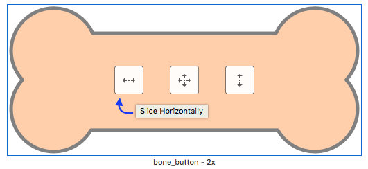
See, I made this button in the shape of a dog treat:

I’ve been using it as the background for my “Play” button on Corgi Corral’s main menu screen. My concern was that when I localized the word “Play,” there might be a translation that caused the word to be too long for the button at the size I designed it. It would be better if the button background itself could scale its width without looking weird and stretched. That’s when I noticed the “Show slicing” button in the bottom-right corner of the asset catalog.
When you click “Show slicing,” your image appears larger and is overlaid with a button that says “Start slicing.” This is where the fun begins! ?

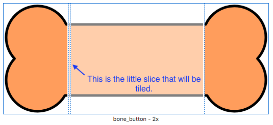
You have three options: slice horizontally, vertically, or both. Slicing horizontally automatically preserves the end caps of the button while simultaneously creating a 1-pixel vertical slice that can either be tiled or stretched, depending on your preference.

After slicing the image, you’re done—there’s no “save changes” or “done slicing” button to press. When I switched back over to my Storyboard, however, my bone button was looking a little squished:

To fix that, I adjusted the content insets on the button like so:

Ah, much better.
And that, my friends, was a quick tutorial on something you probably already knew about. Have a great day! ?